University of Maryland University College (1986 - 1989)
GPA: 2.333
Associate of Science in Natural Sciences
Associate Degree
Riverwside Community College (1992 - 1994)
GPA: 3.000
Associate of Science in Natural Sciences
Novell Certification
Computer Learning Center (1997 - 1998)
Certified
Certified Novell Administrator - Netware 3
Associate Degrees
Mt. San Jacinto College (2005 - 2006)
GPA: 3.093
Associate of Arts in Liberal Arts
Associate of Arts in Social/Behavioral Sciences
Associate of Arts in Humanities
Associate of Science in Mathematics/Science
Bachelor Degree Coursework
California State University San Bernardino (1997 - 2001)
GPA: 3.558
Computer Engineering
Bachelor Degree
National University (2013 - 2015)
GPA: 3.764
Bachelor of Science in Computer Science
Profesional Certificate
University of California Davis Continuing and Professional Education (2017 - 2018)
GPA: 3.860
Web Development Certificate
Master's Degree
Southern New Hampshire University (2016 - 2019)
GPA: 4.000
Master of Science in Information Technology w/conc. in Web Design
Graduate Certificate
Regis University (2020 - 2021)
GPA: 3.917
Graduate Certificate in Full Stack+ Web Development
Doctoral Degree Work
Chicago School of Professional Psychology (2022 - 2023)
GPA: 4.000
Educational Psychology and Technology
Master's Degree Work
National University (2023 - 2024)
GPA: 4.000
Inspired Teaching and Learning with a Preliminary Teaching Credential and Intern Option (California)
2016 - Present
Job Experience
Technical Support Specialist
Broadridge Advisor Solutions (2016 - 2018)
Delivered high-volume technical support during the 2017–2018 performance cycle while maintaining top-tier customer satisfaction, demonstrating strong analytical and debugging skills.
Investigated and resolved 6,900+ Help Desk Incidents (HDIs) during the 2017–2018 cycle, consistently identifying root causes and translating user issues into actionable technical solutions.
Contributed to internal web development by assisting with coding and building reusable templates for the Broadridge DESK Support Site, supporting scalable documentation and improved support workflows.
Associate Software Developer
Broadridge Advisor Solutions (2019 - 2022)
Developed, enhanced, and maintained production web applications supporting financial advisors using ColdFusion and Microsoft SQL Server.
Architected an internal administrative tool for technical support teams to manage broker-dealer and compliance data, reducing task completion time by approximately 50%.
Led accessibility remediation across more than 50 production website templates to achieve WCAG 2.0 AA compliance.
Diagnosed and resolved complex software defects, performance bottlenecks, and data integrity issues in a regulated environment.
Instructional Laboratory Technician
Mt. San Jacinto College (2022 - 2024)
Supported physics laboratories by configuring, testing, and maintaining technical equipment, ensuring reliable operation across multiple instructional environments.
Diagnosed and resolved hardware, software, and instrumentation issues, applying systematic troubleshooting and documentation practices.
Assisted faculty and students by translating complex technical concepts into clear, actionable guidance.
Managed lab workflows, data collection processes, and procedural documentation to support consistency, accuracy, and repeatability.
Math Instructor
Excelsior Charter School (2024 - 2025)
Designed and delivered structured, logic-driven lessons that emphasized problem decomposition, pattern recognition, and step-by-step reasoning.
Adapted instruction based on continuous assessment and feedback, reinforcing iterative improvement and outcome-driven refinement.
Communicated complex concepts clearly to diverse learners, strengthening skills in technical explanation and user-focused thinking.
Developed digital instructional materials and workflows to support consistency, scalability, and student engagement.
Classroom Instructional Aide
Tahquitz High School (2025)
Provided one-on-one and small-group academic support, reinforcing structured problem-solving and step-by-step reasoning.
Assisted in implementing instructional workflows and classroom procedures, supporting consistency and efficiency.
Clarified complex concepts and instructions for students, strengthening skills in clear technical communication and user support.
Supported differentiated instruction and accommodations, developing adaptability and attention to edge cases.
Substitute/Guest Teacher
Hemet/San Jacinto Unified School Districts (2025 - Present)
Stepped into diverse classroom environments with minimal ramp-up time, quickly interpreting lesson plans and maintaining instructional continuity.
Adapted to varying systems, expectations, and student needs, demonstrating flexibility and rapid problem-solving.
Communicated instructions clearly and enforced structured workflows to keep classrooms operating smoothly.
Documented outcomes and provided feedback to permanent instructors, supporting consistent handoff and process continuity.
Learning Support Specialist
Tutor Me Education (2025 - Present)
Delivered individualized instruction tailored to diverse learning profiles, reinforcing structured problem-solving and adaptive approaches.
Analyzed student performance to identify gaps and adjust strategies, applying iterative refinement based on feedback and outcomes.
Broke down complex concepts into clear, manageable steps, strengthening skills in technical explanation and user-focused design.
Maintained detailed documentation of progress, accommodations, and strategies to ensure consistency and continuity.
Features
Languages
C++
70%
C#
65%
ColdFusion
70%
CSS
95%
HTML
95%
Java
60%
JavaScript
80%
PHP
75%
Python
80%
SQL
85%
Features
Developer Strengths
Web Development, SQL
75%
Problem Solving, Automation
85%
Web Accessibility (WCAG), UX Compliance
80%
Debugging, Troubleshooting
90%
Technical Communication, Documentation
90%
Systems Thinking, Workflow Design
85%
Adaptability, Rapid Onboarding
90%
Continuous Improvement, Iteration
85%
User-Centered Design, Usability
80%
Reliability, Ownership
95%
2006 - Present
My Portfolio
2-Day Shower Specialists
A modern web project showcasing 2-Day Shower Specialists through responsive layout, semantic HTML structure, and lightweight JavaScript interaction. The site emphasizes clean visual hierarchy, fast performance, accessibility, and mobile-friendly design while demonstrating practical front-end techniques used in real-world service websites.
A cinematic front end web project that presents a modern film festival experience through responsive layout, semantic HTML structure, and lightweight JavaScript interaction. The site emphasizes clean visual hierarchy, fast performance, accessibility, and mobile friendly design while demonstrating practical front end techniques used in real world event websites.
RoboFriends is a modern React application that fetches user data from an external API and displays it as a searchable grid of robot profile cards. It demonstrates component based architecture, real time client side filtering, responsive UI design, and clean frontend engineering using Vite, hooks, testing, and performance conscious practices.
Digital Rain is a browser based animation project built with HTML, CSS, and JavaScript that recreates a cascading code effect using the Canvas API and requestAnimationFrame to demonstrate responsive design, real time rendering, and performance conscious front end development.
SimpleFolio is a modern, performance focused portfolio built with semantic HTML, modular SCSS, vanilla JavaScript, and a Parcel build pipeline. The project demonstrates responsive design, accessible markup, progressive enhancement with motion controls, and a scalable front end architecture designed for maintainability and real world deployment.
RandomThoughtsInTraffic.com is a production WordPress blog where I publish long form essays on web development while managing performance, SEO, security, caching, theme customization, and real world hosting workflows in a live environment.
Space Portfolio is a full stack Flask web application that blends a space inspired visual theme with structured backend routing, reusable Jinja templates, responsive Bootstrap layout, and a contact system. The project demonstrates secure configuration practices and production readiness while showcasing my development work in an interactive space.
Hacker News Aggregator is a full stack web application that fetches, filters, and displays top Hacker News stories using a PHP frontend and a Python scraping backend, highlighting secure input handling, cross language execution, and responsive dark themed design.
Jamison Stamps and Books is a production ready static e commerce website built with semantic HTML, responsive CSS, and vanilla JavaScript. The project features a dynamic stamp catalog, secure PayPal integration, accessibility focused markup, and search engine optimized architecture designed for performance and maintainability.
Password Exposure Checker is a full stack web application that verifies whether a password appears in known data breaches using privacy focused SHA-1 hashing, secure range based API integration, and responsive client side updates, all without storing or transmitting the full password.
PassionateTeachingJourney.com is a fully implemented WordPress application that documents my path toward teaching while demonstrating CMS configuration, theme customization, plugin integration, performance optimization, and reproducible local deployment practices.
DnD5eTools.com is a static web application built with HTML, CSS, and vanilla JavaScript that provides interactive character creation utilities, including an ability score generator, race based physical stat generator, and a filterable gallery of pre generated character sheets.
AncientWhiteArmyVet RPG Tools is a full stack web application built with Node.js, Express, and MySQL that allows users to securely create, manage, and persist tabletop RPG characters. The project demonstrates RESTful architecture, JWT authentication, relational data modeling, frontend integration, and deployment ready design.
Character Vault is a secure full stack web application that allows authenticated users to create and manage RPG characters and tasks within a protected account. Built with Node, Express, and vanilla JavaScript, it demonstrates JWT authentication, scoped CRUD operations, RESTful API design, and a responsive frontend interface.
Angular CLI Application is a modular single page web application built with Angular and TypeScript, demonstrating component based architecture, client side routing, and structured development using the Angular CLI toolchain.
The Budget Application is a modular JavaScript web app that allows users to track income and expenses in real time, automatically calculate totals and percentages, and view an updated monthly balance through a clean, responsive interface.
The Pig Game is an interactive browser based dice game built with HTML, CSS, and vanilla JavaScript that demonstrates state management, event driven logic, dynamic DOM updates, and clean front end architecture through both one die and two dice gameplay modes.
AncientWhiteArmyVet’s RPG Tools is a browser based suite of tabletop utilities built with HTML, CSS, and JavaScript that features an ability score roller, physical stat generator, and pre generated character browser, demonstrating modular front end architecture and responsive design.
FrankJamison.com v2019 is a responsive, single page professional portfolio built with HTML, CSS, JavaScript, and PHP. It showcases my profile, resume, project work, and a server integrated contact form within a clean, interactive design that emphasizes usability, performance, and maintainable front end architecture.
Founder and Developer of VeteranJobInfo.us, a resource website supporting U.S. military veterans and their families in the job search process. I designed and built a responsive multi page site using HTML, CSS, and JavaScript with reusable components, mobile navigation, accessibility enhancements, and curated veteran employment resources.
AncientWhiteArmyVet’s RPG Tools is a browser based tabletop utility suite built with HTML, CSS, and vanilla JavaScript. It provides fast, responsive tools for dice rolling, stat generation, and gameplay support, demonstrating clean client side architecture, reusable logic, and structured front end development without external frameworks.
QuestKeeper is a full stack web application for creating and managing Dungeons and Dragons Fifth Edition character sheets through a secure, database driven interface. Built with PHP, MySQL, JavaScript, jQuery, and Bootstrap, it demonstrates relational database design, authentication, dynamic form logic, and responsive UI development.
FrankJamison.com v2018 is a responsive single page portfolio built with HTML, CSS, Bootstrap, JavaScript, and PHP. It showcases structured information architecture, interactive front end enhancements, secure server side form handling, and a clean, maintainable design for employers and developers evaluating my work.
Frank’s Classic Cars is a PHP and MySQL web application that simulates a vintage automobile dealership. The site includes a public car catalog, secure employee authentication, internal management tools, RSS feed generation, and dynamic server side charting, demonstrating full stack development and relational database design.
RPG Stat Roller is a lightweight browser based tool that generates tabletop RPG ability scores using multiple rule variants. Built with HTML, CSS, and vanilla JavaScript, it features a clean interface, keyboard shortcuts, and locally stored roll history with no server dependencies.
Riverside Massage and Spa is a professionally designed small business website that showcases a fictional wellness brand through semantic HTML, responsive CSS, and conversion focused layout strategy. The project highlights structured information architecture, accessible design, and a calm, brand aligned user experience.
Stopwatch and Countdown Timer is an interactive front end web application built with HTML, CSS, and JavaScript that provides precise stopwatch and countdown functionality. It features responsive layout design, intuitive controls, and carefully managed interval logic to ensure accurate timing and reliable performance across devices.
JavaScript Guessing Game is a browser based app built with HTML, CSS, and vanilla JavaScript where the computer tries to guess a user selected number between 1 and 999. It showcases clean state management, input validation, and dynamic DOM updates using core front end fundamentals.
FrankJamison.com v2017 is a responsive static resume website built with semantic HTML5 and custom CSS. The project demonstrates structured content architecture, accessible markup, and organized styling while highlighting my experience, education, skills, and professional affiliations in a clean, maintainable front end design.
FrankJamison.com v2016 is a multi-page static resume website built with HTML, CSS, and JavaScript that presents my professional experience, education, and skills through structured layouts, interactive accordion sections, and smooth navigation, showcasing clean front end architecture and attention to user experience.
Virtual World is a Java based interactive application that began as a console driven experience and evolved into a browser accessible system powered by a lightweight HTTP server. It demonstrates object oriented design, REST style API development, and full stack integration using Java, HTML, CSS, and vanilla JavaScript.
Jamison Web Design is a static HTML, CSS, and JavaScript business website created to showcase affordable web solutions for small businesses. The project highlights clean front end structure, consistent visual design, interactive elements like a slideshow, and a functional contact workflow that reflects real world client needs.
The RPG Book Library is a structured static website that catalogs tabletop roleplaying game books by system and edition. Built with HTML, CSS, and lightweight JavaScript, it demonstrates strong information architecture, consistent asset organization, and maintainable front end design without relying on frameworks or a build process.
FrankJamison.com v2015 is a professionally designed front end portfolio built with HTML, CSS, and JavaScript. The project demonstrates structured layout design, consistent styling architecture, and disciplined code organization, reflecting my growth in maintainable web development and user focused presentation.
FrankJamison.com v2013 is a preserved and modernized version of my 2013 personal website, built with HTML, CSS, JavaScript, and PHP. It demonstrates legacy maintenance, shared JavaScript navigation, Flash preservation using Ruffle, and a secure SMTP contact form, showcasing my ability to update and document older codebases responsibly.
Globe Bank is a PHP and MySQL content management system that simulates the internal platform of a financial institution. It includes a public site and a secure staff area with authentication and full CRUD functionality. The project demonstrates relational database design and secure server side architecture.
The MSJC Administration of Justice Department Website is a professionally structured academic site designed to present program information clearly and credibly. Built with semantic HTML and modern CSS, it emphasizes responsive design, accessibility, and clean, maintainable front end architecture.
Zita Worley's Website is a professional academic site I built to showcase a history professor's scholarship, teaching, and research with clarity and credibility. It highlights my strengths in information architecture, responsive design, accessibility, and clean, maintainable front end development tailored for long term academic growth.
Moonwalk Manor is a themed, responsive static website built with HTML, CSS, and JavaScript, showcasing atmospheric layout, image-forward design, and clean navigation with accessibility-minded structure.
A clean, real time web application that measures typing speed and accuracy using precise timer logic, character level input validation, and live performance metrics. The project demonstrates event driven JavaScript, structured state management, and responsive UI updates within a focused, production minded front end build.
FrankJamison.com v2006 is my original 2006 portfolio site, preserved as a static HTML and CSS project. It showcases early web design fundamentals, clean structure, and disciplined organization before modern frameworks became standard.
The Analog Clock Project is a lightweight, framework-free web application that renders dual analog clocks displaying both local time and UTC. Built with HTML, CSS, JavaScript, and SVG, it demonstrates precise rotational math, real-time synchronization, responsive design, and clean separation of structure, style, and logic.
Static Web DevelopmentResponsive Web DesignLanding Page OptimizationHTML CSS JavaScriptPerformance Focused Front End
Built for Speed: Engineering a High Performance Landing Page for 2 Day Shower Specialists
Project Vision
The goal of the 2 Day Shower Specialists project was to design and develop a high performance landing page that focuses on lead generation, visual clarity, and fast loading performance. The site represents a modern residential remodeling service that specializes in fast shower installations. Because the target audience is homeowners searching for renovation services, the design prioritizes clarity, trust signals, and an easy path to conversion.
I approached this project as both a marketing exercise and a technical challenge. The objective was to create a static website that loads extremely quickly while still presenting a polished and professional visual identity. Rather than relying on a heavy framework or content management system, I built the project using lightweight HTML, CSS, and minimal JavaScript. This approach reduces complexity, improves performance, and keeps the deployment process simple.
The result is a streamlined landing page architecture that demonstrates front end engineering fundamentals, performance awareness, responsive design, and practical user experience considerations.
Layout and Visual Design
The visual design of the project centers on clarity, contrast, and strong call to action placement. The site uses a clean modern layout that highlights the service offering immediately when the page loads. A large hero section establishes the brand message and introduces the core value proposition of a fast two day shower renovation.
The layout structure follows a traditional marketing flow that guides visitors through several stages of persuasion. After the hero section, the page presents key benefits, service highlights, and supporting information that builds trust. Clear typography, spacing, and consistent visual hierarchy allow users to scan the content quickly while still absorbing the essential information.
The design also incorporates modern color choices that evoke water, cleanliness, and professionalism. The palette uses cool blues and aqua tones paired with neutral backgrounds. This combination supports the theme of bathroom renovation while maintaining visual comfort and readability.
Every section of the layout was built to reinforce the conversion goal of the page. Prominent buttons, consistent spacing, and strategic grouping of information help visitors understand what action they should take next.
Semantic HTML Structure
The foundation of the project is a semantic HTML structure that emphasizes accessibility and maintainability. Rather than relying on generic containers alone, I used meaningful HTML elements to define the layout and content areas.
Major page sections are organized using structural elements that clearly separate the hero area, service descriptions, and lead generation form. Headings follow a logical hierarchy so that both search engines and assistive technologies can interpret the content correctly.
This structure also improves long term maintainability. When the layout is organized using semantic markup, future updates become easier to implement because the purpose of each section is clearly defined within the document structure.
In addition, the HTML markup avoids unnecessary complexity. Each element serves a specific purpose and the document remains easy to read and understand. Clean markup is an important aspect of professional front end development and this project reflects that principle.
CSS Architecture and Styling Strategy
The styling system for the project focuses on clarity, modularity, and predictable layout behavior. The CSS defines typography, spacing, color usage, and responsive layout adjustments while avoiding unnecessary complexity.
I structured the stylesheet so that base styles establish the visual foundation of the site. These rules handle global typography, color variables, and layout defaults. From there, component level styles define the appearance of specific sections such as the hero banner, service descriptions, and form elements.
Flexbox is used to control layout alignment and spacing throughout the page. This approach allows sections to remain flexible and responsive while maintaining consistent visual balance. The use of modern layout tools ensures that the site behaves predictably across different screen sizes.
Spacing and typography are also carefully managed through the stylesheet. Consistent margins, padding values, and font sizes create a clean visual rhythm across the page. These decisions help maintain readability and visual coherence as users move through the content.
Responsive Design and Mobile Optimization
A large portion of home improvement searches occur on mobile devices, so responsive design was an essential requirement for this project. The layout adapts gracefully across desktop, tablet, and smartphone screens.
The responsive strategy relies on flexible layouts and targeted media queries. At smaller screen widths, the layout reorganizes to maintain readability and usability. Elements that appear side by side on desktop screens stack vertically on mobile devices to prevent crowding.
Buttons, form fields, and interactive elements are sized appropriately for touch input. This ensures that mobile users can interact with the page comfortably without accidental taps or layout issues.
Images are also handled carefully to ensure that they scale correctly without breaking the layout. By combining flexible containers with responsive CSS rules, the site remains visually consistent regardless of the device being used.
Performance and Lightweight Architecture
Performance was a primary consideration throughout the development process. Many marketing landing pages rely on large frameworks, excessive scripts, or heavy visual effects that slow down page loading times. In contrast, this project focuses on efficiency.
The site uses static HTML and CSS as its foundation. JavaScript usage is minimal and reserved only for small interactive features where necessary. By limiting the amount of client side scripting, the page remains fast and responsive even on slower networks.
Images are optimized for web delivery so that they load quickly while still maintaining visual quality. The absence of large frameworks also reduces the number of network requests required to render the page.
These decisions help ensure that the landing page performs well in real world conditions, which improves both user experience and search engine performance metrics.
Lead Generation and Conversion Design
The primary purpose of the site is to generate leads for the renovation service. To support this goal, the page includes a clear and accessible quote request form. The form collects basic information that allows potential customers to request more details about their project.
The form is designed with usability in mind. Input fields are clearly labeled and spaced so that users can complete the process quickly. The submission button is visually distinct and placed where users naturally expect it to appear.
This conversion focused design reflects common best practices in marketing oriented web development. Rather than overwhelming visitors with excessive information, the page focuses on guiding them toward a simple action that moves the conversation forward.
Deployment and Real World Application
One of the strengths of this project is that it mirrors real world deployment scenarios. Because the site is built as a static application, it can be deployed easily to many hosting platforms. This includes traditional hosting environments as well as modern static hosting providers.
The lightweight architecture simplifies the deployment process. There is no server side dependency or database requirement. The entire project can be uploaded directly to a hosting provider and served immediately.
This simplicity also improves reliability and maintainability. Fewer moving parts means fewer opportunities for failure, which is a valuable characteristic for marketing websites that must remain consistently available.
What This Project Demonstrates
The 2 Day Shower Specialists project highlights several core skills that are essential in professional web development.
It demonstrates the ability to build clean semantic markup that supports accessibility and search engine visibility. It shows how modern CSS techniques can create responsive layouts that remain stable across many devices. It also reflects a strong awareness of performance optimization and lightweight design principles.
Equally important, the project illustrates how technical decisions connect to business goals. Every aspect of the layout and structure is designed to support a clear marketing objective. This blend of technical implementation and practical usability is an important part of building effective web applications.
For employers, recruiters, and fellow developers, this project represents my approach to front end engineering. I focus on clarity, maintainability, performance, and real world usability. The end result is a clean, efficient website that delivers a focused user experience while remaining technically sound.
HTML5CSS3JavaScriptResponsive DesignFront End Development
Lights, Code, Festival: Building a Cinematic Web Experience
Project Vision
I built the Film Festival project as a front end web experience that captures the atmosphere of a modern independent film festival while demonstrating practical front end engineering skills. The goal was to design a visually engaging website that feels cinematic and immersive while remaining fast, accessible, and maintainable. The project emphasizes thoughtful layout design, responsive behavior, semantic structure, and clean client side interaction.
From the beginning, I approached the project as both a design challenge and a development exercise. I wanted the site to reflect the visual language of film culture while also demonstrating disciplined front end architecture. Every component of the site is intentionally structured to balance aesthetics, usability, and technical clarity.
Information Architecture and Page Structure
The foundation of the project is a clear and semantic HTML structure that organizes the festival experience into logical sections. The site is designed to guide the user through the essential elements of a festival event. Visitors encounter a prominent hero section that establishes the theme and visual tone of the festival, followed by structured sections that highlight featured films, event information, schedules, and calls to action.
Semantic HTML elements organize the document structure in a meaningful way. Sections, headers, navigation elements, and content groupings communicate the purpose of each part of the interface. This approach improves accessibility while also making the layout easier to maintain and extend.
Each section of the page is modular in design. Film entries, event highlights, and informational blocks follow consistent structural patterns so that new content can be added without redesigning the layout. This modular approach reflects common patterns used in professional front end development.
Visual Design and Layout Strategy
The visual design focuses on a cinematic presentation that reinforces the theme of a film festival. Typography, color contrast, and spatial layout all contribute to the visual hierarchy of the page. The design emphasizes readability while maintaining a modern and visually engaging style.
Layout decisions rely on modern CSS techniques that allow the interface to adapt smoothly to different screen sizes. Flexible layout systems organize film cards, event sections, and promotional areas so that the page remains balanced across desktop, tablet, and mobile devices.
Spacing, alignment, and grid structure play a major role in the presentation. Consistent margins and padding create visual rhythm throughout the interface, while grid based layouts allow multiple film entries and festival highlights to appear organized and scannable.
The design also incorporates strong visual emphasis in key areas such as the hero banner and featured sections. These elements create a focal point that immediately communicates the purpose of the site and invites the visitor to explore further.
Responsive Design Implementation
A central goal of the project is reliable responsiveness across devices. The layout adjusts fluidly from large desktop displays to smaller mobile screens. Responsive design techniques ensure that content remains readable and visually balanced regardless of viewport size.
Media queries adjust layout behavior for different screen widths. Grid structures shift from multi column arrangements on desktop screens to stacked layouts on mobile devices. Navigation elements remain accessible while adapting to smaller displays.
Images and media assets scale proportionally to maintain visual clarity while preventing layout breakage. This responsive approach ensures that the site delivers a consistent experience across a wide range of devices.
Client Side Interaction
JavaScript enhances the user experience by adding small interactive elements that improve usability and engagement. These interactions are designed to remain lightweight so that the site retains fast loading performance.
Interactive behaviors may include navigation handling, dynamic interface responses, and visual feedback that guides the user through the page. These features are implemented with a focus on clarity and maintainability so that the code remains easy to understand and extend.
The project intentionally avoids excessive scripting. The goal is to demonstrate how thoughtful front end design can deliver an engaging interface without unnecessary complexity.
Performance and Optimization
Performance plays an important role in the design of the project. Static site architecture allows the page to load quickly without reliance on server side rendering or complex frameworks. This approach reduces overhead and ensures that the user receives content rapidly.
Images and visual assets are organized to support efficient loading. Clean HTML structure and efficient CSS organization minimize rendering complexity and help browsers display the interface quickly.
This performance focused design reflects a real world development priority. A visually rich interface must still respect loading speed and responsiveness, especially for users on mobile networks.
Accessibility and Usability Considerations
Accessibility principles guided the development of the site. Semantic HTML improves screen reader interpretation and establishes logical navigation order. Clear heading structure allows assistive technologies to understand the hierarchy of the page.
Color contrast and text readability are also considered in the design. Interactive elements maintain clear visual states so that users can easily recognize navigation controls and calls to action.
These accessibility practices reflect an understanding that professional web development must support a wide range of users and browsing environments.
Development Approach and Maintainability
Throughout the project I focused on writing clear and maintainable code. HTML structure remains readable and well organized. CSS styles are grouped logically to make layout behavior easy to understand. JavaScript functionality is implemented in a focused and minimal way.
The result is a front end project that can be easily extended. New films, new festival sections, or additional content blocks can be added without major restructuring. This maintainability is essential in real production environments where websites evolve over time.
The project demonstrates practical development habits such as modular design, clear separation of concerns, and attention to long term maintainability.
Conclusion
The Film Festival project represents a combination of design thinking and disciplined front end engineering. I created a visually engaging website that reflects the atmosphere of a modern film festival while demonstrating responsive layout techniques, semantic HTML structure, efficient CSS organization, and lightweight client side interaction.
The final result is a clean, maintainable, and responsive web interface that highlights both creative presentation and solid technical implementation. For employers, recruiters, and fellow developers, the project illustrates how thoughtful front end design can deliver an engaging user experience while maintaining professional development standards.
ReactViteClient-Side SearchService WorkerTesting
Robots in My Pocket: How I Built RoboFriends Into a Clean, Fast, Searchable React UI
In writing this I am talking directly to recruiters, fellow devs, and hiring managers because I want you to see not just what the project does but how I think and build. RoboFriends was never meant to be a sprawling system. I conceived it as a focused exercise in modern frontend engineering where every piece of code has a clear purpose and real user value.
Project Purpose and What It Does
At its heart RoboFriends is a directory of robot avatars that I fetch from a public API, display as cards, and filter instantly based on user search input. The core interaction is simple: type in a search box, see the grid update in real time. I emphasize a clean component UI with instant, client-side filtering so the app feels responsive and deliberate. This is not an academic demo. It is an example of how thoughtful design leads to a user experience that feels smooth and complete.
How I Built It
I started with a modern frontend scaffold using React 19 and Vite. Vite gave me super fast refresh rates during development and clean production builds. I structured the application around composable components so each one does one thing well. The main ones are SearchBox, CardList, Card, and a Scroll wrapper. These work together to make UI logic predictable and easy to extend later.
I fetch user data from https://jsonplaceholder.typicode.com/users, then, for each user, I generate a robot avatar using RoboHash. That decoupling lets me focus on data handling first and component rendering second. The search filtering happens entirely on the client using a case-insensitive name match. I wrap that logic in a memoized hook so it runs efficiently even as the list grows.
Design Choices
For styling I leaned into Tachyons utility classes to avoid handcrafted CSS for every layout nuance. A full page gradient and centered grid give a deliberate feel, and the card list remains scrollable so the header and search bar always remain accessible. I even added a custom, game-like font to give the app a bit of personality.
I thought carefully about user states. While the API request is in flight I render a loading indicator. If the API call fails I have a local fallback dataset and a retry button so the user is never staring at a broken screen. If no robots match the search the UI explains that clearly. Resilience matters in the real world.
Engineering Highlights
Technically I built RoboFriends with:
React function components and hooks like useEffect for data loading and useMemo for efficient filtering.
A Vite build pipeline for fast dev iteration and lightweight production artifacts.
ESLint for consistent code quality.
A service worker that caches both the static assets and API responses so returning visitors load instantly after the first visit.
Basic unit tests with Vitest and Testing Library to validate filtering logic, loading states, and the retry path.
This is the sort of project where setup and workflow matter as much as UI output. Using Vite instead of Create React App gave me room to tinker with modern tooling without friction.
What Employers and Developers Should Know
RoboFriends is more than a toy app. It is a demonstration of deliberate frontend engineering that scales from a simple portfolio piece into a base for richer features. Every piece of code is written to be readable, testable, and extendable. The component-driven design makes it easy to add new features like pagination, dynamic API endpoints, user authentication, or design systems.
If you are evaluating frontend skillsets, this project shows awareness of modern tools like React hooks, service workers, build pipelines, and test coverage. It shows that I think about user experience, error handling, performance, and future maintainability all at once. That is the mindset I bring to every codebase I join.
Digital Rain: Engineering Motion, Timing, and Immersive UI in the Browser
Project Vision and Concept
Digital Rain is my exploration of animation, timing control, and dynamic rendering using core web technologies. The project recreates the cascading code effect inspired by cinematic science fiction, rendered entirely in the browser using HTML, CSS, and JavaScript.
My goal was to move beyond static layout work and build something that required precise control over state, rendering cycles, and user interaction. Instead of relying on external libraries, I engineered the animation logic directly with the Canvas API. This allowed me to demonstrate a deeper understanding of the browser rendering pipeline, event loops, and frame timing.
For employers and technical reviewers, this project showcases my ability to translate a visual concept into a performant, maintainable implementation using clean architectural separation.
Architecture and File Structure
The project follows a deliberate separation of concerns. HTML establishes the structural container, including the <canvas> element that serves as the rendering surface. CSS handles visual theming, background styling, and layout behavior to ensure the animation occupies the full viewport without overflow issues. JavaScript drives the animation engine.
In the JavaScript layer, I structured the logic around initialization, state management, and frame rendering. Variables define the canvas context, font sizing, column calculations, and drop positions. I compute the number of columns dynamically based on the canvas width and font size, which ensures responsive behavior without manual adjustment.
Each column maintains its own vertical drop state, stored in an array. This design keeps animation data organized and makes the system scalable across different screen sizes.
Canvas Rendering and Animation Loop
The heart of Digital Rain is the animation loop. I use requestAnimationFrame to synchronize rendering with the browser refresh cycle. This approach produces smoother motion and reduces unnecessary CPU load compared to fixed interval timers.
Each frame performs a controlled sequence:
The canvas is partially repainted with a translucent background fill. This creates the fading trail effect rather than a full wipe. The subtle opacity control is critical because it determines the persistence of the falling characters.
Random characters are selected and drawn using fillText. Font styling and color configuration give the effect its signature visual identity.
Each column drop advances downward based on its current position. When a drop reaches the bottom, I use randomized reset conditions to create organic, non uniform motion.
This structure demonstrates an understanding of rendering performance, layered transparency, and incremental animation updates.
Responsiveness and Event Handling
To ensure the effect scales properly, I implemented dynamic resizing logic. The canvas dimensions update based on the window size, and the column calculation recalibrates accordingly. This prevents distortion and maintains consistent character spacing across devices.
Handling resize events correctly required careful reinitialization of state arrays so that the animation remains visually coherent rather than breaking mid stream. This attention to edge cases reflects my focus on robustness rather than surface level functionality.
Design and Visual Identity
The visual design intentionally leans into minimalism. A dark background contrasts sharply with the glowing characters. Font choice, sizing, and spacing were tuned to create density without visual clutter.
Color selection was deliberate. The green cascade effect evokes familiarity while still allowing customization through easily adjustable variables. The result is a modular system that can be re themed without altering core logic.
CSS ensures the canvas remains centered and covers the viewport cleanly. Overflow handling and margin resets prevent scrollbars or layout shift during animation.
Performance Considerations
Performance was a primary design constraint. Because the animation updates every frame, inefficient rendering would quickly degrade the experience.
By limiting redraw operations to necessary regions and using controlled opacity layering instead of clearing the entire canvas, I balanced visual quality with efficiency. The use of requestAnimationFrame aligns updates with browser repaint cycles, improving frame stability.
Randomization logic is lightweight and avoids expensive computations inside the loop. This keeps frame execution predictable and scalable.
Development Approach
I approached Digital Rain as both a creative and technical exercise. The visual outcome is engaging, but the real value lies in the engineering decisions behind it.
I began by prototyping a minimal vertical drop animation. From there, I introduced fading, randomness, and responsive recalculation. Each iteration focused on isolating responsibilities and keeping logic readable.
Variable naming reflects intent rather than shorthand, improving maintainability. The animation function remains concise and purpose driven. This is intentional. Clear code scales better than clever code.
What This Project Demonstrates
Digital Rain highlights several capabilities relevant to modern front end development:
I understand the Canvas API and real-time rendering principles.
I can build smooth animation systems using requestAnimationFrame.
I structure state driven logic cleanly and predictably.
I account for responsiveness and dynamic resizing.
I design with performance and maintainability in mind.
This project is visually striking, but more importantly, it reflects disciplined engineering. It demonstrates that I can build interactive experiences from first principles, optimize them thoughtfully, and deliver polished results suitable for production environments.
Digital Rain represents my ability to merge creative UI design with deliberate, performance conscious development.
SimpleFolio: A Minimal Portfolio Built with Purpose and Precision
Project Vision and Intent
I built SimpleFolio to demonstrate disciplined front end engineering grounded in fundamentals while still embracing modern tooling. My goal was to create a clean, high performance portfolio that showcases projects and skills without unnecessary complexity. At the same time, I wanted the architecture to reflect real world development practices rather than a static collection of files.
This project represents my ability to combine thoughtful design, structured styling, build tooling, accessibility, and progressive enhancement into a cohesive and maintainable solution.
Development Environment and Build Pipeline
SimpleFolio is powered by a modern development workflow using Node and Parcel 2 as the bundler. I configured npm scripts to handle local development and production builds, allowing the project to run with a live development server and optimized output during deployment.
Parcel handles asset bundling, SCSS compilation, and optimization automatically. This setup demonstrates my familiarity with contemporary front end tooling, dependency management, and build processes. Instead of manually linking compiled assets, I rely on a structured pipeline that produces efficient, production ready bundles.
By integrating a build tool, I ensure maintainability, scalability, and performance optimization without adding unnecessary complexity.
Semantic Structure and Accessibility
Accessibility is not an afterthought in SimpleFolio. The HTML structure is built with semantic landmarks such as header, main, section, and footer to improve screen reader interpretation and search engine clarity.
I implemented a clear heading hierarchy to support logical navigation. Interactive elements are structured to remain usable with keyboard input. I also included a skip navigation link to improve usability for keyboard and assistive technology users.
ARIA labeling is used thoughtfully where needed to clarify structure without cluttering the markup. These decisions reflect an understanding that inclusive design is a fundamental responsibility, not a bonus feature.
SCSS Architecture and Design System
Styling in SimpleFolio is organized using SCSS with a modular architecture. Instead of writing flat CSS, I structured styles into partials that separate base styles, layout rules, and section specific components.
I implemented design tokens for colors, spacing, and typography. This creates consistency across the interface and makes future updates efficient. If a primary color or font scale changes, it can be updated centrally without refactoring the entire codebase.
Responsive breakpoints are defined through reusable mixins, allowing layouts to adapt cleanly across device sizes. This approach avoids duplicated media queries and enforces consistency in responsive behavior.
The result is not just styled markup, but a scalable and maintainable styling system.
Responsive Design Strategy
I approached this project with a mobile first mindset. Layouts are built to function smoothly on smaller screens before scaling upward to larger displays.
Flexbox is used extensively to manage alignment and spacing. Containers scale fluidly, and typography adjusts proportionally to maintain readability. Navigation and project sections reflow naturally across breakpoints without abrupt shifts or layout instability.
Testing across multiple viewport widths ensured that the design maintains visual hierarchy and usability at every size.
Progressive Enhancement and Motion Control
SimpleFolio integrates subtle animation enhancements through ScrollReveal and Vanilla Tilt. These libraries provide refined visual feedback on project elements and section transitions.
However, these enhancements are implemented responsibly. I respect the prefers-reduced-motion media query, ensuring that users who request minimal motion receive a stable experience without unnecessary animation. This demonstrates my commitment to progressive enhancement rather than decorative excess.
The site remains fully functional without JavaScript enhancements, reinforcing accessibility and resilience.
Performance and Optimization
Performance was treated as a primary feature. By avoiding heavy front end frameworks and relying on modular vanilla JavaScript, I reduced bundle size and minimized runtime overhead.
Parcel optimizes assets during production builds. Styles are compiled and bundled efficiently. Scripts are included only where necessary. Images and layout decisions are structured to prevent unnecessary reflows or blocking behavior.
The outcome is a fast loading, responsive portfolio that performs well across network conditions and devices.
Interface and User Experience
The interface emphasizes clarity, hierarchy, and readability. Visual contrast is carefully managed to guide user attention toward project content and calls to action.
Sections such as hero, about, projects, and contact are modular and clearly defined. Each section serves a focused purpose, allowing recruiters and hiring managers to quickly scan skills, experience, and work samples.
Interactive states provide feedback without distraction. Hover effects and motion cues reinforce responsiveness while maintaining a professional tone.
Maintainability and Scalability
SimpleFolio is structured to grow. Because styling is modular and content is clearly separated into semantic sections, additional projects or new sections can be added without restructuring the entire application.
The build system allows for future enhancements such as environment configuration, asset expansion, or integration with APIs if needed. The architecture supports long term evolution rather than short term demonstration.
Final Reflection
SimpleFolio demonstrates my ability to engineer a modern front end solution using strong fundamentals and current tooling. It showcases semantic HTML, modular SCSS architecture, responsive design, accessibility best practices, progressive enhancement, and performance optimization within a structured build pipeline.
For employers, recruiters, and developers, this project reflects both technical competence and disciplined decision making. It illustrates that I understand not only how to build interfaces, but how to build them responsibly, efficiently, and with long term maintainability in mind.
Random Thoughts in Traffic: A WordPress Blog Rooted in Real-World Web Engineering
When I set out to build Random Thoughts in Traffic I wanted a project that embodies both craftsmanship in web fundamentals and proficiency in real-world platform engineering. This is not an academic exercise or a demo app. I treat this as a living, breathing technical publication where every design choice reflects a lesson, a tradeoff, or a deliberate strategy to write about how the web works and how to make it work better.
What This Project Is
At its core Random Thoughts in Traffic is a production WordPress blog. I publish long-form essays on topics like HTML, CSS, and JavaScript that balance depth with approachability. The project exists in a space where narrative meets infrastructure. It is meant to educate readers and demonstrate my end-to-end skill set as a developer who knows both code and the ecosystems that support it.
This project is not about showing off flashy animations or bleeding-edge frameworks. It is about the fundamentals of the web and how to make them accessible and performant in real usage. It crops up at the intersection of content strategy, platform engineering, performance optimization, stability, maintainability, and thoughtful developer tooling.
Design and Development Vision
From the outset I treated this project as a platform engineering challenge as much as a writing outlet. WordPress was my choice because it powers a large share of the web globally and because working with it hones PHP skills and exposes me to the realities of maintaining a production CMS instance.
The theme sits on top of a stable, widely supported base theme called Ashe, giving me a solid visual foundation. From there I drive customizations that align presentation with content. I tweak templates and style rules so that typography, layout, and semantics work together to serve clear, readable essays.
Behind the scenes the stack includes PHP running on the server, MySQL or MariaDB as the database, and Apache as the web server. Each of these choices reflects industry-standard tooling that employers and teams will recognize. They also allow flexibility when developing locally via tools like XAMPP.
Performance and Stability
I take performance seriously. I integrate caching strategies using plugins like LiteSpeed Cache to reduce repeated work on the server and deliver faster page loads. Pages are structured with semantic HTML and optimized CSS to make sure that content renders quickly and clearly in the browser.
Search engine optimization is another pillar in this project. I focus on clean markup, readable URLs, proper use of headings and metadata, and efficient asset loading. These choices help the work I publish reach real readers, and they signal to recruiters and technical leads that I understand how the web is discovered and consumed.
Beyond performance I plan for backups, upgrades, and safe deployment practices. Keeping WordPress core, plugins, and the theme updated is a cadence I maintain to guard against security issues. I practice operational hygiene that mirrors what you would expect on a team that values stability and quality in their production systems.
Workflows and Maintainability
Developing for this project is not a one-off endeavor. I have established a workflow for making content edits, updating theme files, and managing plugins that supports both stability and progress. I manage assets and media in the uploads directory and keep meaningful configuration versioned when safe to do so.
The structure of the project reflects standard WordPress conventions: core runtime folders, site configuration in wp-config.php, theme files and user assets in wp-content, and the administrative interface via wp-admin. This familiarity makes onboarding easier for collaborators or reviewers.
Why This Matters to Employers and Developers
This project is not a simple brochure site. It is a living example of building and running a platform that must scale, stay secure, and deliver value to readers. Every design and development decision is grounded in real-world constraints.
For recruiters and hiring managers this site demonstrates my ability to navigate and manage real production concerns: performance tuning, caching strategy, SEO best practices, maintainable workflows, plugin integration, and theme customization. For fellow developers it shows respect for web fundamentals and the craft of thoughtful engineering.
In the end my goal with Random Thoughts in Traffic is to show work that matters, to tell stories about how the web works, and to invite collaboration and conversation around web development excellence.
Launching Beyond Static: Engineering My Space Portfolio
Vision and Objectives
I designed the Space Portfolio as a full stack web application that demonstrates how I think as a developer. My goal was to move beyond a static resume site and build something interactive, structured, and deployable. I wanted employers, recruiters, and developers to see not only visual polish but also architectural intention. Every design and development decision reflects that purpose.
This project presents my work within a space inspired visual theme, but the aesthetics are supported by sound engineering choices. The result is a portfolio that feels immersive while remaining clean, readable, and production aware.
Backend Architecture with Flask
At the core of the application is Python with Flask. I selected Flask because it provides flexibility without unnecessary abstraction. It allows me to demonstrate understanding of routing, templating, request handling, and server configuration in a clear and explicit way.
The application initializes a Flask instance and defines structured route handling. Instead of hardcoding individual routes for every page, I implemented a controlled dynamic routing pattern. The server maps approved route names to templates using an allowlist strategy. This prevents unintended file access and ensures that only valid templates are rendered. If a requested page does not exist, the application returns a proper 404 response. This approach keeps the architecture scalable while maintaining security awareness.
Template Structure and Separation of Concerns
I organized the frontend using Jinja templating with a base layout that defines shared structural elements such as navigation, footer, and common scripts. Individual pages extend this base template, which reduces repetition and reinforces consistency across the site.
This separation of concerns keeps presentation logic in templates and routing logic in the backend. It also makes the application easier to maintain and extend. Adding a new page requires only a new template and a corresponding safe route entry.
Contact Form and Data Handling
The contact form is a fully functional backend feature rather than a static placeholder. When a user submits the form, the server validates required fields and processes the data through a dedicated endpoint.
I implemented file based persistence by storing submissions in a structured format within an instance folder. This folder lives outside the main source directory, which keeps runtime data separate from application code. That separation is important in real deployment environments because it prevents accidental exposure of user data and keeps the repository clean.
I also built optional SMTP support using environment variables for configuration. This demonstrates awareness of secure credential handling and deployment practices. Sensitive information is not hardcoded. Instead, it is injected through environment configuration, which mirrors real world production workflows.
Error handling is included to ensure that invalid submissions return meaningful feedback. This improves user experience and shows attention to application robustness.
Frontend Design and User Experience
The visual identity is built on Bootstrap’s grid system and utility classes, combined with custom CSS for theme refinement. The layout is responsive across screen sizes, from desktop to mobile, using semantic HTML structure and proper viewport configuration.
The hero section introduces strong typography and animated text effects that create motion without overwhelming the user. These animations are subtle and performance conscious. They enhance engagement while preserving clarity.
Project previews are presented using a carousel component that allows users to navigate featured work interactively. Hover effects and visual transitions are intentionally restrained. They guide attention rather than distract from content.
Throughout the design, I focused on hierarchy, spacing, and readability. The space theme supports the narrative without compromising usability.
Accessibility and Semantic Structure
I structured the HTML with semantic elements such as header, section, and footer to improve readability and assistive technology compatibility. Responsive design principles ensure usability across devices.
Color contrast and spacing were considered to maintain legibility. While future iterations may expand ARIA attributes and keyboard navigation refinement, the foundation demonstrates an understanding of accessible design principles.
Static Assets and Organization
All static assets including CSS, JavaScript, and media files are organized within a dedicated static directory. This mirrors best practices for Flask applications and ensures clarity in deployment.
Custom styles are layered on top of Bootstrap rather than modifying core files directly. This preserves upgrade flexibility and keeps styling maintainable. JavaScript enhancements are scoped to interactive features such as carousel behavior and animated text.
Deployment and Production Awareness
This project is designed for real deployment. The application can be served through a WSGI server such as Gunicorn. Configuration supports environment variable usage for production settings.
The clear separation between templates, static assets, application logic, and runtime data demonstrates awareness of maintainability and operational concerns. I built this with the expectation that it could run in a hosted environment, not just on a local machine.
What This Project Demonstrates
The Space Portfolio shows that I can architect a full stack web application with thoughtful backend design, structured templates, secure configuration handling, and responsive frontend execution.
It reflects my ability to integrate design and engineering rather than treating them as separate disciplines. I build with clarity, scalability, and deployment in mind. For employers and technical teams, this project demonstrates practical full stack capability, structured thinking, and a commitment to writing maintainable code that serves real users.
Code Waves and News Bytes: My Hacker News Aggregator Story
I want to talk about a project I built that lives in that grey space between elegant design and gritty engineering reality: my Hacker News Aggregator. It is a web app that pulls stories from the Hacker News site and presents them in a smooth, readable interface while showing how I think about practical full stack development.
Why I Built This
I built this project because I wanted something real in my portfolio. Not a boilerplate CRUD app or something that only works when the sun shines. I wanted a system that shows how I manage data fetching from an external source, handle cross-language execution safely, and deliver a UI that does not feel like an afterthought. This project lets me talk about both frontend polish and backend resilience all at once.
What It Actually Does
At its core, this app fetches stories from Hacker News and displays them to the user with filters you expect from any modern aggregator. In its default configuration, it retrieves stories from up to five pages of Hacker News, filters them by how old they are and by minimum vote count, and then sorts them by vote count in descending order. That means users see the most relevant and recent high-impact stories without wading through noise.
The Architecture
I wrote the frontend rendering layer in PHP because I wanted to showcase how a classic server-side rendered app can still feel crisp and responsive. That PHP layer takes care of input validation and output escaping so that any user input is safe to handle. It then launches a Python script to fetch and parse the Hacker News HTML directly. Using a subprocess call gives me the flexibility to keep the parsing logic independent and testable, and it makes the backend script runnable on its own for debugging or future API work.
The Python part uses libraries like requests and BeautifulSoup to fetch HTML pages and parse them into a stable JSON structure. I focused on producing predictable, clean data that PHP could decode reliably, even across different environments. The architecture is simple but robust: the browser hits the PHP page, PHP runs the Python script with validated parameters, Python prints JSON, and PHP turns that into a polished list of stories.
The Design Choices
The user interface was not an afterthought. I wrote custom CSS using CSS variables so the dark theme feels consistent and coherent. Typography, spacing, and accessible focus states were intentional choices so that scanning headlines feels natural. I also made the layout responsive so it scales cleanly from mobile screens to desktops. I even included reduced motion support for users who prefer it.
Engineering Decisions That Matter
I paid close attention to real world deployment issues. User input is always escaped, links open in new tabs with secure attributes, and I explicitly handle the many ways a server might fail to find Python on the PATH. I wrote logic that tries multiple interpreter names and respects an environment variable for the Python path so the app can run under Apache in different setups. The Python output is forced to UTF-8 to avoid encoding issues that can break JSON decoding. All of this adds up to a backend that is predictable and easier to debug.
Performance and Caching
I built in sensible guardrails so the fetch script does not run wild. It limits page requests and stops early if it sees that older pages are unlikely to contain fresh stories. I also chose to send no-cache headers from PHP on purpose so that every refresh pulls fresh data. I added a cache-busting version string on the CSS link so style changes are always picked up.
What I Would Improve Next
This is not a static work of art. I have plans for a lightweight server side cache that keeps fresh results for short periods to reduce scraping overhead. I would add automated tests for edge cases in the parsing logic so that HTML changes on the Hacker News site do not silently break the data pipeline. I also want to add more filters and perhaps a JSON endpoint for clients that want the same payload in a more programmatic format.
Reflecting on the Process
This project taught me a lot about balancing simplicity with reliability. I chose a stack that is familiar but not trendy, and I treated deployment realities with the seriousness they deserve. If you are looking at this code and wondering how I think, I want you to see how I handle cross-language execution, data hygiene, UI polish, and pragmatic engineering in equal measure. That is who I am as a developer and what I bring to a team.
Jamison Stamps and Books: Engineering a Purpose Built Static Commerce Platform
Project Vision and Product Intent
I built Jamison Stamps and Books as a production ready static commerce platform designed to serve collectors, book buyers, and search engines with equal care. The goal was not to experiment with trendy frameworks. The goal was to engineer a fast, maintainable, accessible site that could scale in content without scaling in complexity. This project represents my ability to take a real business concept and translate it into a structured, performant, and thoughtfully engineered front end system.
Information Architecture and Content Strategy
The site architecture is intentionally segmented by purpose. Core informational pages establish brand credibility and context. The catalog lives in a dedicated directory with its own data layer and rendering logic. Transaction confirmation pages are separated and excluded from indexing. A sitemap and robots configuration guide search engine behavior. This structure supports both user clarity and crawl efficiency.
Navigation is semantic and predictable. I used logical heading hierarchies, properly grouped navigation landmarks, and consistent layout patterns so that users can move through the site intuitively while assistive technologies interpret structure correctly.
Semantic HTML and Accessibility Engineering
All pages are built with semantic HTML5 elements. Header, nav, main, section, article, and footer are used intentionally to communicate structure. Form controls are properly labeled. Interactive elements use ARIA attributes only where necessary, not as decoration. A skip link enables keyboard users to bypass repetitive navigation. Focus states are clearly visible and preserved.
I engineered accessibility as a foundational requirement. Screen reader utility classes, descriptive alt text, meaningful link text, and logical tab order were designed into the markup from the start. This was not retrofitted compliance. It was integrated engineering.
Styling System and Responsive Layout Strategy
The CSS architecture is organized for clarity and maintainability. Global variables define color tokens and typography scale. Layout utilities and component level styling are separated logically. Media queries follow a mobile first strategy. Breakpoints are chosen based on content behavior rather than arbitrary device widths.
The visual theme reflects the tactile warmth of philately while remaining modern and legible. Contrast ratios meet accessibility guidelines. The layout collapses gracefully from desktop to tablet to mobile. Navigation transforms into a mobile friendly toggle controlled through lightweight JavaScript without external libraries.
Client Side Application Layer in the Catalog
Although the site is static, the catalog behaves like a lightweight client side application. Product data is stored in structured arrays and rendered dynamically through vanilla JavaScript. Rendering logic is isolated so that data and presentation remain conceptually separate.
Filtering, sorting, and pagination logic operate on structured data objects. Sorting accounts for numeric and textual values properly to avoid lexicographical errors. Event listeners are attached thoughtfully to avoid redundant bindings. Where appropriate, event delegation is used to improve efficiency.
DOM updates are controlled to minimize unnecessary reflows. The rendering function clears and repopulates the catalog container in a predictable sequence. This keeps state management simple and transparent without introducing external frameworks.
Commerce Integration and Transaction Flow
The project integrates with hosted PayPal cart functionality. Product identifiers and pricing are mapped carefully so that the front end data layer aligns with payment processing. Thank you pages are isolated and excluded from indexing to avoid SEO pollution.
This approach allows secure payment processing without exposing sensitive logic in the client code. The architecture balances simplicity with practical commerce requirements.
Search Engine Optimization and Metadata Engineering
Each page includes structured metadata including title tags, meta descriptions, canonical links, Open Graph tags, and Twitter card metadata. This ensures that the brand displays correctly in search results and social shares.
Structured content hierarchy improves crawl understanding. The sitemap provides explicit indexing instructions. Robots directives prevent unintended indexing of transactional pages. These decisions reflect a systems level understanding of discoverability.
Performance and Optimization Decisions
Performance is achieved through minimal dependency architecture. There is no build pipeline, no runtime framework overhead, and no unnecessary JavaScript payload. CSS and JavaScript files are modular and concise.
Images are optimized and appropriately sized for context. Asset organization supports caching efficiency. By remaining static, the site benefits from predictable performance characteristics and simplified deployment.
Deployment and Maintainability Philosophy
The project is designed for zero build deployment. It can be hosted on any static hosting provider without configuration complexity. This reflects a deliberate engineering philosophy that prioritizes portability and long term maintainability.
Code organization emphasizes readability. Naming conventions are consistent. Files are grouped logically by function. Future expansion of the catalog requires adding structured data rather than rewriting rendering logic. This keeps the maintenance burden low.
What This Project Demonstrates
This platform demonstrates that I can architect a complete front end commerce solution without relying on heavy frameworks. It shows competency in semantic markup, responsive design, accessibility engineering, client side application logic, SEO strategy, and commerce integration.
More importantly, it demonstrates engineering judgment. I selected technologies and patterns appropriate to the problem space. I balanced performance, usability, accessibility, and maintainability in a real world application.
Jamison Stamps and Books 2025 is not a demo. It is a disciplined implementation of front end fundamentals applied to a functional commerce platform. It reflects how I approach software development: intentional structure, careful reasoning, and execution grounded in practical requirements.
Guardian of Secrets: An Honest Look at My Password Exposure Checker
I built the Password Exposure Checker as a demonstration of practical security engineering meeting clean full stack design. The goal was not only to check whether a password has appeared in a known breach, but to do it in a way that puts privacy and robustness front and center. This tool is engineered with real users and real threats in mind. It conveys to hiring managers and developers that I can design systems that think beyond surface level functionality.
Purpose and Core Privacy Design
The problem at the heart of this project is simple and serious: passwords leak, reused credentials get exploited, and users often remain unaware of exposure. To address this, I integrated with the Have I Been Pwned (HIBP) range API using a model called k-anonymity. This model allows a service to check for a password’s exposure without ever seeing the full password. I compute a SHA-1 hash on the server side, send only the first five characters of that hash to the external API, and then locally compare suffixes returned by the API to find matches. This means the full hash of the password is never transmitted, and the plain password never leaves the server.
This mechanics shows respect for user privacy and it reinforces a security-first mindset. The design intentionally avoids backend storage of passwords or hashes and leans on ephemeral, in-memory processing.
Technology Stack and Responsibilities
I divided responsibilities across technologies to illustrate separation of concerns and maintainability:
PHP handles the web layer because of its wide adoption and ease of deployment on many hosting environments. It accepts form input, invokes backend logic, sanitizes input, handles errors, and returns serialized JSON responses.
Python performs the core logic: hashing, API communication, and breach count determination. I chose Python because of its readable syntax, strong standard library for cryptographic hashing and HTTP calls, and my desire to show cross-language integration.
HTML, CSS, and JavaScript compose the client interface. The front end is minimalist by design: a form input for the password and a responsive results area. JavaScript manages asynchronous requests and updates the UI without page reloads.
Input Handling and Security
One of the central challenges in this architecture is secure command execution. When PHP invokes a Python script with user input, there is a risk of command injection if that input is not sanitized. To address this, I make sure PHP uses proper escaping of all arguments passed to the Python process. I validate input on the server side for expected length and format before any processing occurs. No raw user input is concatenated into shell commands.
Additionally, the project anticipates that it should run behind HTTPS in any production deployment. HTTPS prevents network eavesdropping and ensures encrypted transport of form data. While this checker never stores passwords, safe transmission remains essential.
Safe API Integration
The integration with the external breach service follows a clear pattern:
Compute the SHA-1 hash of the submitted password entirely on the server.
Take only the uppercase hexadecimal representation of that hash.
Send the first five characters of that representation in a range query to the external API.
Receive a list of suffixes and counts from the API.
Perform a local comparison of suffixes to see if the full hash appears in the returned set.
Return a simple count to the caller.
This pattern respects the external API’s design and aligns with privacy preserving principles.
Asynchronous Client Behavior
The front end uses JavaScript’s fetch API to post passwords to the server without blocking the page. Once a response arrives, the UI updates dynamically. I handle success and error states explicitly in the front end. For example, if the network fails or the server returns an error, the UI displays a friendly error message. This improves user experience and shows that I handle the full request lifecycle.
The JavaScript code also takes care to avoid storing sensitive values in the client. The password is sent over fetch and never held in persistent storage.
Error Handling and Resilience
Errors happen. Networks fail, APIs timeout, and unexpected input arrives. I built the server side to catch exceptions from the Python process or HTTP calls to the external service. When an error occurs, PHP serializes an error message with an appropriate HTTP status code. On the client side, JavaScript checks for non-200 responses and surfaces those messages to the user.
This attention to error paths elevates the utility beyond a toy project and shows an understanding of reliability concerns.
Project Structure and Maintainability
The repository is organized with clear separation:
index.php handles routing and responses.
A dedicated Python script contains hashing and API logic.
Static assets like HTML, CSS, and JavaScript sit separately and do not mix concerns.
Each component has a clear contract: PHP does web interactions and orchestrates logic, Python does computation, and JavaScript drives the UI.
This separation facilitates testing, reuse, and future extension.
Testing and Verification
I built and tested this checker iteratively:
Unit testing of the Python hashing function ensured correct transformation from password input to expected hash.
Mocking API responses verified that the logic correctly interprets the returned ranges.
Manual end to end tests simulated form submission, server side handling, and client updates.
I also tested edge cases like extremely long passwords, empty fields, and network failures to verify error handling.
A next step for this project would be to add formal automated tests for the PHP layer using PHPUnit and for the JavaScript using a browser test runner.
Deployment and Scalability Considerations
While this tool is lightweight, deployment in a real environment would require a few best practices:
Host behind HTTPS termination.
Disable debug output.
Use rate limiting to prevent abuse.
Isolate the external API integration with timeouts.
Consider containerization for consistent environments across development and production.
The architecture supports these adjustments without fundamental redesign, showing that this project scales in thought if not immediately at internet scale.
What This Project Communicates
This project goes beyond a simple password checker. It shows that I:
Think about security and privacy from ground up.
Understand how to integrate multiple technologies cleanly.
Can articulate asynchronous client behavior and server responsibilities.
Anticipate failures and handle them responsibly.
Design for maintainability and extension.
As a demonstration project it signals readiness for real world engineering challenges. It is not about novelty or complexity. It is about solid design, clean development, and making practical tools that work with care.
If you are looking for someone who writes code with intention and understands the engineering responsibilities of real applications this project helps tell that story.
FrankJamison.com v2025: Engineering a Modern Portfolio Platform with Intentional Architecture
Project Vision and Architectural Goals
I built FrankJamison.com v2025 as a production ready portfolio platform designed to demonstrate disciplined engineering rather than decorative experimentation. My goal was to create a system that highlights front end craftsmanship, secure server side processing, maintainable architecture, and thoughtful user experience design within a clean and dependency conscious stack.
This project reflects how I approach real client work. I focus on clarity, performance, accessibility, and security from the beginning rather than layering those concerns on top of a finished interface.
Technology Stack and Architectural Decisions
The application is built with PHP for server side handling, semantic HTML5 for structure, Bootstrap for responsive layout scaffolding, custom CSS for brand level styling, and JavaScript with jQuery for progressive enhancement.
I intentionally avoided a heavy framework or build pipeline. There is no bundler, no transpilation step, and no abstraction layer hiding core logic. Every file is readable and directly interpretable by the browser or server. This keeps the system transparent, portable, and easy to deploy on standard shared hosting environments.
The architecture separates responsibilities clearly:
PHP handles server side logic and contact form processing.
HTML defines semantic structure and accessibility hierarchy.
CSS handles visual identity and layout refinement.
JavaScript enhances interactivity without breaking baseline functionality.
This separation ensures maintainability and allows future scaling without structural rewrites.
Information Architecture and Content Strategy
The site uses a structured single page layout that is intentionally segmented into logical sections. Each section exists to serve a hiring workflow.
The hero section establishes positioning and professional identity immediately.
The about section builds narrative credibility.
The skills and services section communicates technical capabilities in scannable form.
The portfolio gallery demonstrates applied work.
The philosophy section communicates mindset and long term direction.
The contact section converts interest into engagement.
Navigation uses anchored scrolling with smooth behavior enhancements. The structure allows recruiters to skim quickly while enabling deeper exploration for technical reviewers.
Visual System and Design Consistency
The visual system is built around consistent spacing, typographic hierarchy, and reusable component patterns. Bootstrap provides grid responsiveness, but I override and extend styling through custom CSS to maintain brand identity.
Typography is selected for readability and hierarchy. Heading levels are used semantically rather than purely for visual scale. Spacing is controlled through consistent margin and padding patterns so that visual rhythm remains predictable across sections.
Cards, buttons, and panels follow reusable styling rules. Hover states and focus states are intentionally defined to preserve accessibility and interaction clarity.
Responsive Strategy
Responsiveness is implemented using Bootstrap grid breakpoints combined with custom refinements. Layout decisions were tested across mobile, tablet, and desktop widths to ensure:
Content does not collapse awkwardly.
Navigation remains usable in reduced viewports.
Touch targets remain accessible on smaller screens.
Images scale without distortion.
The responsive navigation collapses predictably and maintains accessibility semantics. The design does not rely on viewport specific hacks but instead uses fluid grid logic.
Accessibility Implementation
Accessibility was considered at structural and interaction levels.
Semantic HTML elements are used for headers, navigation, sections, and forms.
Alt text is applied to meaningful images.
Focus states are preserved and visually reinforced.
Color contrast is selected to maintain readability.
Keyboard navigation remains functional across interactive elements.
Animations and scroll behavior enhancements do not interfere with baseline usability. If JavaScript fails, the site remains navigable and readable.
Contact Form Architecture and Security
The contact form demonstrates practical server side engineering rather than simple mail forwarding.
Input fields are validated server side using pattern checks.
User input is sanitized to prevent header injection and malicious payload insertion.
A honeypot field is included to reduce automated spam submissions.
Session tokens are used to mitigate cross site request forgery risks.
Basic rate limiting logic reduces the likelihood of abuse.
Error handling provides meaningful feedback to users without exposing internal implementation details. Success and failure states are clearly communicated while preserving security boundaries.
This portion of the project shows that I treat form handling as a security surface, not as a cosmetic feature.
Performance Considerations
Performance decisions were intentional.
Assets are loaded directly without unnecessary build overhead.
External libraries are limited to essential functionality.
Script placement is optimized to prevent render blocking where possible.
Image usage is controlled to avoid excessive payload size.
By avoiding a large framework, the site reduces dependency weight and improves initial load times. The architecture supports future caching or CDN strategies without structural redesign.
Code Organization and Maintainability
The file structure is clean and logical. Styling is separated into custom and vendor layers. Scripts are organized so that enhancements are easy to identify and modify. PHP logic is isolated to prevent entanglement with presentation code.
Naming conventions are descriptive and consistent. The structure allows another developer to onboard quickly and extend the project without reverse engineering intent.
Local development requires only a standard PHP server environment. Deployment requires no build step, which reduces friction and potential configuration errors.
Engineering Philosophy Demonstrated
This project demonstrates several core engineering values:
Clarity over abstraction.
Security awareness in even simple features.
Accessibility as a baseline requirement.
Performance through thoughtful restraint.
Maintainability through separation of concerns.
For employers and engineering leaders, this portfolio platform shows that I understand full stack responsibility even in a focused personal project. It reflects production minded thinking rather than tutorial level experimentation.
FrankJamison.com v2025 is not simply a resume on the web. It is a deliberately engineered platform that represents how I design, build, secure, and maintain real world applications.
Leave a Reply
WordPressPHPMySQLApacheCMSSEOCachingPlugins
From Reflection to Real Code: Building PassionateTeachingJourney.com with Purpose and Precision
When I built PassionateTeachingJourney.com I approached it as more than a personal blog. I treated it as a production ready web application that demonstrates my ability to design, configure, optimize, and document a full content management system. This project allowed me to combine structured thinking, technical implementation, and user centered design into a cohesive, deployable product.
Project Vision and Architecture
The goal of this project was to create a reflective teaching platform while showcasing my ability to deliver a complete WordPress implementation. I built a fully reproducible WordPress application that runs locally with Apache and MySQL and can be migrated to production hosting without structural changes.
The architecture follows a traditional WordPress stack:
Apache web server
PHP runtime
MySQL database
WordPress core
Custom theme configuration and plugin integrations
I included the complete application structure so the project can be evaluated as a working system rather than a static mockup.
Environment Configuration and Local Deployment
A key design decision was reproducibility. The application can be deployed locally using XAMPP or similar development stacks. I configured:
A working wp-config.php with environment aware database settings
A database dump that preserves content structure and theme customization
.htaccess rewrite rules for clean URLs and caching
This allows anyone reviewing the project to recreate the full experience, including posts, layout, navigation, and plugin behavior. It demonstrates that I understand not just frontend presentation but full stack configuration.
Theme Strategy and UI Design
Rather than building a theme from scratch, I chose a modern, performance oriented WordPress theme and leveraged the block editor for layout control. This was a deliberate engineering choice. It shows that I can:
Evaluate existing tools instead of reinventing them
Use theme customization panels effectively
Maintain design consistency through configuration rather than code duplication
Typography, spacing, navigation hierarchy, and layout responsiveness were configured through the theme customizer and block editor. I structured content using reusable patterns to maintain visual coherence across pages and posts.
The result is a clean, readable, content focused interface that emphasizes clarity and accessibility.
Plugin Integration and Feature Implementation
To transform the site into a realistic production system, I integrated a focused plugin stack that supports:
Search engine optimization with metadata and sitemap generation
Analytics tracking for user behavior analysis
Caching for performance optimization
Form handling for visitor interaction
Privacy and consent management
Each plugin was selected to support a clear functional requirement. I disabled host specific or unnecessary plugins to maintain portability across environments. This reflects disciplined dependency management and awareness of long term maintainability.
Performance Optimization
Performance is a critical component of modern web development. I implemented:
Page caching through server level rewrite rules
Plugin based caching for content delivery optimization
Image asset management within WordPress media libraries
These configurations ensure fast page loads while maintaining flexibility for future scaling.
Content Architecture and Data Integrity
I intentionally preserved the full database structure to maintain:
Post categories and taxonomies
Menu hierarchies
Theme customization settings
Media asset relationships
This ensures that the project represents a complete application with real data relationships. It demonstrates that I understand how content modeling and database design impact frontend rendering and user experience.
Security and Best Practices
Within the configuration I documented considerations for production hardening, including:
Rotating security keys and salts
Separating sensitive credentials in environment variables
Sanitizing database exports before public release
These notes reflect awareness of secure deployment practices and responsible version control management.
Engineering Growth and Future Direction
While the project currently follows a traditional WordPress structure, I have identified clear pathways for further engineering refinement:
Containerized development using Docker
WP CLI driven environment automation
CI and CD workflows for deployment
Separation of wp-content from core for cleaner version control
These enhancements would move the project toward a more modern DevOps aligned workflow, and I have intentionally structured the project so it can evolve in that direction.
Why This Project Matters for Employers and Developers
PassionateTeachingJourney.com demonstrates that I can:
Deploy and configure a full CMS application
Manage dependencies and plugin ecosystems
Design coherent user interfaces through configuration
Optimize performance with caching strategies
Document reproducible development workflows
Think beyond immediate functionality toward long term maintainability
It is a complete, working system that reflects both technical competence and thoughtful design. I built it to show not only that I can write code, but that I understand how real web applications are structured, deployed, optimized, and evolved over time.
ARCHITECTING THE TABLETOP: Engineering DnD5eTools.com from the Ground Up
When I built DnD5eTools.com, I approached it as a deliberate exercise in front end architecture rather than a simple hobby utility. My goal was to design a static, framework free application that demonstrates disciplined engineering decisions, modular organization, and scalable structure while delivering practical tools for tabletop players.
Project Architecture and File Organization
The project is structured as a clean multi page static application. Each tool has its own HTML entry point, supported by dedicated JavaScript modules and shared styling. Assets such as character portraits and PDF sheets are organized in predictable directory paths, allowing deterministic linking rather than dynamic discovery logic.
I separated concerns intentionally:
HTML files define semantic structure and page specific containers.
CSS handles layout, theme, and responsive behavior.
Feature specific JavaScript files contain domain logic.
Utility functions are isolated where reuse is expected.
This organization ensures that each layer can evolve independently. A developer reviewing the project can quickly trace data flow from user interaction to state mutation to DOM update without navigating unnecessary abstraction.
Semantic Markup and Accessibility
The markup emphasizes semantic structure using appropriate sectioning elements, headings, and interactive controls. Buttons are used for actions, anchors for navigation. Inputs are labeled clearly and grouped logically.
Layout is handled with Flexbox to support responsive behavior across screen sizes. The site adapts without requiring a framework or component library. This keeps the DOM shallow, readable, and accessible. Even in a themed interface inspired by tabletop aesthetics, clarity and usability remain primary.
Data Modeling and Domain Logic
The core strength of the project lies in how data is modeled.
For the ability score generator, the logic follows the canonical four dice roll pattern. The rolling algorithm is encapsulated in functions that generate random integers, sort values, drop the lowest, and compute totals. By keeping this logic separate from rendering, I ensured that the function can be tested or reused independently of the interface.
The race based physical statistic generator parses dice expressions such as 2d10. Instead of hard coding numerical outcomes, I store dice notation as human readable expressions. A parser interprets the string, extracts dice count and range, and calculates results dynamically. This design makes the system extensible. Adding new races requires updating configuration data rather than rewriting logic.
The pre generated character gallery demonstrates structured data modeling. Character objects contain consistent fields such as class, level, name, portrait path, and sheet reference. Filtering logic operates on this structured dataset and produces subsets based on user criteria. The renderer consumes filtered arrays and rebuilds the visible card set.
This separation between dataset, filter logic, and DOM rendering reflects professional application design patterns, even within a static environment.
Event Handling and State Management
Event listeners are attached to buttons, select controls, and filters in a controlled manner. Each feature maintains localized state through structured variables rather than scattered globals.
When a user interacts with the gallery filters, the system recomputes the filtered dataset and re renders the card container. Rendering is idempotent, meaning repeated actions produce consistent outcomes without accumulating duplicate elements.
State transitions are explicit. User input triggers logic. Logic updates data. Data drives rendering. This predictable flow prevents subtle UI bugs and simplifies future refactoring.
Performance and Dependency Strategy
The project intentionally avoids external frameworks and libraries. There is no build process, no bundler, and no runtime dependency graph. The result is lightweight page loads and immediate execution in any modern browser.
Because the site is static, it can be deployed on any simple hosting platform or CDN. There are no server requirements, no database dependencies, and no configuration complexity. This design keeps operational overhead minimal and maximizes portability.
Extensibility and Forward Strategy
The current structure provides clear extension paths.
Character datasets could migrate to JSON files to separate content from logic even further.
Dice parsing utilities could evolve into a reusable module or npm package.
Filtering logic could be adapted into a reactive component system if the project transitioned to a framework.
A backend API layer could replace static data without altering the rendering contract.
The architecture already supports these shifts because the responsibilities are clearly divided.
What This Project Demonstrates
DnD5eTools.com demonstrates that I understand foundational web engineering principles. I can design semantic structure, implement responsive layouts, write modular JavaScript, model domain data, manage UI state, and structure a project for maintainability and growth.
This is not simply a themed utility site. It is an intentionally engineered front end application that shows my ability to think in systems, isolate concerns, and build software that can scale from static deployment to more advanced architectures.
It reflects how I approach development in general: start with clear structure, separate responsibilities, keep logic transparent, and design with the next iteration in mind.
Code and Character: My Journey Building AncientWhiteArmyVet RPG Tools
AncientWhiteArmyVet RPG Tools is a full stack web application I designed and built to solve a real workflow problem in tabletop role playing games while demonstrating disciplined backend engineering, secure authentication, relational data modeling, and clean frontend integration. This project represents more than a hobby tool. It is a deliberate exploration of architecture, state management, REST design, and deployment topology built with technologies that expose core mechanics rather than abstract them away.
System Architecture
The application follows a traditional client server model with a Node.js and Express backend serving both static assets and RESTful API endpoints from a single origin. This design eliminates unnecessary cross origin complexity in production and keeps the request lifecycle transparent.
The server is structured around clear separation of concerns. Routes define HTTP endpoints. Controllers orchestrate request handling logic. Query modules encapsulate database access. Middleware manages authentication and request validation. This modular structure ensures that each responsibility is isolated and testable.
Every incoming request follows a predictable pipeline: request enters Express, passes through middleware such as JSON parsing and authentication guards, reaches a route handler, delegates to controller logic, executes database queries when required, and returns structured JSON responses. This transparency makes the application easy to reason about and easy to debug.
Data Modeling and Database Design
Persistence is handled through MySQL. I chose a relational database intentionally because the domain naturally fits structured entities and relationships.
Core entities include users and characters. Users represent authenticated accounts with securely stored password hashes. Characters represent game entities owned by users and include attributes such as name, class, level, and stat values.
The schema reflects normalization principles. User identity data is separated from character records. Character records reference user ownership through foreign key relationships. This enforces logical boundaries and prevents duplication.
On startup, the application ensures required tables exist. This design choice improves developer onboarding while preserving explicit schema definitions in SQL. It demonstrates practical ergonomics without sacrificing structural clarity.
Database queries are abstracted into dedicated modules. This prevents route handlers from containing inline SQL and keeps data access logic centralized. It also creates a natural boundary for future enhancements such as connection pooling or query optimization.
Authentication and Security Model
Security was designed as a foundational layer, not an afterthought.
Passwords are hashed using bcrypt before storage. Plain text credentials never persist. During authentication, bcrypt verifies hashed values securely.
JWT based authentication protects private endpoints. Upon successful login, the server issues an access token and a refresh token. Access tokens authorize API requests. Refresh tokens enable renewal without re authentication.
Middleware validates tokens before protected routes execute. Unauthorized access attempts are rejected early in the pipeline. This pattern enforces stateless authentication and keeps the API scalable.
The design acknowledges tradeoffs. Refresh tokens are stored in memory, which is appropriate for a single instance deployment but would require adaptation for horizontal scaling. That awareness of scaling constraints is intentional and documented in my planning process.
Input validation and structured error responses reduce attack surface exposure. The server avoids leaking internal stack traces and returns consistent error payloads to clients.
Frontend Architecture and User Flow
The frontend is intentionally framework light. I used multi page HTML, CSS, vanilla JavaScript, and jQuery to demonstrate understanding of the underlying browser environment.
Client side JavaScript manages authentication state, token storage, API communication, and page redirection guards. If a user attempts to access a protected page without valid authentication, the guard logic redirects appropriately.
API interaction is encapsulated in helper functions that standardize fetch requests and attach authorization headers automatically. This centralization reduces duplication and simplifies maintenance.
The user flow is structured clearly:
Registration creates a new account.
Login issues tokens.
Authenticated users can create, view, update, and delete characters.
UI components reflect backend state changes immediately after API responses.
Form validation occurs on the client side before submission to reduce unnecessary server calls. The layout prioritizes clarity over visual complexity, reinforcing usability and maintainability.
Error Handling and Response Strategy
Error handling is consistent across layers. Controllers wrap database calls in try catch logic and return structured JSON responses. Status codes reflect outcome semantics such as success, unauthorized access, not found, or server error.
On the frontend, error responses are captured and displayed in a user friendly manner rather than failing silently. This demonstrates attention to real world user experience rather than purely functional correctness.
Testing Strategy
The project includes integration tests built with Mocha and Chai. These tests validate CRUD operations and API behavior. Rather than only testing isolated functions, the test suite exercises endpoint logic to ensure routing, controllers, and database interaction function cohesively.
Testing reinforces confidence in core functionality and shows that development was guided by verification rather than assumption.
Deployment Topology and Operations Thinking
The deployment model assumes a reverse proxy such as Apache or NGINX handling TLS termination and forwarding traffic to the Node application running on a private interface.
This architecture separates concerns between application logic and transport security. It reflects real production patterns rather than simplified local development assumptions.
Environment configuration is designed to support development and production separation. Sensitive values such as database credentials and secrets are intended to reside in environment variables rather than hardcoded values.
The stateless nature of JWT authentication allows horizontal scaling in principle. However, refresh token storage would need adaptation for distributed deployments. This awareness demonstrates architectural foresight.
Performance and Scalability Considerations
While the dataset is modest, query abstraction supports future optimization. Character retrieval is scoped by user identity to prevent unnecessary data exposure.
Connection management can evolve toward pooling as load increases. The API is designed around resource based endpoints that support predictable scaling patterns.
Because the frontend is served statically and API calls are lightweight JSON transactions, the system remains efficient under moderate load.
Developer Experience and Code Readability
One of my priorities was clarity. File structure is logical. Naming conventions are descriptive. Controllers, routes, and queries are easy to navigate.
A diagnostic endpoint assists with confirming server and database connectivity during setup. This small addition reduces friction during onboarding.
The project avoids heavy scaffolding or hidden abstractions. Every line of code serves a visible purpose. This transparency allows another engineer to quickly understand architecture and intent.
Conclusion
AncientWhiteArmyVet RPG Tools demonstrates my ability to design and implement a complete web application with secure authentication, relational data modeling, RESTful architecture, frontend integration, testing, and deployment planning.
For employers and engineering teams, this project reflects more than feature implementation. It shows architectural reasoning, awareness of tradeoffs, and the discipline to build with clarity rather than complexity.
It is a practical system built from first principles, engineered with intention, and structured for growth.
Vault of Imagination and Code: Crafting a Character Hub with Clean Design
Project Vision and Objectives
I built Character Vault to demonstrate how I design and implement a secure, user focused full stack application from the ground up. My goal was to create something that feels like a real product rather than a classroom exercise. The application allows authenticated users to manage role playing game characters and associated tasks within a clean, responsive interface. More importantly, it showcases how I structure backend architecture, enforce security boundaries, design RESTful APIs, and connect a dynamic frontend to a protected server layer.
This project reflects how I think about system design, separation of concerns, and long term extensibility.
Architectural Overview
Character Vault follows a clear client server architecture. The backend is built with Node.js and Express. The frontend is implemented with semantic HTML, custom CSS, Bootstrap for layout consistency, and modular vanilla JavaScript for interactivity.
The server is responsible for authentication, authorization, data persistence, and API routing. The client is responsible for rendering views, handling user input, managing tokens, and communicating with the API through fetch requests.
I structured the application so that static assets are served from a public directory while API routes are grouped logically by responsibility. This separation ensures clarity in code navigation and maintainability as the application grows.
Authentication and Security Design
Authentication is handled using bcrypt for password hashing and JSON Web Tokens for session management. During registration, passwords are salted and hashed before storage. During login, credentials are validated against stored hashes.
Upon successful authentication, the server issues a signed token. The frontend stores this token and attaches it to subsequent API requests. Protected routes use middleware to validate the token before allowing access to user scoped resources.
This design demonstrates my understanding of stateless authentication, secure password storage, and middleware based access control. Unauthorized requests are rejected at the server layer, reinforcing proper separation between authentication logic and business logic.
User Scoped Data Isolation
Each character and task belongs to a specific authenticated user. When an API request is made to retrieve characters or tasks, the server filters data based on the user identity extracted from the validated token.
This ensures that one user cannot access or manipulate another user’s data. Implementing user scoped isolation required careful consideration of how identity flows from authentication middleware into route handlers.
This pattern mirrors how production systems enforce data ownership and reinforces my ability to build secure multi user systems.
RESTful API Design
I designed the API around clear REST principles. Endpoints are organized by resource type, such as authentication, characters, and tasks. HTTP methods map directly to CRUD operations.
POST requests create new resources.
GET requests retrieve collections or specific items.
DELETE requests remove resources.
Route naming is consistent and predictable. Parameters are used for resource identification. This design makes the API intuitive to test using tools such as Postman and easy to extend with additional operations such as update or filtering.
Error responses are structured and meaningful, allowing the frontend to respond appropriately when validation fails or authentication is invalid.
Data Persistence Strategy
For this implementation, I used a JSON file as the persistence layer. This decision was intentional. It eliminates external database configuration, allowing the application to run immediately in a local environment with minimal setup.
While file based storage is not suitable for production scale, it clearly demonstrates data modeling, serialization, and server side state management. The architecture can transition to a database solution with minimal structural change because business logic is separated from storage concerns.
If extended to production, this system could be refactored to use MongoDB or PostgreSQL, with models abstracted behind a data access layer.
Frontend Architecture and State Management
On the frontend, I separated markup from behavior. HTML provides semantic structure. CSS and Bootstrap handle layout and responsive design. JavaScript modules manage authentication state, API communication, and DOM updates.
When a user logs in, the token is stored and used to fetch user specific data. Character and task lists are dynamically rendered based on API responses. DOM updates occur only after successful server responses, ensuring consistency between client and server state.
I implemented conditional rendering patterns that redirect unauthenticated users to the login view. This reinforces secure flows and demonstrates understanding of client side session handling.
User Experience and Interface Decisions
I chose a dark themed interface with clean typography and structured spacing to create a focused environment. Forms are organized logically with clear labels and feedback messages.
Bootstrap provides grid consistency and responsive behavior across screen sizes. I paid attention to alignment, spacing, and visual hierarchy so that the application feels polished rather than experimental.
Although the application is technically driven, visual clarity and usability were deliberate design priorities.
Error Handling and Validation
Both client and server layers implement validation checks. On the server, required fields are verified before processing. Authentication failures and malformed requests return clear status codes.
On the client, user feedback messages inform the user when input is invalid or when authentication fails. This two layer validation approach improves reliability and mirrors real world best practices.
Scalability and Extensibility Considerations
Character Vault is intentionally structured for extension. Additional features such as update operations, character image uploads, advanced filtering, or role based permissions can be added without restructuring the core architecture.
Replacing file storage with a database would require minimal changes to route handlers if a data abstraction layer is introduced. Middleware can also be expanded to support rate limiting or enhanced security controls.
By building with modular separation and predictable routing patterns, I ensured that future development can occur without technical debt.
Professional Impact
Character Vault demonstrates that I can design and implement a secure full stack system with thoughtful architecture, proper authentication, RESTful API principles, user scoped data isolation, and responsive frontend design.
It highlights my ability to move beyond simple scripting into system level thinking. Employers and technical reviewers can see how I approach structure, security, and maintainability in a cohesive application.
This project reflects how I build software that is organized, secure, extensible, and ready to evolve.
Angular CLI Application: Engineering a Structured Single Page Experience
Project Vision and Objectives
I built this Angular CLI Application to demonstrate my ability to design, scaffold, and engineer a modern single page application using the Angular framework and the Angular CLI toolchain. My goal was to move beyond static web development and into a structured, component driven architecture that emphasizes scalability, maintainability, and clean separation of concerns.
This project represents a deliberate shift from simple HTML, CSS, and JavaScript pages to a fully modular front end framework. I wanted to show employers and technical reviewers that I understand how Angular organizes applications into modules, components, templates, services, and routing configurations, and how those pieces work together to form a cohesive system.
Application Architecture
The application is organized around Angular core concepts. I structured the project using the Angular CLI, which generated the foundational configuration, build pipeline, and folder hierarchy. From there, I customized the application by building feature focused components and structuring them in a logical and maintainable way.
At the core of the application is the root module, which bootstraps the primary component and wires together dependencies. I leveraged Angular modules to keep the codebase clean and organized, ensuring that responsibilities are clearly defined and isolated.
Each component encapsulates its own template, styling, and TypeScript logic. This separation reinforces maintainability and allows for easier testing and future expansion. I paid careful attention to how data flows between components and how properties are bound within templates, ensuring clarity and predictability throughout the application.
Component Design and Templating
The user interface is built using Angular templates with property binding, event binding, and interpolation. I structured templates to be readable and logically segmented, avoiding unnecessary complexity. Where appropriate, I used structural directives to dynamically render content and respond to user interaction.
Styling is handled in a component scoped manner, which prevents unintended side effects across the application. This demonstrates my understanding of how Angular encapsulates styles and how to maintain a consistent visual identity without leaking CSS rules into unrelated components.
Each component is purpose driven. Rather than combining large blocks of functionality into a single file, I separated concerns into focused units. This mirrors professional Angular development practices and ensures that the application can scale without becoming difficult to manage.
Routing and Navigation
Routing is configured to support a multi view single page experience. Instead of reloading the page for each navigation action, the router swaps components within the main view container. This approach improves performance and aligns with modern front end expectations.
I defined routes clearly and mapped them to their respective components. Navigation links are structured to provide a seamless user experience while maintaining clear route definitions in the configuration layer. This demonstrates my understanding of client side routing and how Angular handles state transitions.
TypeScript and Strong Typing
All application logic is written in TypeScript. I used strong typing to define variables, component properties, and method signatures. This reinforces reliability and reduces runtime errors by catching issues at compile time.
I structured classes carefully, keeping methods concise and focused. By leaning into TypeScript features, I reinforced the benefits of Angular as a robust framework for building enterprise level applications.
Build Configuration and Tooling
Because the project was scaffolded with Angular CLI, it includes a complete build configuration that supports development and production environments. The CLI handles bundling, optimization, and compilation through the Angular build pipeline.
I understand how the configuration files interact with the build system, including how environment settings and TypeScript configuration influence the final output. This knowledge allows me to modify build behavior when necessary and troubleshoot configuration issues efficiently.
User Experience and Interface Decisions
The user interface is intentionally clean and structured. I focused on clarity over complexity. Layout decisions emphasize readability and predictable navigation. Interactive elements respond clearly to user input, and visual structure aligns with Angular component boundaries.
I avoided over engineering the interface and instead concentrated on making sure that each visible element maps directly to a logical unit within the codebase. This makes the project easy to reason about from both a developer and user perspective.
Testing and Maintainability
Although the project is compact, it is structured in a way that supports unit testing and future feature expansion. Angular CLI scaffolding includes testing configurations, and the component based design allows for isolated testing of logic and rendering behavior.
Maintainability was a primary concern. Clear file naming, consistent folder structure, and modular design decisions all reflect an understanding of long term project sustainability.
What This Project Demonstrates
This Angular CLI Application demonstrates my ability to:
Design and scaffold a modern Angular application using the CLI toolchain
Implement modular architecture with clearly separated components
Configure and use Angular routing for a single page experience
Write structured TypeScript with strong typing principles
Build maintainable front end systems that scale logically
For employers, recruiters, and developers reviewing my work, this project shows that I can move beyond static development into framework based application architecture. It reflects not only familiarity with Angular, but an understanding of how to structure a front end system in a way that supports clarity, scalability, and long term maintainability.
This application is a foundational step in my evolution as a front end developer. It represents deliberate practice with a professional framework and demonstrates that I can build structured, modular, and thoughtfully engineered web applications using Angular.
Built to Balance: Engineering a Modular JavaScript Budgeting System
Project Vision
I built The Budget Application to demonstrate disciplined front-end architecture using plain JavaScript, HTML, and CSS. My goal was to design a responsive budgeting tool that performs real-time financial calculations while maintaining strict separation of concerns. Rather than relying on frameworks, I intentionally structured the application around modular patterns to highlight my understanding of scalable JavaScript design.
The application allows users to enter income and expense items, automatically calculates totals, computes spending percentages, and updates the UI dynamically. Every interaction reflects deliberate engineering decisions focused on clarity, maintainability, and predictable behavior.
Application Architecture
The core strength of this project lies in its modular structure. I implemented the application using three distinct modules built with Immediately Invoked Function Expressions.
The Budget Controller acts as the data layer. It stores all income and expense objects in structured arrays and exposes methods to add items, delete items, calculate totals, and compute percentages. Income and Expense objects are constructed with unique IDs, descriptions, and numeric values. Totals are recalculated each time data changes, ensuring a single source of truth.
The UI Controller encapsulates all DOM manipulation. Every selector is stored in a centralized DOM strings object to prevent duplication and magic strings throughout the code. This module handles rendering new items, clearing input fields, formatting numbers, updating totals, and displaying the current month. By isolating DOM logic here, I ensure the data layer never interacts directly with the interface.
The Global App Controller serves as the orchestration layer. It wires event listeners to the Add button, the Enter key, and delete actions using event delegation. When a user performs an action, this controller validates inputs, delegates data updates to the Budget Controller, updates the UI, and triggers recalculation of financial summaries.
This layered design demonstrates my ability to architect maintainable front-end systems rather than writing monolithic scripts.
Data Modeling and Logic
Each income and expense entry is modeled as an object with structured properties. Expenses additionally store percentage values that are calculated relative to total income.
The Budget Controller performs several core calculations:
Total income aggregation
Total expense aggregation
Net budget calculation
Expense percentage calculation
Individual expense percentage calculation
The logic ensures that division by zero is handled safely when income is absent. Calculations are always triggered after any state mutation, guaranteeing consistency between data and presentation.
User Interaction and Event Handling
The application responds instantly to user input. I implemented input validation to prevent empty descriptions or non-numeric values from entering the system.
For deletion, I used event delegation on a parent container instead of attaching listeners to each item individually. This approach improves scalability and performance while keeping the code concise. When a delete icon is clicked, the controller extracts the item ID, removes it from the data structure, and removes the corresponding DOM node.
Keyboard interaction is also supported, allowing users to press Enter to add items, improving usability.
UI Rendering and Presentation
The interface uses a clean two-column layout separating income and expenses visually. Color differentiation reinforces financial meaning, with positive values styled differently from negative values.
Number formatting includes two decimal places and proper sign display. The current month is dynamically inserted based on the system date, which enhances realism and contextual awareness.
The design avoids unnecessary complexity. Instead, it prioritizes readability, usability, and clarity. Styling is organized and purposeful, supporting the application logic without overpowering it.
Scalability Considerations
Although the current version is intentionally lightweight and runs entirely in memory, the architecture supports extension. Because concerns are clearly separated, adding local storage persistence, API integration, currency formatting options, or filtering logic would require minimal restructuring.
The absence of external libraries also demonstrates that I understand foundational JavaScript patterns rather than depending on abstractions.
Professional Relevance
For employers and technical reviewers, this project highlights several competencies:
Modular JavaScript architecture
Constructor based data modeling
Event driven programming
DOM manipulation best practices
Separation of concerns
Input validation and state management
Scalable deletion handling through delegation
It shows that I can design a small system thoughtfully, structure code for maintainability, and build interactive applications that behave predictably.
This project reflects how I approach development. I break problems into layers, define clear responsibilities, and ensure that logic, presentation, and orchestration remain distinct. That discipline scales beyond a budgeting tool. It is how I engineer software systems.
Leave a Reply
HTMLCSSJavaScriptVanilla JSDOMEvent Handling
Roll for Code: Building The Pig Game With Purpose
I built The Pig Game as a dynamic demonstration of front-end fundamentals and thoughtful user interaction. This browser game implements the classic dice rules popular in probability and game theory discussions, with both 1-die and 2-dice variations, all crafted in pure HTML, CSS, and vanilla JavaScript. It is a small project with strategic design choices that reflect solid engineering practice and a clear focus on usability and maintainability.
Game Concept and Rules
At its core this project translates the mechanics of the Pig dice game into a responsive web experience. Two players take alternating turns rolling one or two dice, accumulating points in the current turn and risking losing that turn’s points if an unlucky roll occurs. The active player can choose to hold and bank their current points into a total score. The first player to reach a winning score defined by the user wins. I expanded the classic rules to include a variation that uses two dice, where rolling a one on either die ends the turn and rolling two ones resets the active player’s total score to zero.
State Management and Game Logic
I approached the internal design with clarity of state as a priority. The engine of the game revolves around a small set of variables that track global scores for both players, the current turn total, which player is active, and a guard flag that ensures controls only affect play while a game is in progress. I also included a version flag so that the logic can adapt when players switch between the one-die and two-dice modes. This state model keeps logic predictable and simplifies updates to the user interface.
User interactions such as rolling the dice, holding points, starting a new game, or changing dice mode are all driven by event-based JavaScript. I added click listeners for the primary controls and a change listener for the mode selector. Each event handler updates state variables according to the game rules and then calls the DOM update routines to reflect the new state. A safety guard prevents any state updates once a winner has been declared, ensuring a consistent experience.
DOM Strategy and UI Feedback
The user interface is structured with semantic HTML elements and styled to create a strong visual hierarchy. Large numeric displays for each player’s total score sit beside smaller containers for current turn totals. I used stable DOM element identifiers so that updates to the UI are deterministic: text content changes drive score displays, style.display toggles show and hide the dice images, and CSS class toggles highlight the active player or mark the winner. These updates are always in sync with the underlying game state, which reduces complexity and prevents visual glitches.
I made deliberate design choices around visual feedback. An active player panel receives a unique styling class so players can instantly tell whose turn it is. A winner state triggers a distinct class that visually emphasizes the victory. Dice images only appear when relevant, reducing clutter and keeping the board clean. I also include background imagery and consistent typographic choices to give the game a cohesive look and feel without relying on external build tooling.
Input Handling and Defensive Logic
I built input validation into the winning score control so that players can optionally customize the target score. The code uses integer parsing with range checks and gracefully defaults to a safe value if the user input is invalid. This defensive approach prevents the game from entering undefined or broken states. Additionally, switching between one-die and two-dice modes triggers a full game reset so that the rules remain consistent and unambiguous.
Project Structure and Assets
The project directory is organized in a way that mirrors common front-end conventions. The index.html file defines the structure and semantics. Styles are in a dedicated CSS file that governs layout, typography, and state styling. The core JavaScript logic lives in a separate file that handles game state, events, and DOM updates. Dice assets and background images live in an images folder. This structure makes it easy for another developer to explore or extend the project.
Technical Takeaways
The Pig Game reflects a combination of thoughtful state modeling, event-driven interaction handling, clear DOM strategies, user-focused feedback, and defensive logic. The choice to use vanilla JavaScript underscores fluency with foundational web APIs rather than abstraction layers. All of these design and development elements work together to produce a responsive, engaging game experience that translates easily into other interactive web projects.
This project sits in my portfolio as evidence of practical front-end skill and the ability to design and build an interactive application from concept through completion. It speaks to the kinds of challenges I enjoy tackling and the engineering discipline I bring to each line of code.
I built AncientWhiteArmyVet’s RPG Tools as a static, browser-based collection of utilities that help tabletop players generate characters fast and with precision. The suite includes a classic ability score roller, a physical stat calculator based on official race rules, and a dynamic browser for pre-generated characters. It runs entirely in the browser with no build step or backend required, and every piece of the user experience and underlying architecture was crafted to show both engineering skill and user care.
Design and Project Architecture
This project lives in a clean folder structure that separates styles, scripts, images, and document assets into purposeful directories. My css/ directory holds modular stylesheets for the global theme, layout utilities, and specific components like character cards. The js/ directory organizes feature scripts and service modules that encapsulate logic for each tool. The project does not use any build tools, bundlers, or frameworks, which means it remains lightweight while still delivering rich interactions.
When the browser loads the site, navigation and layout are driven by semantic HTML enhanced with CSS for a responsive interface. A fixed header and footer keep navigation in place, and I implemented the hamburger menu with pure CSS using a checkbox toggle. This choice allowed me to minimize JavaScript overhead while keeping the interface intuitive and accessible.
JavaScript Logic and Feature Implementation
The ability score generator lives in js/abilityGenerator.js. When a player clicks the roll button, the script performs six independent rolls where each roll is four six-sided dice with the lowest dropped. The results are presented in both assigned order and sorted descending, demonstrating thoughtful rendering logic that goes beyond basic display.
For the physical stat generator, I created a data model in js/races.js that defines race-specific parameters such as base height, weight modifiers, and adult age ranges. The generator computes actual values by parsing dice notation like “2d8” and rolling accordingly. I compute min and max values dynamically so that users can see the full range of possible outcomes.
The pre-generated character browser brings a more complex interaction model. I separated data access from rendering by creating a small service in js/characters-api.service.js that provides character objects in a format that could easily be swapped for a real API in the future. The renderer in js/characters.service.js constructs DOM nodes programmatically rather than using string concatenation, which reduces injection risk and makes maintenance clearer. Links to character sheets and portraits follow a strict naming convention that keeps asset management simple.
Responsive and Themed Styling
The CSS uses Flexbox layouts and CSS variables to maintain consistent spacing, typography, and colors. Layouts gracefully collapse on smaller viewports without JavaScript intervention. I used Google Fonts like Cinzel to evoke a thematic feel that aligns with tabletop gaming without compromising readability. Style sheets are composed and scoped so that shared utilities live in a central stylesheet while page-specific rules reside separately, making the style layer modular and predictable.
Engineering and Maintainability
The decision to eschew frameworks or build pipelines speaks to a fundamental design principle: keep the product easy to host and simple to extend. Anyone can clone the project, open index.html in a browser or serve the files with a simple static server, and begin using or modifying it. This lowers barriers for future collaborators and makes evaluation by recruiters straightforward.
I embraced clear code separation so that logic, data, and presentation do not bleed into one another. Each tool’s core logic is encapsulated in its own script, and helper modules provide utility functions for dice rolls, event wiring, and UI updates. I chose vanilla JavaScript and minimal jQuery for DOM interactions not to indulge nostalgia but to show mastery of fundamentals and avoid abstraction layers that might obscure intent.
Testing and Quality Awareness
While this project has no automated test suite, the structure I used makes it straightforward to introduce one. The logic in the generators is pure and isolated, which would make unit tests trivial to write. I have also documented potential improvements such as migrating the race lookup to a table or enhancing accessibility with ARIA attributes. These notes show forward-looking engineering judgment and an eye toward scalable refinement.
What Employers and Developers Should Take Away
This project is a portfolio piece that demonstrates thoughtful front-end engineering without dependencies, strong architectural separation for maintainability, and purposeful design choices driven by user experience. It shows that I can build polished, interactive tools that perform reliably, stay responsive across devices, and remain easy to host and extend. The clarity of the codebase invites inspection and signals that I value readability, structure, and long-term maintainability.
Leave a Reply
HTMLCSSJavaScriptjQueryPHPResponsive Design
Engineered Identity: Designing and Building My 2019 Professional Web Presence
Project Vision and Strategic Intent
FrankJamison.com v2019 was built as a deliberate professional instrument. It is not simply an online resume. It is a carefully structured, fully responsive, interactive portfolio designed to communicate credibility, technical competence, and thoughtful engineering to employers, recruiters, and developers.
My goal was clarity. I wanted a single page experience that reduces friction, loads quickly, and presents my background and technical work in a way that is both visually disciplined and technically sound.
Information Architecture and Semantic Structure
The site is structured as a section driven single page application built with clean, semantic HTML. Major content areas include Profile, Resume, Portfolio, and Contact. Each section is clearly defined with proper heading hierarchy and logical grouping of content blocks.
I used meaningful structural elements rather than excessive div nesting. This improves readability of the markup, strengthens accessibility, and ensures that screen readers can interpret the document structure properly.
The navigation system reinforces the architecture. Smooth scrolling and active state highlighting keep users oriented within the page. Recruiters can move directly to experience, projects, or contact without navigating away from context.
Visual Design System and Layout Engineering
The design language is intentional and restrained. Typography establishes hierarchy. Consistent spacing creates rhythm. Accent colors guide attention toward interactive elements and calls to action.
CSS is modular and organized into theme, layout, and responsive components. Media queries are written to handle key breakpoints so the layout adapts fluidly across desktop, tablet, and mobile devices. Elements reflow intelligently rather than simply shrinking.
The interface avoids unnecessary visual noise. Subtle transitions enhance user experience without distracting from content. Every design decision supports clarity and professionalism.
Responsive Strategy and Cross Device Behavior
Responsiveness is not an afterthought. The grid system and layout components were designed to scale across screen sizes. Navigation adjusts for smaller screens. Content stacks cleanly. Images remain proportionally balanced.
Viewport configuration ensures proper scaling on mobile devices. Typography maintains legibility without requiring zoom. The experience is consistent whether viewed on a widescreen monitor or a smartphone.
Client Side Interactivity and User Experience
JavaScript enhances functionality without overwhelming the page. Smooth scrolling improves flow within the single page layout. Active section tracking gives users contextual awareness.
The portfolio grid includes client side filtering so visitors can quickly isolate categories of work. This reduces cognitive load and allows targeted review. Modal previews provide expanded project visuals without forcing page transitions.
Lightweight plugin integrations are used where appropriate. Instead of reinventing complex behaviors, I integrated well tested solutions and ensured they were initialized efficiently. Script loading is structured to avoid blocking initial rendering.
Performance Optimization and Asset Management
Performance was a guiding principle. CSS and JavaScript assets are organized logically to support maintainability and efficient loading. Scripts are loaded intentionally to avoid unnecessary blocking.
Images are sized appropriately for web display. External APIs such as the map integration are initialized only when needed rather than loaded prematurely. This reduces initial page weight and improves perceived performance.
The result is a portfolio that loads quickly and remains responsive even on slower connections.
Accessibility and Usability Considerations
Semantic markup supports assistive technologies. Heading hierarchy is logical and consistent. Interactive elements are clearly identifiable.
Forms include structured labeling. Visual contrast supports readability. The layout avoids reliance on color alone to communicate meaning. These decisions reflect awareness of inclusive design principles.
Server Side Integration and Form Handling
The contact section integrates a PHP based backend endpoint that processes form submissions securely. Input is handled server side, and responses are returned in structured JSON format so the front end can display appropriate feedback.
This demonstrates understanding of client server interaction. The backend logic remains minimal by design, focusing on reliability and clarity rather than unnecessary abstraction.
The integration shows full stack awareness within a portfolio context.
SEO and Metadata Configuration
The document head is structured with appropriate title and meta elements to support search visibility and proper rendering across devices. Viewport configuration ensures mobile compatibility.
Clear content hierarchy improves crawlability. Descriptive section labeling and structured markup contribute to search engine readability and professional presentation.
File Organization and Maintainability
Project assets are separated logically into directories for styles, scripts, images, and supporting files. This separation of concerns improves maintainability and scalability.
CSS and JavaScript are not monolithic. Their organization reflects forward thinking development practices, allowing for future expansion or refactoring without structural disruption.
The architecture is understandable to another developer reviewing the code. That clarity is intentional.
Deployment Awareness and Practical Hosting
The project is structured for straightforward deployment on standard hosting environments that support PHP. The backend contact handler requires no complex configuration beyond basic server support.
This portability ensures that the project can be deployed reliably without specialized infrastructure. It reflects practical understanding of real world hosting constraints.
Professional Impact and Technical Narrative
FrankJamison.com v2019 represents a stage in my growth as a developer where design discipline and technical implementation converge. It demonstrates:
Clear information architecture
Responsive layout engineering
Client side interactivity
Server side integration
Performance awareness
Accessibility consideration
Maintainable file structure
Deployment practicality
For recruiters, it presents a cohesive and polished professional presence. For developers, it offers readable, organized, purposeful code that reflects thoughtful engineering.
This project is not simply a website. It is a demonstration of how I translate identity, experience, and technical skill into a structured and maintainable digital product built with intention.
Leave a Reply
HTMLCSSJavaScriptjQueryStatic SiteAccessibility
VeteranJobInfo.us: A Purpose Built Resource With Intent and Clarity
I want to tell you a little about VeteranJobInfo.us by walking you through what it is, why I built it, how the design came together, and how I crafted the development so it works well, stays maintainable, and meets real needs for real people. This project is a static resource website dedicated to job search and employment guidance for U.S. military veterans and their families. It was built with clarity and practicality at heart, focusing on solid fundamentals rather than the latest trendy frameworks.
What the Project Is and Who It Serves
VeteranJobInfo.us is a multi-page static site that curates job search tools, frequently asked questions, checklists, directories, and targeted resources for veterans. As a static website with no backend, it was designed to be fast, reliable, and easy to host anywhere. What it offers is straightforward information organized in a way that a veteran or their family member can find what they need without frustration.
The homepage serves as a portal to key content such as a job search checklist, a FAQ page, veteran friendly company lists, a VA office directory, and dedicated resources for disabled veterans. I also included a contact page with necessary contact information and integrated a form with map directions for in-person assistance.
Intentional Design Choices
From the first sketch to the final pages, design was shaped by one question: How do I make this easy and useful for someone who needs it? I adopted a clear information architecture with topic-oriented pages. The navigation menu is consistent across all pages and built as a shared layout component so that users never feel lost when moving from one section to another.
Visual hierarchy and typography are kept clean so that no single element overwhelms the content. The color scheme and layout choices aim to be professional and respectful, not distracting. Each page is structured to present content in digestible chunks and to guide readers through relevant information with minimal cognitive load.
Technical Structure and Maintainability
On the development side I chose a classic static architecture with plain HTML, CSS, and JavaScript. There is no build process, no server side code, and no dependency on heavy frameworks. That choice keeps the learning curve low for other developers who might explore or extend the project and makes deployment trivial.
To keep repeated UI elements consistent without duplicating code, I implemented lightweight client-side includes. Shared blocks like the header, navigation menu, sidebar, and footer are injected via small JavaScript modules rather than duplicated across pages. The header and menu are written with header.js and menu.js, the sidebar uses sidebar.js, and the footer is served via an HTML include that loads into an <iframe>. This means updates to layout or navigation can happen centrally rather than page by page.
JavaScript behavior adds subtle but meaningful interactions. The mobile menu has a toggle and click-away close behavior for a more natural mobile experience. There is also a “scroll to top” button that appears when the user scrolls, helping them navigate long pages without frustration. Contact page details are programmatically written into the DOM so that personal contact info stays consistent and easy to update in one place.
Responsive and Accessible Experience
I knew from day one that the site had to work well for people on any device. To make sure the layout adapts cleanly from wide desktops to small phones, the CSS is organized into base styles and responsive breakpoints defined in a separate media queries stylesheet. These breakpoints adjust grid layout, navigation behavior, and typography for a seamless experience across screen sizes.
Accessibility was an active focus rather than an afterthought. I included utility classes designed for screen readers and made sure interactive elements are usable with keyboard navigation. This inclusive mindset matters for a resource meant to serve veterans of all abilities.
Dependencies and Vendor Code
To support interactive features and slideshow functionality on the homepage, I included vendor libraries such as jQuery and a lightweight slideshow plugin. These are contained in a JQuery/ vendor folder so that all third-party code is separated from the custom site logic. This separation keeps the core project clean and makes it easier to update or replace dependencies in the future without touching site logic.
Content Strategy and Resource Organization
One of the most important parts of this project is the content itself. Rather than just dumping links or resources together, each page was curated with purpose. The FAQ page anticipates common questions and provides direct answers with links to supporting documents. The job search checklist lays out a sequence of tasks that help veterans move forward in practical steps. The VA office directory provides relevant contacts for local support, and the vet friendly companies page highlights employers known for supportive hiring practices. Disabled veteran resources point visitors to disability specific support and organizations.
Deployment and Future Growth
Because this site is static, deployment can happen on any static hosting solution with minimal configuration. It is easy to host on GitHub Pages, a static hosting service, or to drop it into an existing web server environment. The simplicity of static architecture also means that the long term maintenance cost is low, and contributions from other developers can happen without specialized toolchains.
Looking forward, there are clear paths to modernize this project further. One could replace document.write based component injection with fetch based includes or integrate a static site generator to standardize layouts even more. Another option is to replace jQuery with modern DOM API based scripting and build out an automated accessibility validation step into a CI pipeline. These enhancements would bring the project closer to modern front end standards while preserving the core value and content.
As an employer, recruiter, or fellow developer, you can see that this project is more than a repository of files. It is a thoughtful, user centered, technically grounded resource that balances simplicity, maintainability, and real world impact.
Leave a Reply
HTMLCSSJavaScriptVanilla JSDOMResponsive Design
AncientWhiteArmyVet's RPG Tools: Engineering Practical Utility for Tabletop Play
Project Overview
AncientWhiteArmyVet's RPG Tools is a browser based utility suite that I designed and built to support tabletop role playing game sessions with fast, reliable, and accessible mechanics. The application focuses on practical gameplay support rather than visual spectacle. My goal was to create a lightweight, responsive set of tools that runs in any modern browser without installation, account requirements, or external dependencies.
This project represents an early but serious exploration of client side application structure, state handling, user interaction, and modular JavaScript design. While the theme reflects my long standing interest in tabletop RPG systems, the engineering decisions reflect my growth as a developer who values clarity, maintainability, and performance.
Architecture and Technology Stack
The application is built using HTML, CSS, and vanilla JavaScript. I intentionally avoided frameworks in order to deepen my understanding of the browser runtime, the DOM API, and event driven programming. Every interactive feature is handled through custom JavaScript logic, including input parsing, randomization, conditional branching, and dynamic content rendering.
The structure separates markup, styling, and behavior into distinct files. The HTML establishes a semantic layout with clearly defined tool sections. The CSS defines visual hierarchy, layout responsiveness, and interactive states. The JavaScript layer contains the computational logic that powers dice rolling, stat generation, and rule based utilities.
By structuring the project in this way, I reinforced separation of concerns and ensured that the application remains readable and maintainable.
Core Features and Functional Design
The application includes gameplay utilities such as randomized dice rolling, character stat generation, and supporting mechanics calculators. Each feature is implemented through reusable functions that simulate traditional tabletop mechanics using pseudo random number generation.
The dice rolling logic is intentionally encapsulated so that the core randomization function can be reused across multiple tools. Input validation ensures that user entries remain within defined limits, preventing runtime errors and preserving application stability.
Event listeners are attached to user interface controls to trigger calculations and update results dynamically. Instead of reloading the page, the application updates the DOM in real time. This demonstrates my ability to manage state changes and user feedback within a single page context.
User Experience and Interface Design
The interface prioritizes clarity and speed. I structured the layout so that users can access tools quickly during live gameplay sessions. Typography, spacing, and color contrast are tuned to maintain readability in varied lighting conditions.
Interactive elements provide immediate visual feedback through CSS hover and active states. Output sections are clearly separated so results are easy to interpret at a glance. I minimized unnecessary clicks and ensured that each action produces a visible and meaningful outcome.
The layout adapts to different screen sizes using responsive CSS techniques. This ensures usability across desktops, laptops, and tablets without relying on external libraries.
Code Quality and Maintainability
One of my primary goals was to write code that I could revisit and extend without friction. Functions are logically grouped and named according to their purpose. Repeated logic is abstracted to reduce duplication. Conditional flows are structured for readability and future scalability.
Event binding occurs after the DOM has fully loaded, which prevents undefined reference issues. Computational logic is kept separate from rendering logic wherever possible, making future enhancements more manageable.
For employers and technical reviewers, this project demonstrates that I can design and implement interactive front end systems using core web technologies. It highlights algorithmic reasoning, structured problem solving, and disciplined organization.
Performance and Reliability
Because the project is entirely client side and free from external dependencies, load times are minimal. There are no network calls or asynchronous library requirements that could introduce latency. All computations occur locally within the browser, ensuring consistent performance.
Defensive coding practices and input validation help reduce the risk of user driven errors. Edge cases are handled explicitly to maintain predictable behavior during gameplay.
Professional Value
Although the theme is centered on tabletop gaming, the engineering principles are broadly applicable. This project demonstrates that I can translate user needs into functional specifications, implement algorithmic logic, and deliver a clean, maintainable application.
It reflects initiative and ownership. I identified a real world use case, designed a solution, implemented it independently, and produced a working tool suite that solves a specific problem.
Final Reflection
AncientWhiteArmyVet's RPG Tools represents a foundational stage in my development journey. It captures my ability to blend personal interest with technical discipline and transform an idea into a functional browser based application.
More importantly, it shows that I understand how to architect interactive systems from the ground up. I approach development with clarity, structure, and a commitment to maintainable design. This project continues to inform how I build modern applications today, with stronger abstraction, cleaner logic, and a deeper respect for thoughtful engineering.
Leave a Reply
PHPMySQLBootstrapjQueryAJAXAuthentication
Sheetforge: Crafting QuestKeeper into a Living Character Canvas
When I sit down with a project I want it to sing. I want it to feel purposeful, deliberate, and polished enough that a recruiter, a lead engineer, or a thoughtful developer can trace how each design decision reflects who I am as a builder. Quest Keeper is one of those projects that lets the code speak and the design matter. It takes the familiar but chaotic world of Dungeons and Dragons character sheets and turns it into a living, breathing web experience that also doubles as a demonstration of practical full-stack skills.
The Problem I Set Out to Solve
In tabletop RPGs players carry a lot of numbers, rules, and modifiers in their heads or on paper. DnD Fifth Edition character sheets in particular pile up saving throws, ability scores, skills, equipment and rules interactions. My goal was to take those complex pieces and ground them in a structured, responsive browser UI that felt natural to players and logical to engineers. I wanted an application that shows clear intent from both a user experience perspective and a software craft perspective.
Foundational Design Choices
I started with the premise that the character sheet should feel familiar. When users sign in they see a layout that mirrors the structure of a physical sheet so they do not get lost learning new metaphors. This was not a small choice. It meant thinking as much about cognitive load and layout hierarchy as about fields and inputs. I leaned on Bootstrap to achieve responsive layout, grid systems, and consistent form styling so the interface adapts gracefully to different screens. Using Bootstrap also allowed me to keep the visual rhythm steady without fighting custom styles.
Under the surface there is a relational database. I modeled core entities like users, characters, classes, races, backgrounds, and alignments in separate tables. This architecture eliminated data duplication, kept reference data centralized, and laid a foundation that makes future expansion easier. For example, adding new races or backgrounds in the future only requires updates to lookup tables and not rewiring the core character entity.
The Stack in Motion
On the backend I chose classic server-rendered PHP and a MySQL database. This choice is intentional. I wanted to build something understandable and maintainable without the noise of heavy frameworks. PHP handles routing, authentication, session management, and serves most pages. It also provides the CRUD endpoints that the frontend uses to persist user changes.
Authentication was built using session logic that restricts access to member pages and ties each character to a specific user. You register a new account, log in, and the system maintains a session so your data stays private and persistent. This part of the tool was designed to demonstrate my grasp of basic security practices within the constraints of the course era while also being functional.
I added client-side JavaScript and jQuery not as afterthoughts but to improve responsiveness. When a player changes an ability score the application immediately recalculates derived values such as modifiers, saving throws, skill bonuses, and passive perception. This gives instant feedback instead of relying on slow roundtrips to the server. I used AJAX calls to load character data and update it without a full page reload. That combination of server rendering and asynchronous updates keeps the interface feeling alive while staying easy to reason about.
Architecture and Code Organization
I implemented a clear folder structure where public entry points like index.php and register.php live at the root while authenticated areas live under a members/ folder. Shared includes hold configuration and common logic such as database connectivity, session gating, and error handling. This modular approach reduces duplication and makes the application easier to maintain.
A key nuance is automatic base path computation. Instead of hard-coding where the application lives, the tool derives its own path so it is resilient to deployment in different directory layouts. This kind of detail signals attention to deployment and developer experience rather than ignoring environmental differences.
Developer Experience and Setup
For another developer or an employer spinning this up locally I included a SQL dump that seeds the database with tables and reference data. There is a clear configuration approach where you copy an example file and fill in database credentials. Once that prerequisite is done a standard PHP web server can serve the project and let you register or manage characters right away. That clarity matters when someone inherits your code and tries to run it with minimal friction.
What QuestKeeper Shows About Me
This project illustrates intent and craft. I built something that is not only useful for RPG players but also structured enough to tell a story about my engineering mindset: I think deeply about schema design, I care about interface clarity, and I tie frontend interactivity closely to backend resilience. The result is a web application that feels alive, behaves predictably, and demonstrates full-stack fluency. Recruiters and developers can read this and understand not only what the app does but also why I made the choices I did and how I approach building software that works for both users and teams.
Leave a Reply
PHPBootstrap 3jQueryResponsive DesignSingle-Page LayoutContact Form
FrankJamison.com v2018: Engineering a Narrative Portfolio Experience
Project Vision and Purpose
In 2018 I designed and developed this version of my personal portfolio to function as both a professional narrative and a technical demonstration. My goal was to create a single page experience that tells my story, showcases my work, and demonstrates practical front end and server side engineering decisions in a way that hiring managers and developers can evaluate quickly. I intentionally avoided unnecessary architectural complexity. Instead, I focused on clarity, responsiveness, performance, and maintainability within a traditional LAMP style hosting environment.
This project reflects how I think about software: structure first, user experience second, and technical decisions that support both.
Information Architecture and Narrative Flow
The site is structured as a vertically scrolling single page application built around anchored sections. Each section has a specific purpose:
Introduction establishes identity and tone.
About provides context and background.
Skills communicates technical capabilities in grouped categories.
Portfolio showcases applied work.
Goals shares professional direction and growth mindset.
Contact invites engagement.
The scrolling design creates continuity while the anchored navigation allows direct access to any section. This hybrid structure supports both exploratory browsing and task focused evaluation. Recruiters can skim. Developers can inspect. Both can move efficiently.
The sticky navigation ensures constant orientation during scrolling. Smooth scroll behavior reinforces cohesion and eliminates abrupt jumps between sections. These details improve usability without distracting from content.
Front End Design System
I built the layout using Bootstrap 3 as a stable and widely recognized grid system. This allowed me to focus on composition and customization rather than reinventing structural components. The grid adapts across screen sizes and maintains visual consistency on desktop, tablet, and mobile devices.
Typography is intentionally restrained. Clear hierarchy through heading levels establishes semantic meaning and visual rhythm. Consistent spacing and margin patterns reinforce readability. Sections are visually separated through subtle background changes and padding rather than heavy decorative elements.
Icons from Font Awesome provide recognizable visual cues without requiring custom graphics. External fonts are loaded via CDN to improve performance and leverage browser caching.
Custom CSS overrides Bootstrap defaults where needed to personalize the visual identity. I kept styles modular and organized within dedicated CSS files rather than embedding large inline styles. This separation of concerns keeps structure and presentation cleanly divided.
Semantic HTML and Accessibility Considerations
The markup uses meaningful structural elements and consistent heading order to support assistive technologies. Form fields are associated with labels. Images include descriptive alternative text. The reading order follows a logical progression that works even without styling.
Although this project predates formal accessibility audits in my workflow, I approached structure with clarity in mind. Clean HTML benefits both machines and humans. That mindset is visible throughout the document structure.
Portfolio Architecture and Project Linking Strategy
The portfolio section uses card style previews arranged within the Bootstrap grid. Each card links to a standalone mini project housed in its own directory. This design accomplishes several goals:
It keeps the primary page lightweight.
It allows individual projects to operate independently.
It makes adding new projects straightforward.
It demonstrates separation between presentation layer and individual applications.
By isolating each portfolio project in its own folder, I made the site extensible. New work can be added without restructuring the main layout. This reflects how I think about scalability even in smaller applications.
JavaScript Behavior and Interaction Design
JavaScript usage is intentionally minimal and targeted. I used jQuery to support:
Smooth scrolling between anchored sections.
Sticky navigation behavior.
Lightbox functionality for portfolio previews.
The goal was enhancement rather than dependency. The site remains structurally coherent even if scripts fail. Interactive behavior improves user experience but does not replace core functionality.
This balance demonstrates restraint. I prefer to use JavaScript where it adds measurable value rather than as decoration.
Server Side Engineering and Contact Form Logic
The site uses PHP as a lightweight server side layer. The main entry point handles both page rendering and contact form submission. I implemented server side validation to verify input patterns before processing email delivery.
Validation includes:
Sanitizing user input.
Checking required fields.
Pattern matching for expected formats.
Mitigating header injection risks.
I created helper functions to centralize repeated logic such as cleaning and validating strings. This avoids duplication and makes the code easier to audit or extend.
The form posts back to the same page, allowing status messaging to be displayed within the user flow. This design eliminates unnecessary redirects and keeps feedback immediate.
My approach demonstrates defensive programming within a simple hosting environment. The goal was secure functionality without overengineering.
Performance and Deployment Strategy
This project is designed for compatibility with shared hosting environments. It does not require a build pipeline, package manager, or framework compilation step. Deployment is straightforward: upload the files and configure PHP mail settings.
External libraries are served via CDN, reducing local asset weight and improving caching efficiency. JavaScript is minimal. Images are organized and optimized for web use.
This simplicity makes the project easy to evaluate and easy to maintain. It reflects my understanding of real world deployment constraints.
Code Organization and Maintainability
The folder structure separates concerns clearly:
CSS files contain styling logic.
JavaScript files contain behavior enhancements.
Image assets are grouped logically.
Portfolio projects live in dedicated directories.
Reusable PHP functions are isolated in includes.
This organization reduces cognitive load for anyone reviewing or modifying the project. It demonstrates my preference for readable systems over dense monolithic files.
Professional Signaling Through Design
This site is more than a layout. It signals how I approach software:
I value narrative clarity.
I prioritize user experience.
I respect compatibility and hosting realities.
I structure code for maintainability.
I apply security principles even in small applications.
Every technical decision supports those principles.
Conclusion
FrankJamison.com v2018 represents a deliberate balance between storytelling and engineering. It is not a framework heavy experiment or a flashy front end showcase. It is a structured, secure, responsive portfolio built with practical technologies and clean organization.
For employers and developers evaluating my work, this project demonstrates foundational strength in HTML, CSS, JavaScript, PHP, responsive design, server side validation, and maintainable architecture. It reflects my belief that strong fundamentals, thoughtful structure, and disciplined simplicity create durable software.
If desired, I can also provide a technical deep dive into specific sections such as the validation functions, layout decisions within the grid system, or how I would modernize this version today while preserving its architectural strengths.
Cruisin Into Code: My Journey Building Frank's Classic Cars
Project Vision and Architectural Intent
Frank's Classic Cars is a full stack PHP and MySQL web application that simulates the operational needs of a classic automobile dealership. I built it to demonstrate my ability to design, structure, and implement a complete server rendered system that handles authentication, structured data, business workflows, reporting, and content syndication.
Rather than focusing on modern client heavy frameworks, I intentionally chose a traditional server side architecture. This allowed me to highlight mastery of request lifecycles, state management, database integration, modular includes, and environment aware configuration. My goal was to build a cohesive system that mirrors how many real world production applications still operate.
System Architecture and Separation of Concerns
The application follows a structured page controller pattern. Each request is routed to a PHP script responsible for orchestrating three responsibilities:
Session validation and access control
Data retrieval or mutation
Server side HTML rendering
I organized shared logic through include files to reduce duplication and enforce consistent behavior. Configuration, database connectivity, header output, navigation, and footer markup are modularized. This allows layout consistency while keeping business logic isolated in page level scripts.
Session checks are centralized so that protected pages enforce authentication before executing business logic. This separation ensures that presentation logic is not entangled with access control rules.
Database Design and Data Modeling
The system relies on a MySQL relational schema that models a dealership environment. Core entities include customers, employees, product lines, products, and offices. Relationships are defined using foreign keys and are leveraged in queries to support realistic business workflows.
For example:
Products are associated with product lines
Customers are associated with sales representatives
Employees are linked to offices and roles
This relational structure enables meaningful queries such as filtering inventory by product line, calculating customer credit exposure, and associating employees with operational regions.
I used normalized table design to reduce redundancy and preserve referential integrity. Query design reflects practical data access patterns, including joins, filtering, and aggregation.
Authentication and Session Lifecycle
Authentication is implemented using PHP session management. When a user logs in, credentials are validated against stored records and a session variable is established to represent authenticated state.
Protected pages verify session existence before allowing access. If a session is not present, the user is redirected to the login page. This approach enforces access control without duplicating logic across every protected script.
Session based state management allows internal users to access employee dashboards, inventory tools, and reporting features while keeping public browsing functionality accessible without authentication.
In a production environment I would extend this with password hashing enforcement, stricter session regeneration on login, and CSRF tokens for state changing requests.
Public Catalog and Data Retrieval Strategy
The public facing portion of the application allows users to browse classic cars stored in the database. Catalog pages retrieve product data dynamically and render it into structured HTML.
Each product detail page accepts an identifier parameter, queries the database, and renders descriptive content such as model information, pricing, and specifications. Input is validated before being used in queries to reduce risk exposure.
Pagination is implemented for larger result sets. The logic calculates offsets and limits based on page parameters, enabling scalable browsing while preventing excessive data retrieval per request.
This demonstrates understanding of efficient data access and user experience concerns in database driven applications.
Internal Tools and Business Workflows
Authenticated employees gain access to administrative functionality, including:
Customer creation workflows
Inventory browsing with pagination
Data visualization through chart generation
Customer creation involves capturing form input, validating fields, and inserting structured records into the database. I structured these workflows to separate validation, data processing, and user feedback.
Inventory browsing leverages joined queries and paging logic to simulate operational inventory management. This models real internal tooling rather than simple static CRUD examples.
Dynamic Chart Generation Using GD
One of the more technically interesting features is server side chart rendering using the GD graphics library. Instead of relying on client side charting frameworks, I generate chart images dynamically on the server.
The chart script retrieves aggregated customer credit data, calculates proportional bar dimensions, and renders a PNG image with axes, labels, and bars. The resulting image is embedded into an internal dashboard.
This demonstrates comfort working outside typical HTML output and shows that I can manipulate binary image output, manage headers correctly, and perform server side data visualization.
RSS Feed Generation and XML Output
The application includes an RSS feed generator that outputs XML compliant with RSS standards. The script retrieves filtered product data and emits structured XML nodes for external consumption.
I implemented correct content type headers and optional XSL styling to transform the feed for human readable display. This shows awareness of interoperability requirements and standards based content syndication.
Supporting RSS illustrates that the system is not limited to HTML presentation. It can provide machine consumable outputs, which is critical in integration heavy environments.
Configuration Strategy and Environment Awareness
Configuration is handled through layered precedence:
Default configuration values
Optional local overrides
Production environment toggles
Environment variable support
This design keeps sensitive information such as database credentials out of committed source while enabling flexible deployment across development and production environments.
Environment awareness is a critical engineering trait. I designed the system so it can adapt to differing host contexts without code changes.
Error Handling and Defensive Programming
Throughout the system I incorporated basic input validation and controlled output patterns. Query failures are handled gracefully, and error reporting is structured so that sensitive information is not exposed to end users.
Although this is a learning oriented project, I evaluated it through a production lens. Areas identified for further hardening include:
Conversion of dynamic queries to prepared statements
Comprehensive CSRF protection
Centralized sanitization utilities
Stronger role based authorization controls
This reflective analysis demonstrates engineering maturity and an understanding of secure coding practices.
Scalability and Refactoring Path
The current architecture is procedural but modular. If scaling were required, the natural next step would be introducing:
A routing layer
Object oriented data access abstractions
A templating engine
Dependency injection for configuration and services
Because responsibilities are already separated logically, this refactor path is straightforward. The existing modular includes make the system extensible without wholesale rewrites.
Technical Competencies Demonstrated
Frank's Classic Cars showcases the following capabilities:
Relational database design and SQL proficiency
Server side rendering with PHP
Session management and authentication flows
Dynamic image generation with GD
Standards compliant XML and RSS creation
Pagination logic and efficient query design
Environment aware configuration management
Structured modular architecture
For a technical hiring manager, this project demonstrates that I can architect and implement a complete business application, reason about security and scalability, and work across multiple output formats.
Closing Perspective
This project represents disciplined engineering within a traditional web stack. I designed it not as a static demonstration but as an integrated system that simulates realistic operational needs. It highlights backend depth, architectural thinking, and awareness of production concerns.
Frank's Classic Cars is evidence that I can build a full stack application from the database layer to dynamic server generated graphics, while maintaining structure, modularity, and forward looking improvement paths.
Leave a Reply
HTML5CSSJavaScriptAccessibilityUXLocalStorage
Dice, Data, and Delight: Building a Clean RPG Stat Roller
I want to walk you through RPG Stat Roller, a front-end web tool I designed to take the tedium out of generating ability scores for tabletop role playing games. It is a small scale project by scope but ambitious in the way I approached clarity, performance, accessibility, and real-world use. I wrote and maintained every line of code myself using standard web technologies. What I produced works without servers, build steps, external packages, or frameworks.
Why This Project Exists
Game night prep can be a wash of dice, spreadsheets, and scribbled notes. I wanted a tool that would make that a little more joyful and a little less chaotic. I wanted something that I could open in any browser, on any device, and just press a button to get valid stat sets for systems like classic Dungeons and Dragons or Pathfinder variants. I also wanted the design to feel intentional and polished rather than thrown together. What you see in RPG Stat Roller is code that reflects thoughtful decisions about user experience, code organization, and long term usability.
A Static Architecture With Purpose
At its core this project is a static web application built with plain HTML, CSS, and JavaScript. There are no build tools or compilation steps. Everything lives in the repository as static files that you can open directly in a browser or serve with any static host. I made that choice to keep deployment simple and to make the codebase as accessible as possible to other developers and curious recruiters alike.
Shared logic and design patterns live in an assets folder where the CSS design system and UI behavior are defined. Individual rules for different stat roller variants live inside those HTML pages as inline script logic. This pattern keeps business logic close to the UI definition while centralizing shared behaviors like history, theming, and rendering in one place.
Thoughtful Features That Matter
The tool feels simple because it is simple, but every feature has intent behind it. I built a consistent user interface with controls to roll stats, copy results to the clipboard, and clear history. History of recent rolls is stored locally in the browser using localStorage. That means no servers, no network calls, and full respect for user privacy. The dark and light themes toggle seamlessly and persist across sessions. Keyboard shortcuts are baked in to improve accessibility and efficiency for power users.
Accessibility Is Built In, Not Bolted On
I took accessibility seriously. Interactive elements are focusable without a mouse and include visible focus indicators. A “skip to content” link helps support screen reader users. Toast messages are coded with aria-live regions for assistive technology. I oriented the design toward WCAG 2.0 guidelines, even though formal automated testing and manual screen reader audits remain areas I would add if I were shipping this in a production environment.
Clean Rules and Roll Logic
On the logic side the project supports a handful of variants. There is a classic stat roller, a D&D 5e variant, a Pathfinder variant with a minimum threshold setting, and a playful custom version I call Caedi’s Cauldron of Awesome Stats. Across all variants the common pattern is rolling four six-sided dice, dropping the lowest die, and summing the remainder. Some pages go further, throwing out stat sets that fall below defined thresholds or computing a simple point buy score.
Tech Choices and What They Say About Me
I made deliberate decisions here that speak directly to the way I build. I did not reach for frameworks because I wanted a portable, readable codebase independent of tooling constraints. I chose semantic HTML so the structure would be inherently clear. I layered CSS in a way that makes layout, typography, and interactive feedback consistent across pages. And I wrote JavaScript that adapts to its environment, enhancing interactivity while preserving basic functionality even if JavaScript were disabled.
What I Would Improve Next
If I had a runway for continued development I would add formal automated testing, stronger error handling, and a CI workflow to enforce code quality. I would integrate linting and formatting for consistency, and I would iterate on accessibility audits with tools like Lighthouse and axe. These improvements would elevate the project from a portfolio piece to a production quality utility with confidence and scale.
Final Thoughts
RPG Stat Roller reflects my commitment to clean, purposeful design. It is not flashy, but it is reliable, efficient, and built to be understood by another developer at a glance. I wrote this tool to solve a personal need and to demonstrate the way I approach architecture, user experience, and engineering discipline. If you value clarity, accessibility, and practical front-end craftsmanship, this project showcases those values in every line of code.
Leave a Reply
HTML5CSSResponsive DesignAccessibilityUXSemantic HTML
Riverside Massage and Spa: Engineering a Conversion Focused Wellness Experience
Project Vision and Purpose
Riverside Massage and Spa is a professionally designed business website that I built to simulate a modern wellness brand with a strong emphasis on clarity, atmosphere, and user conversion. My goal was to create a site that feels calm and inviting while demonstrating disciplined front end architecture and thoughtful user experience design.
This project reflects how I approach small business websites from both a branding and engineering perspective. I wanted the visual tone to communicate trust and relaxation, while the codebase demonstrates structured layout design, maintainable styling, and responsive behavior that adapts cleanly across devices.
For employers and developers reviewing my work, this project shows my ability to blend aesthetic sensibility with practical implementation.
Information Architecture and Layout Strategy
The site is structured using semantic HTML with clearly defined sections such as hero, services, about, testimonials, and contact. Each section is purpose driven. The hero establishes branding and visual identity. The services section organizes offerings in digestible cards. The about section builds credibility. Testimonials provide social proof. The contact area encourages conversion.
I designed the layout to guide users naturally down the page. Visual hierarchy is controlled through typography scale, spacing, and contrast. Headings are used intentionally to create structure for both accessibility tools and search engines. Content is grouped logically to reduce cognitive load and improve scanability.
Navigation is clean and predictable, supporting both desktop and mobile experiences without unnecessary complexity.
Visual Design and Brand Cohesion
The visual language of Riverside Massage and Spa emphasizes softness and calm. I selected a restrained color palette that reinforces a wellness aesthetic while maintaining sufficient contrast for readability. Background tones, whitespace, and typography work together to create a breathable layout.
Typography choices balance elegance with clarity. Headings provide personality, while body text remains highly readable. Buttons and calls to action are styled to stand out without feeling aggressive. This aligns with the expectations of a spa client who values comfort and trust.
Images and layout spacing are used to create rhythm. Each section has enough visual separation to feel intentional without breaking continuity.
Responsive Design and Cross Device Behavior
Responsiveness was a core requirement. I implemented flexible layouts using modern CSS techniques such as flexbox and percentage based widths. Media queries ensure that content reorganizes intelligently on tablets and mobile devices.
On smaller screens, multi column layouts collapse into vertical stacks. Navigation remains accessible and readable. Service cards and content blocks scale appropriately without losing visual clarity.
This demonstrates my understanding of fluid layout systems and adaptive design principles. I do not treat responsiveness as an afterthought. It is built into the foundation.
Styling Architecture and Maintainability
The CSS is organized for clarity and maintainability. Class naming is intentional and readable. Styling is grouped logically to reduce redundancy and improve long term scalability.
Reusable components such as buttons, cards, and layout containers follow consistent styling patterns. This allows the design system to expand without introducing unnecessary duplication.
Spacing, alignment, and typography are standardized throughout the site. These small structural decisions reflect disciplined front end engineering rather than ad hoc styling.
User Experience and Conversion Design
Beyond layout and styling, I focused on user intent. A spa website has one primary goal: convert visitors into booked appointments. The call to action elements are clearly visible but not intrusive. Contact information is easy to locate. Service descriptions are concise yet descriptive enough to build trust.
The structure supports a natural emotional progression. Visitors are welcomed, informed, reassured, and then invited to take action.
This demonstrates that I design with business objectives in mind. I do not simply build pages. I build experiences that support outcomes.
Accessibility and Semantic Structure
Accessibility is addressed through semantic markup, logical heading structure, and readable contrast ratios. Form elements are labeled clearly. Text hierarchy is consistent and screen reader friendly.
This reflects my broader philosophy that clean code and inclusive design go hand in hand. A well structured document benefits users, search engines, and developers alike.
Professional Takeaways
Riverside Massage and Spa highlights my ability to design and implement a brand focused website from the ground up. It demonstrates clear information architecture, semantic and accessible HTML structure, responsive CSS implementation, consistent design systems, and conversion aware layout strategy.
For employers and recruiters, this project represents more than a themed website. It shows that I can translate a business concept into a polished digital experience while maintaining disciplined code practices.
For developers reviewing my work, it reflects thoughtful layout engineering, maintainable styling, and attention to usability.
This project reinforces how I approach front end development: intentional structure, purposeful design, and technical execution that supports real world business goals.
Precision in Motion: Building a Responsive Stopwatch and Countdown Timer
Project Overview
I built the Stopwatch and Countdown Timer application as a focused front end project that emphasizes precision, state management, and user experience. At first glance, a timer may appear simple. In practice, it requires careful control of time intervals, predictable state transitions, and a clean interface that responds instantly to user input.
This project demonstrates my ability to design interactive browser based tools using semantic HTML, structured CSS, and client side JavaScript. It highlights how I approach problem solving, UI architecture, and timing logic in a way that is reliable and maintainable.
Application Architecture and Structure
The application is structured around a clear separation of concerns. The HTML defines a semantic and accessible layout with clearly identified containers for the stopwatch display, countdown display, input controls, and action buttons. Each interactive element is labeled and grouped logically, which supports both readability and accessibility.
The CSS is responsible for layout, spacing, and visual clarity. I used a centered layout with clear visual hierarchy so that the current time value is always the primary focal point. Buttons are styled consistently, with visual feedback that communicates interactivity. The interface scales cleanly across screen sizes, maintaining readability and usability on both desktop and smaller devices.
The JavaScript layer drives all application behavior. I organized the logic around distinct responsibilities: time tracking, interval management, state control, and display formatting. By separating stopwatch logic from countdown logic, I ensured that each feature can operate independently without shared state conflicts.
Stopwatch Implementation
The stopwatch functionality is built around incremental time tracking using a controlled interval loop. When the user presses Start, a timed interval begins updating the elapsed time. I track time in milliseconds internally to preserve precision, then convert and format that value into minutes, seconds, and smaller units for display.
Pause functionality halts the interval without resetting the accumulated time. Reset clears both the display and the internal counters. These transitions are handled carefully so that multiple intervals cannot stack or conflict. I explicitly guard against duplicate interval creation, which prevents subtle timing bugs and performance issues.
Time formatting logic ensures that values are padded consistently, creating a professional and readable output. The display never flickers or jumps because the update loop is predictable and controlled.
Countdown Timer Implementation
The countdown timer introduces a different state model. Instead of accumulating time upward, it begins with a user defined value and decrements toward zero. I implemented input handling that captures and validates user defined minutes and seconds before starting the timer.
Once activated, the countdown uses an interval loop similar to the stopwatch but subtracts from the remaining total. When the timer reaches zero, the interval clears automatically to prevent negative values. This termination logic is explicit and reliable.
The display formatting mirrors the stopwatch structure, maintaining visual consistency between both tools. By reusing formatting logic where appropriate while keeping the state management separate, I balanced code reuse with clarity.
State Management and Reliability
A key technical focus of this project is state control. Each timer maintains its own running state flag and interval reference. This ensures that actions such as Start, Pause, and Reset always operate predictably.
I structured the event listeners to respond only when appropriate, reducing the risk of race conditions or overlapping intervals. Clear interval management is central to preventing memory leaks or runaway timers in browser environments.
This disciplined approach to state and lifecycle control reflects how I would handle more complex interactive applications.
User Experience and Interface Design
The user interface is intentionally minimal. The goal is clarity and speed. Large numeric displays provide instant feedback, and button placement follows natural interaction patterns. The layout avoids unnecessary distractions and keeps the focus on time tracking.
Responsiveness was built into the layout so that spacing and typography remain proportional across screen sizes. Even though this is a utility tool, I approached it with production level design standards.
Technical Highlights
This project demonstrates:
Strong command of DOM manipulation
Interval based timing control using browser APIs
Clear separation between structure, presentation, and behavior
Robust state handling to prevent logic conflicts
User focused interface design with responsive styling
The result is a lightweight, dependable time tracking application that behaves consistently under repeated user interaction.
Why This Project Matters
For employers and recruiters, this project shows that I do not treat simple applications casually. I design them with precision, structure, and maintainability in mind. Timing based logic may seem basic, yet it exposes weaknesses quickly if not implemented carefully.
For developers reviewing my work, this project demonstrates disciplined state management, predictable interval control, and thoughtful UI construction. It reflects how I build interactive systems that are both functional and polished.
Building a stopwatch and countdown timer is about more than measuring time. It is about demonstrating control over logic, events, and user experience in a browser environment. This project captures that philosophy in a clean and focused implementation.
Thinking in Code: Designing a Smart JavaScript Guessing Game
Project Overview
The JavaScript Guessing Game is a browser based application that I built to demonstrate clean front end architecture, thoughtful state management, and user centered design using only HTML, CSS, and vanilla JavaScript. The premise is simple on the surface. A user chooses a number between 1 and 999, and the computer attempts to guess that number within a limited number of rounds. Beneath that simplicity is a carefully structured interactive system that reflects how I approach application design in a professional setting.
I designed this project to highlight core engineering fundamentals rather than rely on frameworks. Every behavior, visual response, and state transition is intentional and readable. The result is a compact but expressive application that clearly demonstrates my understanding of front end logic, input validation, accessibility, and UI feedback systems.
Designing the User Experience
From the beginning, I wanted the experience to feel responsive and conversational. The interface guides the user step by step through the game, clearly defining the valid input range and communicating progress after each guess.
The layout is intentionally minimal. A focused input area prevents cognitive overload. A visible feedback section provides real time updates as the game unfolds. Each guess is logged so that the user can see the reasoning process of the application. This transparency transforms a simple guessing mechanic into a demonstration of algorithmic thinking in action.
Responsiveness was also a priority. I structured the layout with scalable CSS units and a flexible container design so that the game functions smoothly on desktop, tablet, and mobile screens. The interface maintains clarity regardless of viewport size.
Core Logic and State Management
At the heart of the project is a dynamic guessing engine that maintains and updates internal state variables throughout the session. These include:
The current minimum and maximum bounds
The number of attempts remaining
The history of previous guesses
After each round, the application recalculates the next guess based on updated boundaries. This creates a logical narrowing effect that mirrors binary search principles, even within a casual game structure.
The state management is handled explicitly rather than implicitly. Each variable is defined clearly and updated deliberately. This improves readability and maintainability, which are essential in collaborative environments.
Input Validation and Defensive Programming
Robust input validation was a major focus of this project. I built a layered validation system that checks:
Whether the input is numeric
Whether it is an integer
Whether it falls within the allowed range
If validation fails, the user receives immediate, descriptive feedback. The application does not proceed until valid data is entered. This prevents silent errors and demonstrates defensive programming practices that scale to more complex applications.
Clear validation logic is one of the strongest indicators of production ready thinking. Even in a small project, I treat data integrity as a non negotiable requirement.
Dynamic DOM Manipulation
Every round of the game updates the DOM in real time. Messages change, guess logs expand, and the game state resets when a session ends.
Rather than reloading the page or using heavy abstractions, I directly manipulate the DOM using modern JavaScript techniques. Event listeners handle user interactions. Conditional logic determines visual feedback. Content updates are targeted and efficient.
This approach reinforces my understanding of how browsers render and update content, which is foundational for advanced front end development.
Accessibility and Clarity
Accessibility is integrated into the design. Status updates are structured so that screen readers can interpret dynamic changes. Focus states are visible and consistent. The interaction model supports keyboard input as well as mouse interaction.
Even in a lightweight project, accessibility is not an afterthought. It reflects professional discipline and respect for diverse users.
Professional Value of the Project
This project demonstrates several qualities that are directly relevant to employers and development teams:
Strong command of JavaScript fundamentals
Clear separation of structure, style, and behavior
Thoughtful state tracking and logical flow
Defensive input validation
Responsive and accessible UI design
It also shows that I can build interactive applications without relying on frameworks to mask weak fundamentals. The logic is transparent. The structure is intentional. The design decisions are explainable.
While the application is intentionally simple in scope, the engineering mindset behind it reflects how I approach larger systems. I build with clarity, maintainability, and user experience in mind.
Looking Forward
The JavaScript Guessing Game provides a solid foundation for expansion. The logic can be enhanced with additional difficulty levels, adaptive strategies, analytics tracking, or persistent scoring. Because the core architecture is modular and readable, scaling the project would not require structural rewrites.
This project is a focused example of disciplined front end development. It demonstrates that even a small interactive application can showcase clean architecture, thoughtful UX, and strong JavaScript fundamentals.
For recruiters and developers evaluating my work, this project reflects not just what I can build, but how I think.
Leave a Reply
HTML5CSSJavaScriptjQueryAccessibilityStatic SiteFront End
FrankJamison.com v2017: A Static Resume Site Built with Precision and Purpose
Why I Built This Site
In 2017 I wanted a professional home on the web that would serve as a resume, portfolio piece, and demonstration of core frontend skills. I chose to build a static website with semantic HTML5 and custom CSS. My goal was clarity of content, predictable performance, and a structural foundation that would be easy for future employers, clients, or collaborators to review and extend. I did not use JavaScript or a CSS framework because I wanted the site to be lean, maintainable, and understandable at a glance by any developer or designer looking at my code.
Core Design and Development Elements
Semantic Structure and Accessibility Focus
Every page uses meaningful HTML5 elements like header, nav, main, article, section, aside, and footer. These elements help both people and machines digest the structure and content. Navigation is clear and intuitive, with consistent placement of visual cues that make moving between sections easy even on a small screen. I added alt attributes and ARIA roles where appropriate to enhance accessibility.
Mobile-First Responsive Layout
I built the CSS with a mobile-first philosophy. The default styles target smaller viewports first. Then I progressively layer in media queries at specific breakpoints so the layout grows gracefully into larger screens. At a tablet size the navigation becomes more sophisticated. At a desktop size, content spreads into multiple columns with a centered container. This responsive strategy keeps the site usable on a phone, a laptop, or a large monitor with equal attention to content density and readability.
Navigation Through Icon States
Navigation uses icon backgrounds with three distinct states: default, hover, and current page. Instead of JavaScript, I rely on CSS classes like .current to indicate the active page. This approach gives visual feedback with minimal complexity and shows an understanding of stateful UI without scripting.
CSS Organization and Visual Hierarchy
The stylesheet is clean and organized into logical sections. There is a simple baseline reset, typography defaults, and component blocks for headers, navigation, banners, and content areas. I used Flexbox to achieve modern layout flows. I also included a subtle card style for contact details in the sidebar, helping them stand out without distracting from the main resume content.
Performance and Maintenance Without Tooling
There is no build step, no dependency management, and no runtime JavaScript. This project is intentionally framework free. This is not a limitation. It is an intentional decision that yields fast load times, easy deployment, and long term maintainability. Anyone can clone the repo and open index.html in a browser or deploy it to any static host.
Page Layout and Content Structure
The site consists of multiple HTML pages covering core resume sections:
Home / About
Employment
Education
Skills
Awards
Organizations
Each page follows the same layout pattern. A shared header area presents my name and branding. A hidden banner image becomes visible at larger screen widths. Navigation is placed consistently for all pages. Then a content container holds the meaningful resume content with a persistent contact sidebar for quick access. A simple footer closes out every page.
Responsive Breakpoints and Layout Enhancements
In the CSS file I defined clear breakpoints to evolve layout structure:
Small screens show stacked content with simple navigation.
Mid range screens center the layout and switch navigation to a wrapped row.
Wider screens align navigation horizontally and float the portrait on the home page.
Extra large screens expand column usage for skills and reduce wasted whitespace.
These changes keep interaction smooth and legible from phone to desktop.
User Experience and Usability Notes
I used standard behaviors like tel: for phone numbers and mailto: for email so users can act on contact info directly from any device. Decorative images are marked with aria-hidden="true" so assistive technology focuses on meaningful content. I even used intelligent line breaks in email addresses to avoid awkward wrapping.
Local Development and Deployment
You can view the site locally in a browser just by opening index.html. For more robust testing I set up a simple local web server pattern using Python. The repo also includes a VS Code task that opens the site on a custom local domain for those who want more realistic environment testing.
What This Site Shows About Me
This project showcases a range of fundamental web development skills that matter to employers:
Mastery of semantic HTML and accessible markup
Thoughtful CSS organization and layout logic
Responsive design that adapts across devices
A focus on performance without sacrificing clarity
A clean codebase that any developer can pick up and understand
If you are reviewing this site as part of a candidate evaluation, you are seeing intentional design decisions rooted in practical skills and mindful UX. That is the kind of foundation I build in every project.
Leave a Reply
HTML5CSSJavaScriptjQueryAccessibilityStatic SiteFront End
Engineering My Professional Narrative: FrankJamison.com v2016
Project Overview
FrankJamison.com v2016 represents a pivotal stage in my evolution as a web developer. I designed and built this multi-page resume website as a fully static application using HTML, CSS, and JavaScript. My goal was to create a professional presence that was visually cohesive, technically sound, and easy for employers and recruiters to navigate.
This project allowed me to demonstrate structured front end architecture, interactive UI patterns, performance awareness, and disciplined organization without relying on heavy frameworks or server side technologies.
Design Philosophy
From the beginning, I approached this project as both a digital resume and a user experience exercise. I wanted the layout to feel intentional and unified across every page. To achieve that, I created a consistent structural pattern that includes a shared header, navigation bar, main content region, aside panel, and footer.
I developed a cohesive visual system using a defined color palette and recurring geometric motifs. Typography was handled through locally hosted webfonts loaded with @font-face to ensure visual consistency across devices. Each section of the site includes banner imagery that quickly communicates the context of the content, whether employment history, skills, education, or affiliations.
The result is a site that feels structured and deliberate rather than pieced together.
Information Architecture
Clarity was my primary objective when organizing content. I separated major professional categories into dedicated pages such as employment, skills, education, awards, and affiliations. This segmentation allows recruiters to quickly locate specific information without scrolling through long, dense pages.
Navigation is persistent and clearly labeled, ensuring users never lose orientation. The structure supports both quick scanning and deeper reading, which reflects how hiring managers typically evaluate candidates.
Interactive UI Patterns
While the project is static, I incorporated meaningful interactivity to enhance usability.
For sections containing extensive lists, such as employment and skills, I implemented accordion components. These allow visitors to expand and collapse detailed content on demand, keeping the page visually clean while preserving depth. I used jQuery UI to implement these interactive elements because it provided reliable, accessible behavior without unnecessary complexity.
On the education page, I explored a different implementation strategy by building a checkbox driven accordion pattern styled entirely with CSS. This demonstrates my ability to evaluate multiple technical approaches to similar UI challenges and choose appropriately based on design goals.
These patterns show that I can introduce dynamic behavior without overengineering a solution.
Page Transitions and Experience Polish
To improve perceived smoothness between pages, I integrated animated fade transitions for internal navigation. Rather than abrupt page loads, the site uses subtle transitions that create a sense of continuity. This enhancement improves user experience while maintaining the simplicity of a static architecture.
These choices reflect my attention to detail and understanding that small refinements often elevate a project from functional to polished.
Performance and Asset Strategy
Performance considerations informed several implementation decisions. Images are stored locally for reliability. Social media icons are embedded directly in CSS using base64 encoding to reduce additional HTTP requests. Folder organization separates stylesheets, scripts, fonts, and images into clearly defined directories.
This structure makes the project easy to maintain, extend, or migrate. It also demonstrates clean separation of concerns, which is fundamental to scalable front end development.
Semantic Markup and Accessibility
I used semantic HTML5 elements to structure content logically. Articles, navigation regions, sidebars, and headers are clearly defined. Images include descriptive alt attributes. Contact information uses functional mailto and telephone links for immediate interaction.
These details reflect an understanding that professional web development requires accessibility awareness and practical usability considerations.
Technical Stack
The project is built with:
HTML5 for semantic structure
CSS for layout, typography, and visual consistency
JavaScript for interactive behavior
jQuery and jQuery UI for accordion functionality
A lightweight animation library for page transitions
By building this site with foundational technologies rather than a large framework, I demonstrated strong command of core web principles. This foundation makes it easier to transition into modern frameworks because the underlying concepts remain the same.
Professional Impact
FrankJamison.com v2016 showcases my ability to transform professional content into a structured, interactive, and visually consistent web experience. It reflects careful planning, thoughtful design decisions, and clean implementation.
For employers, this project demonstrates my ability to ship a complete, cohesive product. For recruiters, it highlights communication clarity and attention to presentation. For developers, it shows practical use of semantic markup, modular styling, organized assets, and interactive UI patterns implemented with discipline.
This project stands as a milestone in my progression from foundational web development toward more advanced front end architecture. It represents not just a resume site, but a deliberate exercise in engineering professionalism into code.
Virtual World: Engineering an Interactive Java Universe
Project Overview
Virtual World began as a console based Java application and evolved into a browser accessible interactive system powered by a lightweight Java HTTP server. I designed this project to demonstrate strong object oriented programming, clean architectural thinking, and full stack integration without relying on external frameworks.
For employers, recruiters, and developers reviewing my work, this project highlights my ability to move from foundational Java principles to practical web delivery while maintaining clarity, maintainability, and extensibility.
Core Architecture and Object Oriented Design
At the heart of Virtual World is a well structured Java codebase. I built the system around clearly defined domain classes, including:
MyClone
MyDog
ShoutBox
Each class encapsulates its own state and behavior. I used constructors to establish valid object initialization and applied method overloading where flexibility was appropriate. Encapsulation is enforced through getters and setters, ensuring controlled interaction with internal data.
I separated responsibilities carefully so that user interaction logic does not pollute core domain behavior. This makes the application easier to maintain and extend.
Console Application Logic
The original implementation runs in the console. Users create a clone profile, optionally define attributes for a dog companion, and interact with the ShoutBox feature.
The console flow demonstrates:
Structured control flow
Defensive input validation using Scanner
Clear separation between UI prompts and business logic
Readable method organization
I implemented validation to ensure that incorrect input does not destabilize the application. This approach reflects production oriented thinking, even in a small scale project.
Lightweight HTTP Server and API Design
To expand the project beyond the console, I implemented a minimal HTTP server in Java. This server exposes REST style endpoints under the /api path and serves static frontend assets.
Key endpoints include:
GET /api/preset
POST /api/clone
GET /api/shout/random
These endpoints return JSON, enabling straightforward client server communication. They can be tested independently using tools such as curl or Postman, which supports modular verification of backend functionality.
This portion of the project demonstrates:
HTTP request handling in Java
Basic RESTful API design
JSON response formatting
Separation of concerns between service layer and presentation layer
Frontend Implementation with Vanilla Technologies
The web interface is built with semantic HTML, CSS, and plain JavaScript. I intentionally avoided frameworks to showcase strong foundational knowledge.
The frontend includes:
Structured forms for clone creation
Dynamic interaction with the ShoutBox feature
Asynchronous API calls handled in app.js
Clean layout and styling defined in styles.css
The client dynamically determines its base URL to ensure compatibility across development and deployment environments. Form data is submitted via fetch requests, and responses are rendered dynamically on the page.
This approach demonstrates that I can build interactive browser experiences without relying on heavy tooling while maintaining code clarity and structure.
Deployment and Environment Strategy
I documented how to compile and run the project, ensuring compatibility with Java 8 to maximize accessibility across systems. I also included guidance for running the server behind an Apache reverse proxy in production environments.
This demonstrates awareness of:
Environment configuration
Local versus production deployment considerations
TLS handling through a front facing web server
Practical hosting architecture
Clear documentation ensures that another developer can clone the repository, build the application, and run either the console or web version efficiently.
Technical Skills Demonstrated
Virtual World highlights the following competencies:
Object oriented programming in Java
Class design and encapsulation
HTTP server implementation
REST style API endpoint creation
JSON based client server communication
Vanilla JavaScript integration
Practical deployment awareness
Conclusion
Virtual World represents a deliberate progression from a structured console application to a web enabled interactive system. I approached the project with architectural discipline, focusing on clean separation of concerns, strong object modeling, and maintainable code organization.
This project shows that I understand how to design systems from first principles and extend them thoughtfully into a broader technical ecosystem. It reflects the kind of structured, full stack thinking that I bring to professional development environments and collaborative engineering teams.
Clean Code, Real Clients: Building Jamison Web Design
Project Overview
I built Jamison Web Design as a fully functional static business website that demonstrates structured front end development, thoughtful design decisions, and production ready organization. The repository reflects a traditional HTML, CSS, and JavaScript stack with no build tools, no frameworks, and no compilation layer. Every page is delivered exactly as written, which emphasizes clarity, performance, and maintainability.
This project represents my ability to design and implement a complete small business web presence using foundational web technologies while maintaining professional polish and scalable structure.
Information Architecture and Page Structure
The site is organized into clearly separated HTML documents, each with a specific purpose.
Home page
Services page
Projects or portfolio page
Testimonials page
Contact page
Form response pages for success and error handling
Each page follows a consistent layout pattern with shared structural elements such as header navigation and footer content. This consistency reinforces usability and predictable user flow. The navigation is intuitive and remains stable across pages, reducing cognitive load for visitors.
The structure emphasizes semantic clarity and logical grouping of content. Headings, content sections, and layout containers are organized intentionally to support readability and long term maintainability.
Visual Design and User Experience
The design focuses on clarity, contrast, and business credibility. Typography is enhanced through a custom font loaded with @font face, and spacing is used intentionally to create visual hierarchy.
Styling is centralized in a dedicated CSS file. This separation ensures that presentation logic remains independent from content structure. The layout includes a consistent color palette, structured content blocks, subtle shadows, and carefully placed calls to action that guide users toward engagement.
Front End Engineering Decisions
All styling resides in a centralized CSS file located in the css directory. This reinforces separation of concerns and simplifies long term maintenance.
JavaScript is organized within a dedicated js directory. The project includes a custom image slideshow script, jQuery for simplified DOM interaction, and Modernizr for feature detection and progressive enhancement.
Modernizr supports compatibility strategies across varying browser environments. This reflects awareness of cross browser considerations and graceful degradation. The codebase remains lightweight and readable. Any developer can clone the repository and open the site immediately without configuration.
Contact Workflow and Form Handling
The contact page submits form data to a hosted endpoint. After submission, users are redirected to either a thank you page or an error page depending on the result. This models a real world workflow while keeping client side logic clean and minimal.
This structure demonstrates practical understanding of user flow, validation handling, and post submission feedback.
Search Engine and Metadata Considerations
The repository includes a sitemap.xml file to support search engine indexing. Metadata and Open Graph tags are implemented to enhance link previews and social sharing presentation.
These details show awareness of discoverability, marketing considerations, and search engine best practices within a static site context.
Performance and Deployment Simplicity
Because this is a purely static project, deployment is straightforward. The site can be hosted on any standard web server without build steps or runtime dependencies. Performance benefits from the absence of server side rendering or framework overhead.
This simplicity reflects intentional engineering decisions. I designed the project to be stable, portable, and easy to maintain over time.
What This Project Demonstrates
For employers, recruiters, and fellow developers, Jamison Web Design demonstrates strong understanding of core web fundamentals, clean separation of structure, style, and behavior, practical user experience design, cross browser awareness, and real world business workflow implementation.
This project shows that I can build professional, production ready web solutions using foundational technologies while maintaining clarity, discipline, and long term maintainability.
Mi Familia Taco Catering: Modernizing a Production Website with Clean Front End Architecture
The Mi Familia Taco Catering project represents a full redesign and modernization of a real world catering website that I originally built in 2015 and refreshed in 2026. This repository demonstrates my ability to maintain, refactor, and improve an existing production site while preserving its business purpose and operational continuity.
This is a fully static website built with HTML, CSS, and vanilla JavaScript. It reflects my commitment to strong front end fundamentals, performance conscious decisions, and long term maintainability.
Project Context and Objectives
This project supports a functioning catering business. The primary objective is clear and measurable: present menu offerings, communicate service details, and convert visitors into catering inquiries through a structured quote request flow.
Rather than overengineering the solution, I focused on delivering a fast, accessible, and easily maintainable website. Every design and development decision supports usability and business conversion.
Front End Structure and Code Organization
The codebase consists of structured HTML documents supported by organized CSS and lightweight JavaScript. During the 2026 refresh, I migrated legacy .htm files to .html, standardized naming conventions, and ensured consistent relative path usage throughout the repository.
I implemented semantic HTML5 elements to improve document structure and accessibility. Each page includes appropriate heading hierarchy, descriptive title tags, and meaningful meta information. Layout patterns are consistent across pages, which improves maintainability and reduces duplication.
Core pages include the home page, menu and hours, catering overview, quote request form, gallery, about, contact, and dedicated confirmation and error pages. This structure supports both user navigation and search engine indexing.
Responsive Design and Visual System
A major focus of the modernization effort was responsive behavior. I implemented a proper viewport configuration and refined layout rules to ensure the site adapts cleanly across desktop, tablet, and mobile devices.
The styling system builds on a customized theme foundation that I refined for clarity and cohesion. I adjusted spacing, typography, and layout consistency to ensure a professional presentation while keeping the CSS readable and maintainable.
Progressive Enhancement and JavaScript Refactoring
The JavaScript in this project is intentionally minimal and written in vanilla JavaScript. As part of the update, I removed jQuery and replaced legacy functionality with lightweight custom scripts.
Interactive elements include navigation enhancements and a photo gallery slider. The gallery avoids third party dependencies and uses straightforward configuration patterns. The site remains fully usable without JavaScript, with enhancements layered on top. This progressive enhancement approach improves performance, accessibility, and long term stability.
Form Workflow and Business Alignment
The quote request form is structured to guide visitors through a clear conversion process. After submission, users are directed to confirmation or error pages based on outcome. The flow is simple and purpose driven.
This reflects how I approach development work. Technical implementation supports business goals. In this case, the goal is generating catering leads through a streamlined user experience.
Deployment and Maintainability
Because this is a static site, it requires no build pipeline or server side framework. It can be deployed easily to traditional shared hosting or modern static hosting platforms.
The repository is organized with consistent file structure and relative asset paths, which simplifies both deployment and future updates. The absence of unnecessary frameworks results in a lightweight and performant application.
Professional Competencies Demonstrated
This project demonstrates my ability to refactor and modernize legacy codebases while preserving functionality. It highlights my use of semantic HTML, structured CSS, and minimal dependency JavaScript. It shows my focus on performance, maintainability, and business alignment.
Mi Familia Taco Catering reflects how I approach professional web development. I build solutions that are clear, maintainable, and aligned with real world objectives.
The RPG Books Project: Designing a Structured Static Catalog for Tabletop Collections
Project Overview
I built the RPG Books Project as a structured, static catalog for my tabletop roleplaying game collection. The goal was to design a clean, maintainable front end application that demonstrates disciplined HTML structure, thoughtful organization, and production ready repository practices. While the subject matter reflects my personal interests, the execution reflects professional front end standards that employers and development teams expect.
This project highlights my ability to design information architecture, maintain clean repository hygiene, and build scalable static applications without unnecessary tooling.
Information Architecture and Content Strategy
The foundation of this project is structured organization. I grouped books by system and edition, creating logical category pages that branch into detailed listings. This mirrors how users naturally search and browse collections.
Each book entry follows a consistent layout pattern. Titles, cover images, and descriptive metadata appear in predictable locations so that users can scan quickly. Image assets are organized into folders that match the content hierarchy, reinforcing clarity at both the file system and interface level.
By enforcing naming conventions and consistent structure, I ensured that future expansion requires minimal friction. Adding a new book follows a repeatable process rather than introducing layout drift.
HTML Structure and Layout Decisions
The project is built with plain HTML and CSS. I intentionally avoided frameworks to emphasize foundational front end mastery. Every page follows a consistent structural pattern that separates content from presentation.
Tables are used for predictable catalog layout, ensuring stable cross browser rendering. While modern layout tools such as Grid and Flexbox exist, this implementation demonstrates my ability to work within legacy constraints while maintaining clean visual hierarchy.
Accessibility was also considered. Images include descriptive alt attributes, and markup is structured for readability. The code remains easy to understand for both developers and non technical collaborators.
Styling and Visual Consistency
The CSS layer focuses on clarity and restraint. The visual design supports the content rather than distracting from it. Spacing, typography, and alignment are consistent across pages, reinforcing cohesion.
I prioritized readability and contrast. The layout is intentionally straightforward so that the collection remains the focal point. This demonstrates my understanding that design should enhance usability rather than compete with it.
Lightweight JavaScript Integration
JavaScript is used sparingly to inject shared footer content and maintain consistent elements across pages. By centralizing repeated components, I reduced duplication and improved maintainability without introducing complex dependencies.
The site remains fully functional without heavy scripting. This reinforces performance, portability, and simplicity.
Repository Hygiene and Development Workflow
The repository reflects careful source control discipline. I implemented strategies to prevent oversized files from entering version control and maintained consistent file naming conventions to avoid encoding or path issues.
Documentation in the README explains the project purpose, directory structure, and instructions for running the site locally. This mirrors professional onboarding standards and ensures that another developer can understand and extend the project without guesswork.
The project runs easily on a simple local development server, making testing straightforward and deployment flexible.
Deployment and Portability
Because the project is static, deployment is frictionless. It can be hosted on GitHub Pages or any static hosting provider without additional configuration. This reinforces reliability and eliminates unnecessary infrastructure complexity.
The absence of a build step means the source files are production ready. What exists in the repository is exactly what is deployed.
Forward Looking Improvements
While the current implementation demonstrates solid foundational practices, I see opportunities for thoughtful modernization. These include migrating to HTML5 semantic elements, adopting responsive layout modules, optimizing image delivery, and expanding accessibility features.
These improvements would elevate performance and responsiveness while preserving the structured design philosophy that defines the project.
Conclusion
The RPG Books Project demonstrates my ability to architect a structured static application, maintain clean repository standards, and build scalable front end systems without overengineering. It reflects technical discipline, organizational clarity, and thoughtful design.
For employers, recruiters, and fellow developers, this project showcases practical front end fundamentals, maintainable structure, and a deliberate approach to user experience. It represents not only a personal catalog, but also a professional demonstration of how I build, organize, and document web applications with long term clarity in mind.
FrankJamison.com v2015: A Professional Front End Portfolio Built with Core Web Technologies
Project Overview
FrankJamison.com v2015 represents an important stage in my development as a front end engineer. In this version of my personal portfolio, I moved beyond simple static experimentation and focused on structure, visual hierarchy, and maintainable architecture. The goal was to present my professional identity and technical skills in a format that was both credible and scalable.
This project reflects a deliberate shift toward disciplined layout design and cleaner separation of concerns. It captures the point where I began treating portfolio development as engineered work rather than just presentation.
Front End Architecture
The site is built using HTML, CSS, and JavaScript without reliance on external frameworks. Working directly with core technologies required careful planning of document structure and styling rules.
The HTML is organized into clearly defined sections that separate navigation, content blocks, and supporting elements. Logical grouping ensures consistent styling and predictable layout behavior. This approach reinforces maintainability and simplifies future updates.
CSS controls typography, spacing, alignment, and visual hierarchy. Rather than styling pages individually, I created reusable patterns that apply consistently across the site. This reflects an understanding of scalable styling systems even before I adopted modern preprocessors or component frameworks in later projects.
Layout and Visual Design
Visual clarity was a primary objective. I focused on alignment, proportion, and balance to create a professional presentation. Margins and padding are intentional. Containers are structured to maintain consistent spacing. Headings and content blocks are visually differentiated to improve scanability.
Color and contrast decisions prioritize readability. The design avoids unnecessary visual noise and instead supports the content. This demonstrates restraint and an understanding that good design often means removing distraction rather than adding embellishment.
Navigation is structured to be intuitive and predictable. Users can move between sections logically without confusion. From a development standpoint, this means the navigation system is straightforward to extend or refactor.
JavaScript and Progressive Enhancement
JavaScript is used to enhance interactivity where appropriate. Functionality supports the user experience without dominating it. The site remains usable and structurally sound even without advanced scripting, reflecting awareness of progressive enhancement principles.
This restrained approach shows that I use JavaScript intentionally rather than decoratively. It reinforces performance, accessibility, and maintainability.
Code Organization and Maintainability
File structure within the repository reflects a disciplined approach to organization. Markup, styles, and scripts are separated clearly. Assets are logically grouped. The project is easy to navigate and review.
For developers examining the repository, this demonstrates readability and intentional structure. Even at this stage in my career, I prioritized clarity over cleverness. That philosophy continues to guide my current development practices.
Professional Significance
FrankJamison.com v2015 represents a bridge between my earliest web projects and my later, more advanced work. It shows measurable growth in layout control, styling consistency, and structural planning.
For employers and recruiters, this project demonstrates core front end competency grounded in fundamentals. For developers, it provides insight into how I build from first principles before layering on modern tooling.
Preserving this version highlights my commitment to documenting technical progression. Each iteration of my portfolio reflects increasing intentionality, stronger architectural thinking, and deeper understanding of web standards.
FrankJamison.com v2015 stands as a clear example of disciplined front end development built with core web technologies and a long term growth mindset.
FrankJamison.com v2013: Maintaining a Legacy Site With Modern Compatibility Fixes
FrankJamison.com v2013 is a preserved and modernized snapshot of my 2013 era personal website. I built it with vanilla HTML, CSS, and JavaScript, plus a small PHP handler to process the contact form. There is no framework, no build step, and no dependency chain to hide behind. This project shows how I handle real world maintenance on older web architecture while still shipping practical improvements.
Why this Project Matters to Employers and Developers
Most production work is not greenfield. FrankJamison.com v2013 demonstrates how I approach an older codebase with respect for what already exists, then make targeted upgrades that improve reliability and compatibility without rewriting the entire site. In this repo, that mindset shows up in three places: shared UI includes to reduce repetition, Flash preservation using Ruffle so legacy content still runs, and a contact form that sends mail through authenticated SMTP rather than depending on fragile server defaults.
Site Architecture and Information Design
The site is organized as a multi section static site with an index entry point and distinct content areas such as resume, portfolio, gallery, music, poetry, tools, and contact. Pages are primarily .htm files, which is accurate to the era and keeps hosting simple. I kept content separated by section folders and centralized shared assets under resources so styles and scripts have a predictable home.
Shared UI through JavaScript Includes
A core design and maintenance choice in this project is using classic JavaScript includes to keep the header, navigation, and footer consistent across many pages. The primary navigation is generated through a menu script that builds arrays of labels and links, then writes the markup into the page at runtime. This reduces copy paste drift across pages and makes a global navigation update a single file change.
I also accounted for deployment realities. The menu script computes a site root so links work both locally and when deployed under a specific path, instead of assuming one hardcoded base URL. That kind of detail is small, but it prevents broken navigation when a site moves environments.
Preserving a Flash Era Header with Ruffle
One of the most interesting technical elements in the repo is legacy Flash preservation. The original SWF header is kept as part of the site, but modern browsers no longer support the Flash plugin. To keep that experience alive, I vendor the Ruffle runtime under resources and load it so the SWF can render via WebAssembly in modern browsers. That preserves the historical look while removing the need for Adobe Flash Player.
Contact Form Engineering with PHP and SMTP
The contact form posts to a PHP handler that sends email through authenticated SMTP with STARTTLS, rather than using PHP mail. This matters because SMTP submission is generally more reliable across shared hosting providers and aligns with modern mail delivery expectations. In the implementation, I support configuration via environment variables and also a local config file path for hosts that do not reliably provide env vars. I also included failure logging to a local log file to make server side troubleshooting practical without exposing secrets.
Deployment Constraints, Routing, and Legacy URL Support
This repo documents a real constraint that shows up constantly in older sites: path assumptions. Many pages use absolute root paths like /resources or /resume, which means the site expects to live at the web server document root unless you implement rewriting or a base path strategy. I call that out because it is exactly the kind of detail that breaks deployments when someone tries to tuck a legacy site into a subfolder.
I also added a root .htaccess rule to support a legacy URL move where DnD content changed location. The rewrite only triggers when the target exists, which avoids breaking large local only folders that have not been migrated yet. That is a practical, low risk way to preserve backward compatibility.
Finally, I preserved character encoding realities. Many pages declare iso 8859 1, and the repo notes that edits should keep encoding consistent to avoid garbled text in older content. That is another example of maintenance thinking that recruiters and engineers will recognize instantly.
What this Project Demonstrates
FrankJamison.com v2013 shows that I can maintain and improve legacy web projects with care. It highlights strong fundamentals in HTML, CSS, and JavaScript, pragmatic architecture decisions like shared UI includes, compatibility work through Ruffle, and real server side integration via a secure SMTP based contact workflow. It is a clean example of how I ship upgrades in place, keep behavior stable, and document constraints clearly so the next developer has a fighting chance.
Leave a Reply
PHPMySQLSecurityAuthenticationSessionsCRUD
Globe Bank: Building a Secure PHP Content Management System
Globe Bank is a server side web application that I built using PHP and MySQL to simulate the internal content management system of a financial institution. The project is structured as a secure, role protected administrative platform with a public facing website and a private staff interface. It reflects my ability to design and implement a structured, database driven application using core PHP without relying on modern frameworks.
This project demonstrates my understanding of server side architecture, relational database modeling, authentication systems, and secure separation between public and private application layers.
Application Architecture and Structure
One of the primary architectural decisions I made was to separate the public web root from the private application logic. The public directory serves as the document root, while sensitive logic, configuration files, and database credentials are stored in a private directory outside of direct browser access.
The private directory contains initialization scripts, database connection logic, reusable functions, validation helpers, and authentication controls. By structuring the project this way, I ensured that critical configuration files such as database credentials are not directly accessible through a URL. This reflects secure deployment practices that mirror real production environments.
I also implemented dynamic path resolution through an initialization file that calculates the application root at runtime. This allows the project to function correctly whether the server document root is pointed directly at the public directory or accessed through a higher level entry point. That design improves portability and deployment flexibility.
Database Design and Data Modeling
The database schema is defined in a setup script and includes relational tables such as subjects, pages, and admins. The subjects and pages tables establish a hierarchical relationship that supports ordered navigation and visibility control.
Each subject can contain multiple pages, and pages include attributes such as menu name, position, visibility, and content. I implemented position based ordering logic to allow reordering of subjects and pages while maintaining consistent navigation structure.
The admins table stores staff users who can access the protected area of the site. Passwords are stored using secure hashing rather than plain text. I seeded the initial administrator using a properly hashed password, reinforcing safe credential management from the beginning of the project.
This database design reflects normalization principles and demonstrates my ability to model hierarchical content relationships within a relational database.
Authentication and Session Management
Security was a core component of Globe Bank. I implemented a staff authentication system using PHP sessions. When an administrator logs in successfully, a session is established that grants access to protected routes within the staff area.
Passwords are hashed using bcrypt before storage. During login, submitted credentials are validated against the stored hash using secure comparison methods. This prevents exposure of raw password data and aligns with industry best practices.
I also implemented password validation rules that enforce minimum length and complexity requirements. This reinforces secure user management and reduces the risk of weak credentials within the system.
Protected pages check for an active session before allowing access. If no valid session exists, the user is redirected to the login page. This ensures that administrative functionality is never exposed to unauthenticated visitors.
CRUD Functionality and Content Management
Within the staff interface, administrators can perform full CRUD operations on subjects and pages. This includes creating new entries, editing existing content, reordering navigation items, toggling visibility, and deleting records.
Each form submission is validated on the server side. I implemented custom validation functions to check for required fields, length constraints, and proper formatting before committing changes to the database.
When creating or updating records, the application adjusts position values to maintain correct ordering. For example, when inserting a subject at a specific position, existing records are shifted accordingly. This demonstrates my ability to manage ordered relational data while preserving integrity.
Deletion operations are also handled carefully, ensuring that related records are addressed appropriately and that the user interface reflects updated state immediately.
Code Organization and Maintainability
I structured the codebase to promote readability and reuse. Common functions are centralized in dedicated files. Database interactions are abstracted into query helper functions. Reusable layout components such as headers and footers are included through shared partials.
This approach reduces duplication and improves maintainability. If a layout or logic change is required, it can be made in a single location rather than across multiple files.
I also emphasized clear naming conventions and logical grouping of files. Public facing content is cleanly separated from administrative logic. Initialization and configuration are centralized. This structure allows another developer to navigate the codebase quickly and understand system flow.
Deployment and Real World Considerations
Globe Bank reflects real deployment awareness. The public directory acts as the web root, while sensitive configuration remains outside direct access. The project can be deployed on a standard LAMP stack and mirrors common hosting patterns.
By avoiding heavy frameworks and building with core PHP and MySQLi, I demonstrated a deep understanding of how server side web applications function beneath abstraction layers. This foundation allows me to reason about performance, security, and debugging at a lower level.
What This Project Demonstrates to Employers
Globe Bank shows that I can:
Design and normalize relational database schemas.
Implement secure authentication and session management.
Enforce server side validation and protect sensitive routes.
Structure PHP applications with clear separation between public and private layers.
Build complete CRUD systems with ordered relational data.
Apply security minded thinking in password storage and access control.
For developers reviewing the repository, the project reflects disciplined organization, practical security patterns, and a solid understanding of classic server side web architecture.
Final Reflection
Globe Bank is not simply a static website. It is a fully functional content management system built using PHP and MySQL with structured layering, secure authentication, and relational data modeling. I built it with the mindset of delivering a maintainable internal platform for a financial institution.
This project represents my commitment to understanding foundational web technologies deeply. Frameworks evolve, but architectural principles, database design, authentication logic, and secure coding practices remain essential. Globe Bank demonstrates that I build on that foundation with clarity and intention.
A Structured, Accessible, and Purpose Driven Academic Web Project
The MSJC Administration of Justice Department Website is a full website build that reflects my ability to translate institutional needs into a clear, structured, and maintainable digital experience. This project demonstrates front end architecture, content organization, accessibility awareness, and user focused design within an academic context.
I approached this project as both a developer and a strategist. My goal was to build a site that serves prospective students, current students, faculty, and community members while maintaining technical clarity and long term maintainability.
Project Purpose and Context
The Administration of Justice Department serves a specialized academic audience that includes students pursuing careers in law enforcement, corrections, legal studies, and public service. The website needed to communicate credibility, professionalism, and clarity while making program pathways easy to understand.
I designed the site to function as an informational hub that provides:
Clear program descriptions
Course and degree pathways
Faculty information
Department announcements
Career outlook and transfer guidance
Every design and development decision supports usability, accessibility, and long term scalability.
Information Architecture and Layout Strategy
I began by mapping out a logical information hierarchy. Academic department websites often become cluttered over time, so I structured the navigation around user intent rather than institutional language.
The site architecture includes:
A clear landing page with department overview and calls to action
Dedicated sections for degrees and certificates
Structured faculty profiles
Organized resource and contact areas
Consistent internal linking between related content
I prioritized scannable layouts using semantic HTML structure. Headings are properly nested. Content blocks are modular and reusable. This makes the site easier to maintain and expand.
Front End Development
The project is built using HTML, CSS, and modern layout techniques.
Key technical decisions include:
Semantic HTML for structure and accessibility
Flexbox and CSS Grid for layout control
Consistent spacing system for visual rhythm
Responsive design principles for mobile and desktop
Accessible color contrast for readability
The layout adapts fluidly across screen sizes. I avoided rigid pixel based structures and instead used flexible units that scale appropriately. This ensures usability on mobile devices, which is essential for students accessing the site on phones.
I also focused on separation of concerns. HTML handles structure. CSS manages presentation. The codebase is organized for readability and future updates.
Accessibility and Usability
Accessibility was not treated as an afterthought. I incorporated:
Proper heading hierarchy
Alt text strategy for images
Clear focus states for interactive elements
Logical tab order
High contrast color choices
Given the educational setting, accessibility compliance and inclusive design are critical. This project reflects my awareness of WCAG aligned practices and user first development.
Visual Design and Branding
The visual direction reflects law enforcement and justice themes while remaining professional and academic. The color palette communicates authority and trust without overwhelming the user.
Typography is consistent and readable. Spacing is deliberate. Visual hierarchy guides users naturally through the content.
Rather than over designing the interface, I aimed for clarity and credibility. The result is a clean, professional academic site that aligns with institutional expectations.
Maintainability and Scalability
I built this project with long term sustainability in mind. Academic departments evolve. Courses change. Faculty rotate. Announcements need updating.
To support this reality, I structured the content so that updates can be made quickly without restructuring the entire layout. Sections are modular. Styles are reusable. The codebase is organized and readable for future developers.
This demonstrates my ability to think beyond initial delivery and consider lifecycle management.
What This Project Demonstrates to Employers
This project showcases my ability to:
Translate stakeholder needs into structured digital solutions
Design intuitive information architecture
Build responsive and accessible front end systems
Write clean and maintainable code
Balance aesthetics with institutional credibility
Deliver a complete project from concept to implementation
While the site serves a specific academic department, the principles behind it apply broadly to higher education, government, nonprofit, and structured enterprise environments.
Final Reflection
The MSJC Administration of Justice Department Website represents more than a static academic page. It reflects how I approach development problems: with structure, clarity, user awareness, and long term thinking.
For recruiters and hiring managers, this project demonstrates that I can build purposeful, accessible, and maintainable web applications that serve real world audiences. For fellow developers, it shows clean architecture, responsive design, and thoughtful front end implementation grounded in usability.
It is a disciplined build for a disciplined field.
Zita Worley's Website: Designing a Scholarly Presence for the Web
Zita Worley's Website is a faculty focused academic website that I designed and developed to present a clear, credible, and content rich digital presence for a history professor. This project reflects my ability to translate subject matter expertise into structured, accessible, and maintainable web architecture. It demonstrates front end design discipline, content strategy, and careful attention to usability for an academic audience.
Project Purpose and Audience
The goal of this project was to create a professional website that reflects the authority and clarity expected of a historian while remaining approachable to students, colleagues, and the public. The primary users include prospective students, academic peers, conference organizers, and institutions evaluating credentials and publications.
From the beginning, I treated this as both a branding and information architecture challenge. Academic websites often become dense and difficult to navigate. My objective was to present scholarship, teaching experience, research interests, and contact information in a structured format that supports credibility and ease of access.
Information Architecture and Content Strategy
I began by mapping out the core sections that define an academic profile: biography, research, publications, teaching, curriculum vitae, and contact information. Each section was designed to function independently while maintaining visual and structural consistency across the site.
The navigation system is straightforward and predictable. This was intentional. In academic contexts, clarity outweighs novelty. I structured the layout so that key information such as publications and research interests is reachable within one or two interactions from the landing page.
Content hierarchy was implemented using semantic HTML structure. Headings reflect logical progression, improving both accessibility and search engine interpretation. The layout supports scanning, allowing visitors to quickly identify areas of interest without cognitive overload.
Visual Design and Branding
The visual design aligns with the tone of a history professor’s academic presence. I selected typography and spacing that evoke professionalism and readability. The color palette supports a scholarly feel while maintaining sufficient contrast for accessibility.
Whitespace plays a central role in the design. Rather than crowding content, I used spacing intentionally to create visual rhythm and reduce friction for long form reading. Academic sites often contain dense text, so readability was a priority.
The overall aesthetic avoids unnecessary animation or distraction. Instead, the focus remains on content, authority, and clarity.
Front End Development
The site was built using clean, structured HTML and CSS. My emphasis was on maintainability and simplicity. I avoided unnecessary dependencies and ensured that the layout behaves predictably across screen sizes.
Responsive design principles were implemented to ensure usability on desktop, tablet, and mobile devices. Media queries adjust layout flow, typography scale, and spacing to preserve readability on smaller screens.
I paid careful attention to accessibility considerations. Proper heading structure, meaningful link text, and sufficient color contrast support inclusive design practices. These decisions align with modern web standards and demonstrate my awareness of professional accessibility expectations.
Performance and Optimization
Because this site serves informational content rather than dynamic application logic, performance optimization focused on clean markup and efficient styling. I minimized excess styling rules and ensured that the structure remains lightweight.
Images are used strategically and sized appropriately to prevent unnecessary load overhead. The result is a fast loading site that reinforces professionalism and technical discipline.
Maintainability and Scalability
I structured the project so that future updates can be implemented easily. Academic careers evolve. New publications, conference presentations, and research developments require a site that is easy to expand.
The codebase is organized for clarity. Styles are grouped logically. Structural components are predictable. This makes future iteration efficient and reduces long term maintenance cost.
From a developer perspective, this reflects my commitment to writing readable and extensible front end code rather than one off solutions.
Professional Value
For employers and recruiters, this project demonstrates several core competencies:
I can translate real world client needs into structured digital solutions.
I understand information architecture and user focused design.
I build accessible, responsive, and maintainable websites.
I align visual identity with professional context.
For developers reviewing this project, the value lies in the discipline of execution. The project shows that I understand when simplicity is appropriate and how to structure front end systems that scale over time.
Final Reflection
Zita Worley’s Website is more than a static academic page. It represents my ability to design with intention, build with clarity, and support long term professional growth through thoughtful web architecture.
This project reinforces my commitment to creating digital experiences that respect content, audience, and maintainability. It reflects both technical capability and strategic thinking, which are qualities I continue to refine as I move forward in my development career.
Moonwalk Manor: Building a Retro Futurist Static Experience with Modern Front End Discipline
Project Vision
I built Moonwalk Manor in 2006 as a conceptual marketing site for a fictional luxury hotel on the surface of the Moon. The creative direction blends retro futurism with disciplined front end engineering. While the premise is imaginative, the execution is grounded in practical, production ready techniques.
The goal was not simply to create something visually interesting. The goal was to demonstrate architectural clarity, responsive design principles, performance awareness, and maintainable code structure within a static site environment.
Architecture and File Structure
The project is intentionally structured as a static site centered around a single index.html file. Every major content block lives within this document, organized into clearly defined semantic sections.
This approach was deliberate. Static architecture eliminates unnecessary server side complexity and highlights core front end capabilities. The site can be cloned and opened directly in a browser or deployed to any static host without modification. For employers and reviewers, this means the implementation is transparent and easy to evaluate.
All third party libraries are vendored locally within the repository. There are no external CDN dependencies. This ensures portability, long term stability, and predictable behavior.
Layout and Styling Strategy
All styling is handled in style-main.css. I began with a reset strategy to normalize browser inconsistencies. From there, I built a modular layout system composed of reusable structural classes.
The visual hierarchy is intentional. Typography, spacing, and section rhythm guide the user through the page in a predictable and readable way. Content blocks are visually distinct without being disconnected. The design maintains cohesion while supporting different content types such as hero imagery, feature sections, and testimonials.
Responsiveness is handled directly in CSS through fluid widths and media queries. Breakpoints are chosen based on content behavior rather than device assumptions. The layout adapts smoothly from large desktop screens down to mobile without structural degradation.
Responsive Image Engineering
Performance and scalability were important considerations. I implemented a lightweight JavaScript utility that dynamically generates srcset and sizes attributes for image elements.
The script assumes a naming convention where base files end in -800.jpg. From that reference point, it constructs a range of image widths between 400 and 2000 pixels. This allows the browser to select the most appropriate asset for the viewport and resolution.
This solution keeps the markup clean, reduces redundancy, and demonstrates an understanding of responsive image strategy without requiring a build pipeline or framework tooling.
Interactive Components
The site includes two slider implementations powered by FlexSlider 2.6.1.
The hero slider at the top of the page is configured to be visually immersive and distraction free. Navigation controls are minimized to maintain focus on imagery and branding.
A second slider appears in the Tales from the Moon section, which presents testimonial style content. This instance includes navigation controls and indicators to encourage interaction and user control.
jQuery 2.1.3 is included locally to support this functionality. All dependencies are contained within the repository, reinforcing the self sufficient nature of the project.
Accessibility and Progressive Enhancement
Navigation includes a dropdown toggle script for smaller screens. The script manages class toggling and updates aria-expanded attributes to support assistive technologies.
Even in a conceptual project, accessibility is treated as a requirement rather than an afterthought. Semantic structure, meaningful markup, and progressive enhancement principles guide implementation decisions.
For iconography, I implemented a scalable system using Grunticon. SVG assets are loaded first when supported, with PNG fallbacks for broader compatibility. This layered strategy ensures crisp visuals on modern devices while maintaining graceful degradation.
Development Philosophy
A notable design choice was to avoid heavy tooling. There is no build system, no dependency manager, and no framework abstraction. This was intentional.
Moonwalk Manor is a demonstration of core front end discipline. Clean HTML structure. Purposeful CSS architecture. Lightweight JavaScript used only where it adds value. Every dependency is visible and understandable.
This approach reflects how I think about engineering in professional environments. Complexity should be justified. Performance should be considered. Structure should be readable by another developer without explanation.
What This Project Demonstrates
For employers and recruiters, Moonwalk Manor highlights several strengths:
Ability to architect and structure a complete front end experience
Strong command of HTML, CSS, and JavaScript fundamentals
Responsive design implementation without reliance on frameworks
Performance aware image handling
Thoughtful integration of third party libraries
Clear documentation and maintainable organization
For fellow developers, it represents respect for fundamentals. Even with a creative premise such as a lunar luxury resort, the engineering decisions remain disciplined and practical.
Moonwalk Manor is ultimately a study in clarity. It shows that compelling experiences do not require heavy stacks or complex tooling. They require intentional structure, thoughtful design, and attention to detail.
Even when the setting is a hotel on the Moon, the engineering remains firmly grounded.
The Typing Speed Test: Measuring Performance With Purpose
When I built the Typing Speed Test in 2006, I was not simply recreating a familiar web utility. I was revisiting a foundational concept in human computer interaction and implementing it with modern development discipline. Typing speed tools are deceptively simple. They look minimal on the surface, yet they require careful handling of state, timing accuracy, input validation, performance measurement, and user feedback. This project gave me an opportunity to demonstrate structured front end architecture, clean logic design, and thoughtful user experience decisions within a focused scope.
Project Purpose and Design Philosophy
The core objective of this project is straightforward: measure words per minute and typing accuracy in real time. However, my deeper goal was to design a lightweight, responsive application that showcases clarity in both interface and implementation. I intentionally kept the interface clean and distraction free. Recruiters and developers reviewing my work can quickly see that I prioritize readability, usability, and maintainable code over unnecessary complexity.
From the beginning, I approached the design with three guiding principles:
Clarity of purpose
Deterministic logic flow
User feedback that is immediate and meaningful
The result is a typing test that feels responsive and intuitive while remaining technically disciplined behind the scenes.
Front End Structure and Layout
The application is built using semantic HTML and structured CSS. I paid attention to document structure so that the markup communicates intent. Content is separated into clearly defined containers, including:
Prompt display area
User input field
Timer display
Performance metrics panel
This separation is not only visual but architectural. Each section serves a single responsibility, which makes styling and scripting more predictable.
Styling focuses on visual hierarchy and readability. I selected typography and spacing to ensure that the test prompt is easy to scan and that metrics are visually distinct from the typing area. Accessibility considerations include sufficient color contrast and logical tab flow. These choices reflect my belief that good development practice includes usability from the outset rather than as an afterthought.
Real Time Input Handling
The most important technical element of the project is real time input processing. Every keystroke is evaluated against the expected text. I designed the logic so that:
Each character entered is compared to the corresponding character in the source text
Correct and incorrect inputs are tracked independently
Visual feedback is updated dynamically
This approach allows the interface to respond instantly, highlighting correct characters and identifying errors as they occur. That immediate feedback loop improves the user experience and demonstrates event driven programming in action.
I structured the JavaScript logic to keep responsibilities isolated. The core components include:
Text initialization
Timer control
Input comparison engine
Statistics calculation
By separating these concerns, I avoid tangled logic and make the code easier to review and extend.
Timer Implementation and Accuracy
Accurate timing is essential in a typing speed application. I implemented a controlled timer that begins on the first keystroke rather than on page load. This ensures that the measurement reflects actual typing behavior instead of idle time.
The timer logic:
Captures the start timestamp
Updates elapsed time at regular intervals
Stops automatically when the test is complete
This sequence ensures predictable measurement. Words per minute is calculated using a standard formula based on total characters typed divided by five, adjusted for elapsed time in minutes. Accuracy percentage is computed by comparing correct characters to total characters entered.
These calculations are handled in clearly defined functions so that the performance logic is easy to test and modify. For employers evaluating my work, this reflects my preference for explicit, testable computation over hidden side effects.
State Management
Although this is a small application, it still requires state management. The system tracks:
Current character index
Total correct characters
Total incorrect characters
Elapsed time
Completion state
I avoided global variable sprawl by grouping related data logically and updating state through controlled functions. Even in a project of modest scale, disciplined state handling prevents subtle bugs and improves long term maintainability.
If this project were expanded into a larger application, the logic structure would support refactoring into modular components or integration into a framework without significant architectural changes.
User Feedback and Visual Indicators
One of the most important design decisions was how to present progress and performance data. I wanted users to understand their results instantly.
The application provides:
Live words per minute updates
Live accuracy percentage
Completion summary at the end of the test
Visual differentiation between correct and incorrect characters reinforces learning and engagement. This is not only a usability decision but a design pattern that demonstrates responsive UI updates tied directly to application state.
For recruiters and technical reviewers, this shows my ability to connect user interaction with real time computation in a predictable and maintainable way.
Performance and Efficiency
Because the application responds to every keystroke, efficiency matters. The comparison algorithm is linear and straightforward. Each character is evaluated once in sequence. There is no unnecessary DOM reconstruction or heavy re rendering.
I minimized DOM manipulation by updating only what needs to change. This reduces layout thrashing and ensures smooth interaction even on lower powered devices.
While this is not a high load enterprise system, I treated it with the same mindset I apply to larger projects. Clean logic, predictable performance, and deliberate updates lead to reliable outcomes.
Extensibility Considerations
I designed the project with extension in mind. Potential enhancements could include:
Multiple difficulty levels
Dynamic text generation
Leaderboard functionality
Persistent high scores using local storage or a back end API
Because the codebase is modular and clearly structured, adding these features would not require rewriting the core logic. The separation between display, timing, and computation makes growth practical.
This forward thinking structure demonstrates how I approach even smaller projects as foundations rather than disposable experiments.
Code Readability and Professional Standards
Throughout this project, I prioritized readability. Variable names are descriptive. Functions are purposeful. Logic flows in a predictable order. There is no unnecessary abstraction, but there is also no ambiguity.
As someone transitioning more deeply into software development roles, I understand that maintainable code matters as much as functional code. Hiring managers and senior engineers reviewing my repositories should be able to understand my reasoning without reverse engineering my intent.
This project reflects:
Clear naming conventions
Logical organization
Separation of concerns
Consistent formatting
These are habits, not accidents.
Why This Project Matters
At first glance, a typing speed test may appear simple. However, it demonstrates many core competencies relevant to front end development:
Event driven programming
Real time UI updates
Accurate time based measurement
Data calculation and display
State management
User centered interface design
It also reflects something important about how I work. I value building foundational tools that solve specific problems cleanly. I focus on correctness, clarity, and maintainability. I do not chase complexity for its own sake.
Final Reflection
The 2006 Typing Speed Test is a focused, disciplined web application that showcases my approach to front end engineering. It combines clean interface design with precise logic and thoughtful performance measurement. It demonstrates that I understand not only how to write code that works, but how to structure code that can grow.
For employers, recruiters, and developers reviewing my portfolio, this project represents more than a utility. It represents how I think. I design with intention. I build with clarity. And I approach even small projects with professional standards that scale.
Leave a Reply
HTMLCSSStatic SiteSemantic MarkupInformation ArchitectureWeb History
FrankJamison.com v2006: The Foundation of My Web Development Career
FrankJamison.com v2006 is a preserved archive of my original personal website built in 2006. I maintain this repository as a documented starting point of my development career. For employers, recruiters, and fellow developers, this project shows how I approached structure, design, and professional presentation at the beginning of my journey.
This project is intentionally simple. It is a static site built with structured HTML and custom CSS. There are no frameworks, no build tools, no preprocessing layers, and no JavaScript dependencies. That simplicity is not a limitation. It is a clear demonstration that I understand the fundamentals of how the web actually works.
Project Structure and Organization
The repository follows a clean and deliberate file structure.
The index.html file contains the full structural markup of the site. It defines every section, every heading, and every content block.
A dedicated css directory contains the stylesheet responsible for layout, spacing, typography, and visual hierarchy.
An images directory stores visual assets such as profile images and background elements.
A documents directory contains a downloadable PDF resume that integrates directly into the user experience.
From the beginning, I organized assets by responsibility. Content, presentation, and supporting files are separated clearly. That separation of concerns is still central to how I build applications today.
HTML Architecture and Semantic Design
This site is a single page portfolio structured with internal navigation links that move the user between sections such as About, Work Experience, Education, and Contact. I structured the document with clear heading hierarchy and logical grouping of related information.
Even at that early stage, I was thinking about readability, maintainability, and professional clarity. The markup is clean and intentional. Content flows logically from introduction to qualifications to contact information.
There is no script driving the navigation. The browser handles it natively through anchor linking. That design decision reinforces my understanding of built in web capabilities before adding complexity.
This project demonstrates my early commitment to:
Semantic structure
Logical content grouping
Clear information architecture
Accessible internal navigation
I was building with the platform itself rather than relying on external abstractions.
CSS Layout and Visual Hierarchy
The stylesheet reflects careful design decisions within the capabilities of the time period. I focused on spacing, alignment, and typographic contrast to create hierarchy and readability.
Headings are visually distinct. Content sections are separated clearly. Margins and padding create visual rhythm. Colors are restrained and professional.
The layout is controlled entirely through CSS. I relied on document flow, positioning, and structural styling to shape the user experience. There is no reliance on dynamic styling libraries or client side rendering.
From a technical perspective, this project demonstrates:
Separation of content and presentation
Intentional typographic hierarchy
Structured layout control
Maintainable stylesheet organization
Those principles still guide how I approach modern responsive design systems.
Performance and Efficiency
This site loads instantly because it is entirely static. There is no database, no server side rendering, and no runtime dependency overhead. Opening the index.html file in a browser renders the full experience immediately.
Even at that stage, I valued efficiency and clarity. Performance was not an afterthought. It was inherent to the design.
That mindset carries forward into how I build modern applications. I still prioritize speed, clarity, and maintainability over unnecessary complexity.
Professional Intent and User Experience
I built this site as a professional portfolio with a specific audience in mind. I wanted recruiters and employers to be able to quickly understand my background and qualifications.
The downloadable resume is integrated as a clear call to action. Contact information is accessible. Experience and education are presented in logical order.
This project shows that I was thinking strategically about presentation and user experience from the beginning of my development career.
Why I Preserve This Project
I maintain FrankJamison.com v2006 as an archive rather than updating it with modern frameworks. I preserve it because growth is meaningful when the starting point remains visible.
For employers and recruiters, this repository demonstrates longevity. I have been building for the web since 2006. I did not enter development casually or recently. I have grown with the platform.
For developers reviewing my work, this project shows that I understand foundational web standards at their core. When I build with Flask, modern CSS, or JavaScript frameworks today, I do so with a strong mental model of how HTML and CSS operate underneath abstraction layers.
Frameworks evolve. Core web standards remain.
This repository represents the foundation beneath everything I build now. It is evidence of durability, foundational skill, and long term commitment to the craft of web development.
FrankJamison.com v2006 is where my web journey began. Everything that followed builds on this structure.
Leave a Reply
JavaScriptSVGCSS TransformsGeometryDOMDate APITime Zones
The Analog Clock Project: Engineering Time from First Principles
There is something quietly revealing about building an analog clock.
Three hands. Twelve markers. A circular face.
It looks simple. It is not.
When I built the Analog Clock Project, I was not trying to recreate a decorative widget. I was intentionally building a small, self-contained time engine using only core web technologies. No frameworks. No libraries. Just HTML, CSS, JavaScript, and SVG working together with precision.
Projects like this expose whether you truly understand how the web works underneath abstraction. That was the point.
Purpose and Design Philosophy
As I continue building modern applications with Python, Flask, and JavaScript, I deliberately return to foundational exercises. Stripping away abstraction forces clarity.
This project focuses on:
DOM manipulation
Geometric reasoning
Rotational mathematics
Time synchronization
SVG coordinate systems
Responsive layout
Separation of concerns
It is small in scope but deliberate in execution.
Dual Time Displays: Local and UTC
The application renders two fully independent analog clocks.
One displays the user's local system time.
The other displays Coordinated Universal Time.
This design choice demonstrates:
Understanding of JavaScript Date APIs
Time zone handling
Independent state calculation
Modular logic for reusable components
Each clock calculates its own hour, minute, and second values. These values are converted into rotational degrees and applied separately. Nothing is hard-coded for a single display.
Even in a compact project, I build with scalability in mind.
The Mathematics Behind the Motion
An analog clock is geometry made visible.
The hour hand rotates 30 degrees per hour plus a proportional minute offset.
The minute hand rotates 6 degrees per minute plus a proportional second offset.
The second hand rotates 6 degrees per second.
In the script, I calculate these angles in real time and apply them using CSS transforms on grouped SVG elements. Rotating SVG groups instead of individual lines ensures consistent pivot alignment and cleaner transformation behavior.
Precision matters here. Even a minor miscalculation produces visible jitter or drift. Debugging that reinforces discipline around coordinate systems and transform origins.
It is mechanical thinking applied to interface design.
Timing Strategy and Accuracy
Rather than relying on pure CSS animations, I use JavaScript with setInterval to recalculate positions every second based on the actual system clock.
This decision ensures that the clock reflects authoritative time rather than a looping animation sequence that could drift.
This approach demonstrates:
Control over timing loops
Awareness of animation drift
Deterministic UI updates
Synchronization between logic and presentation
Accuracy is not assumed. It is recalculated.
SVG as a Structural Tool
I chose SVG intentionally.
SVG provides crisp rendering at any size. It supports logical grouping with the g element. It integrates cleanly with CSS transforms. It scales without pixel distortion.
Using SVG simplifies responsiveness and reduces layout complexity. Instead of simulating geometry with div elements, I work directly with vector primitives.
The right structural decision often removes future problems.
Responsive and Clean Layout
The layout adapts across screen sizes without heavy styling.
I focused on:
Centered composition
Flexible sizing
Minimal styling rules
Clear time zone labeling
The CSS is readable and intentionally restrained. There is no unnecessary complexity. If another developer opens the repository, the separation between structure, style, and logic is immediately clear.
Clarity is a feature.
Code Organization and Maintainability
The repository is intentionally straightforward:
index.html defines structure and SVG markup
style.css defines layout and presentation
script.js handles time logic and rotation updates
This separation reinforces maintainability. Each file has a clear responsibility. There is no overlap between visual styling and behavioral logic.
Even small projects benefit from disciplined structure.
Deployment Simplicity
The project runs directly in the browser without a build process. It works locally and deploys cleanly to static hosting environments such as GitHub Pages.
There is no configuration overhead. No dependency management. No tooling requirements.
That simplicity makes it ideal for demonstrations, dashboards, educational use, or embedding into larger applications.
A Subtle Creative Angle
As someone who enjoys tabletop role-playing games, I appreciate how an analog clock introduces atmosphere. The sweeping second hand creates tension in a way that digital numbers do not.
In a campaign dashboard, it could track combat rounds or ritual durations. In a web interface, it adds motion without visual noise.
It feels immersive while remaining technically straightforward.
That balance matters to me. I enjoy building systems that feel dynamic but are grounded in clear, mechanical logic.
What This Project Signals
For employers, recruiters, and fellow developers, this project demonstrates:
Strong grasp of core web fundamentals
Ability to translate real-world systems into mathematical logic
Clean, modular JavaScript
Effective use of SVG for scalable UI
Intentional timing and synchronization strategy
Professional separation of concerns
Anyone can install a clock package. Building one from scratch reveals whether you understand how time becomes motion in a browser.
This clock is compact. It is precise. It is intentionally engineered.
Whether I am building Flask applications, RESTful services, or front-end interfaces, I approach them the same way. Understand the mechanics. Design cleanly. Implement deliberately.
The gears matter.
If they turn smoothly, everything else follows.
Leave a Reply
Get in Touch
Contact Me
Frank Jamison
Web Designer & Developer
I’m available for freelance and contract work. Send me a message and I’ll get back to you.


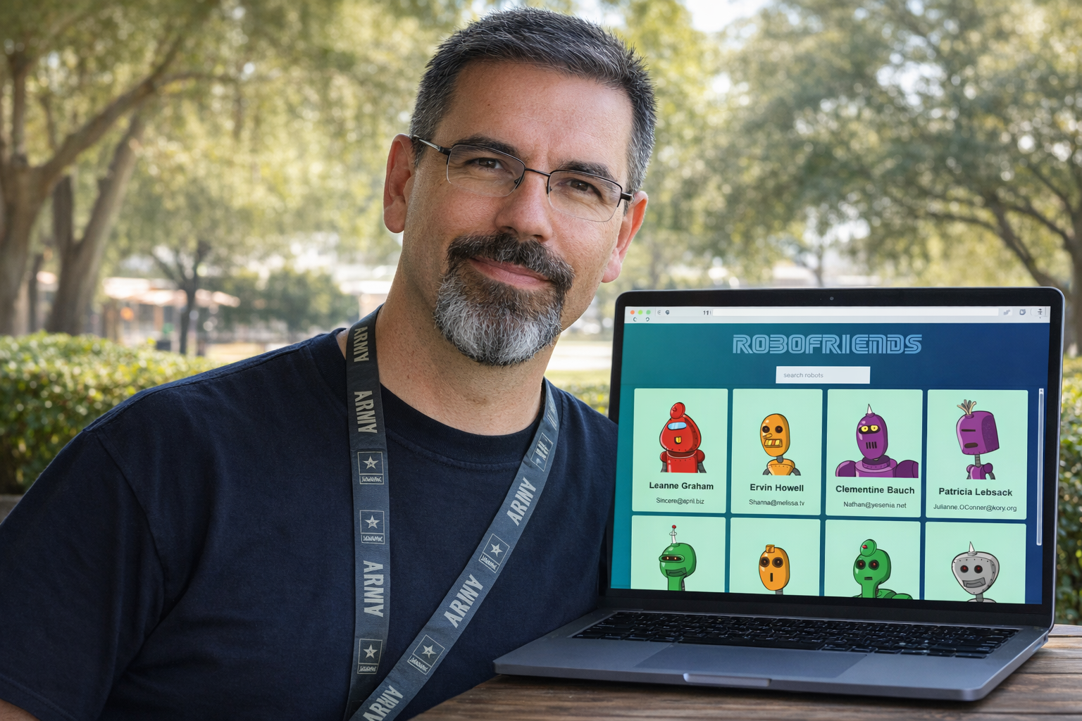


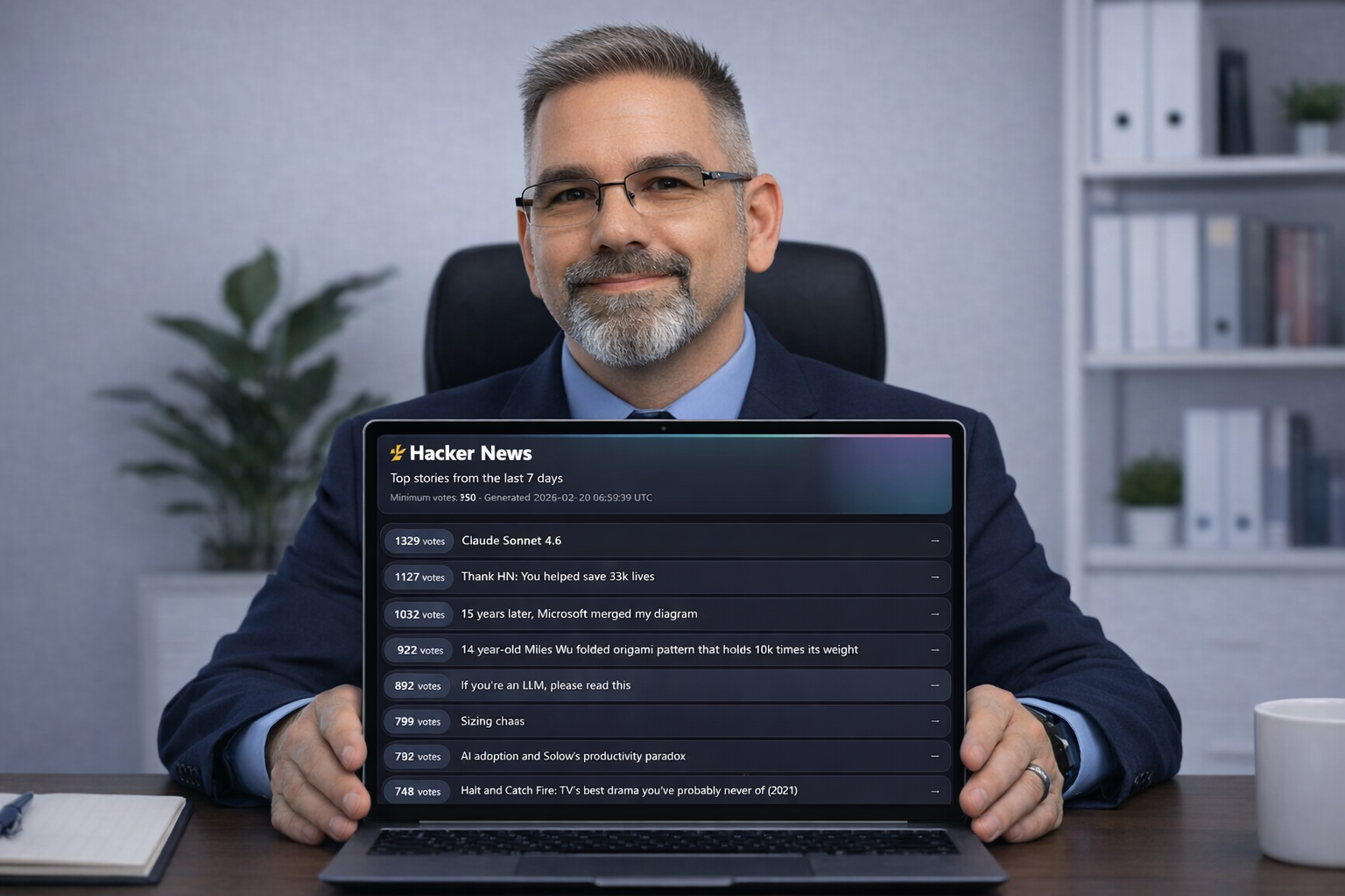

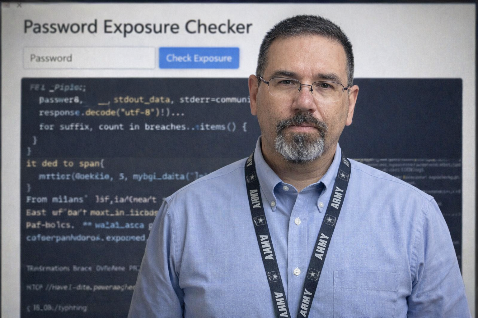


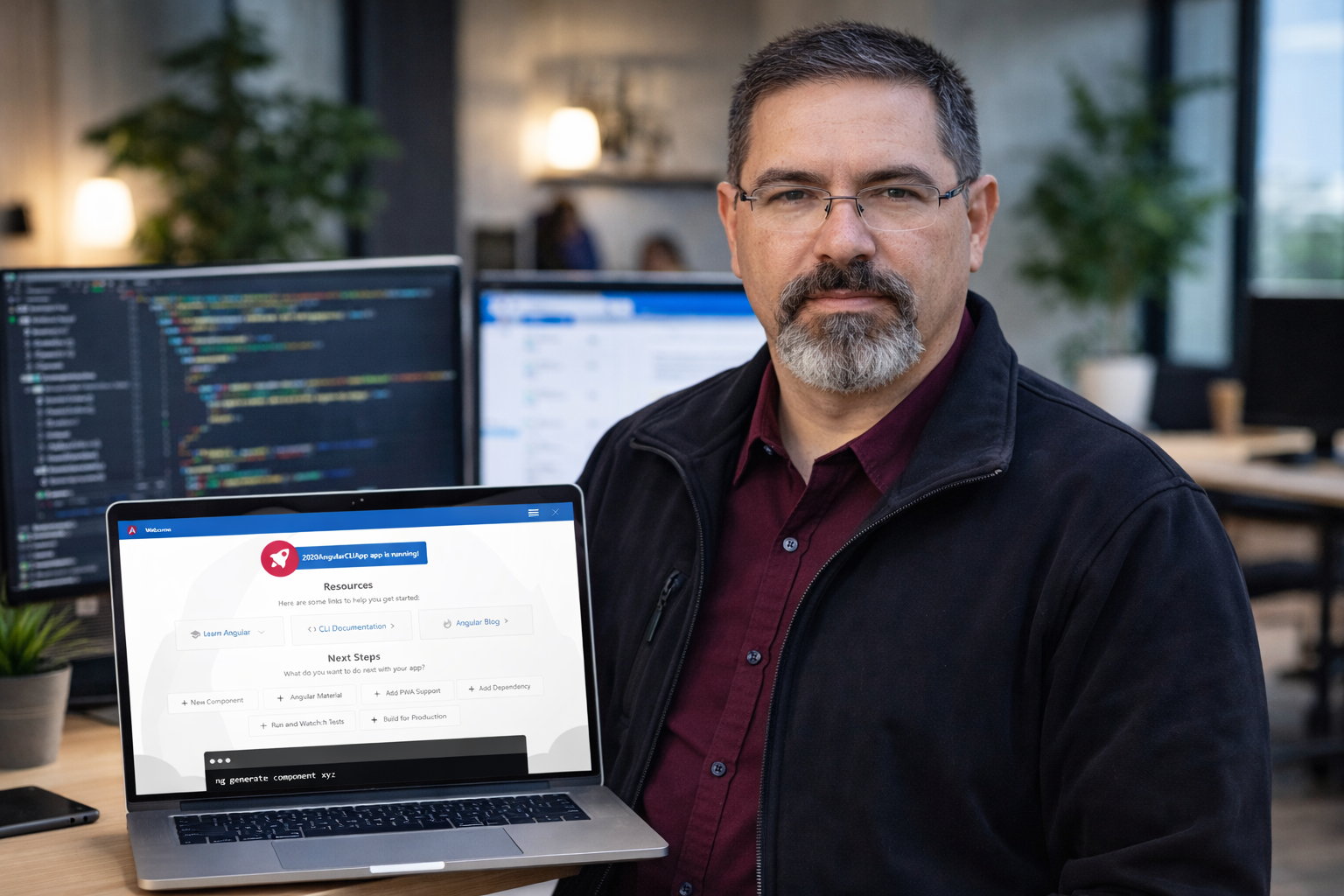
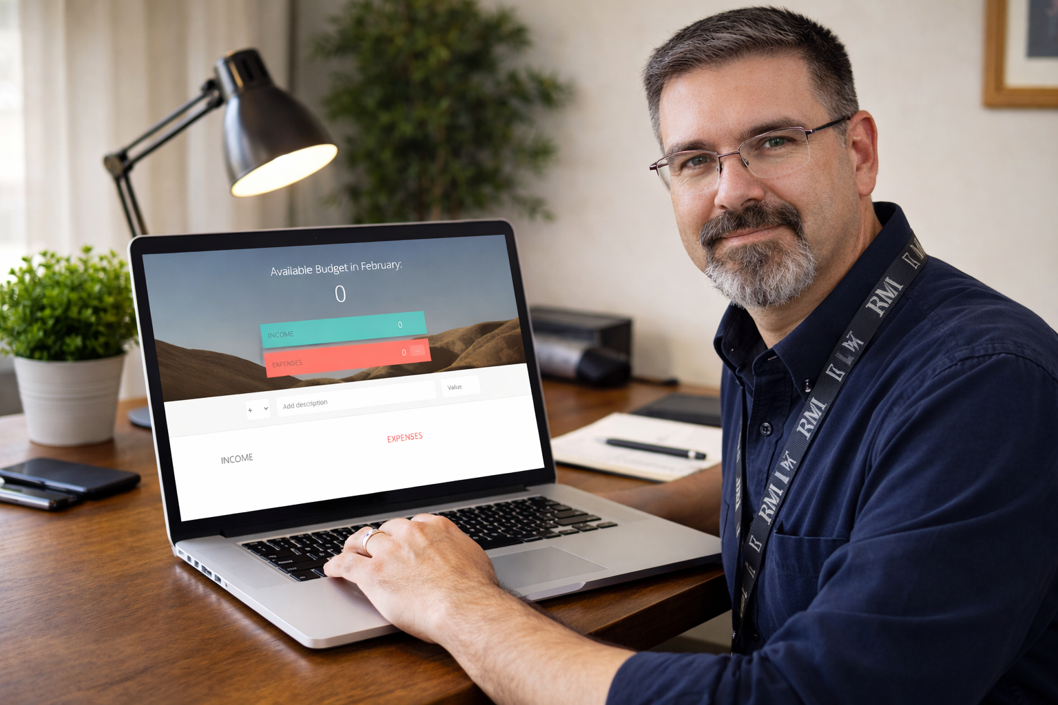
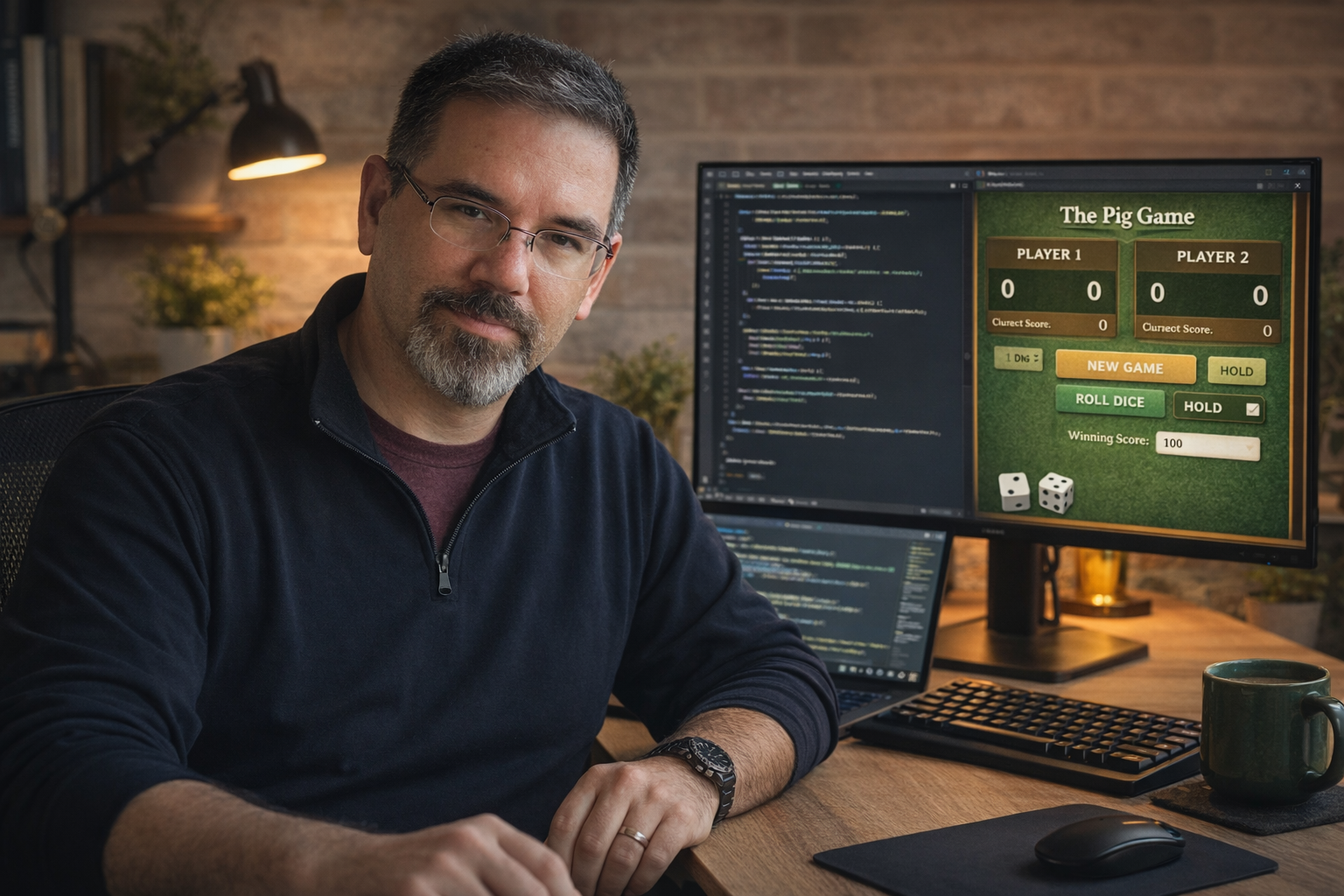

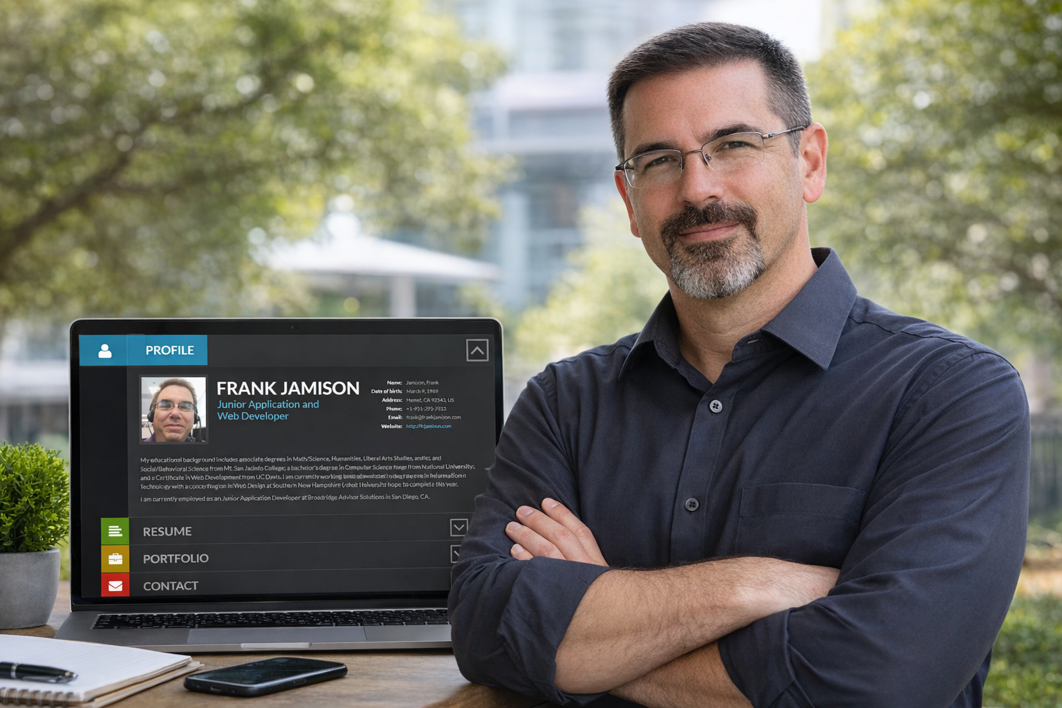


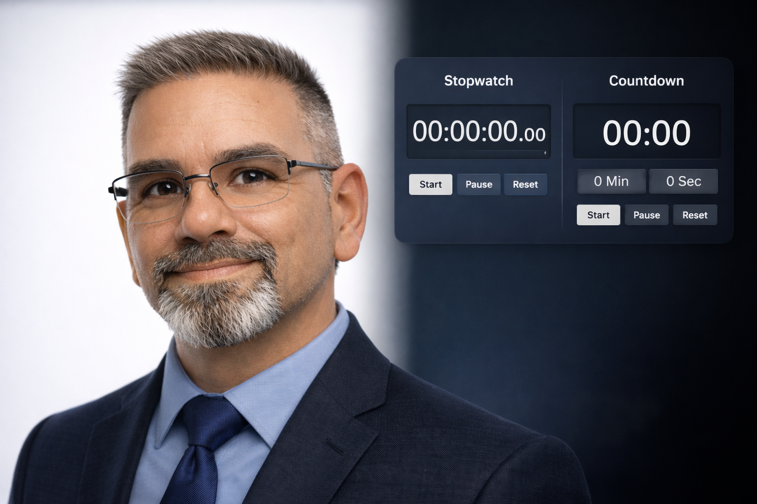
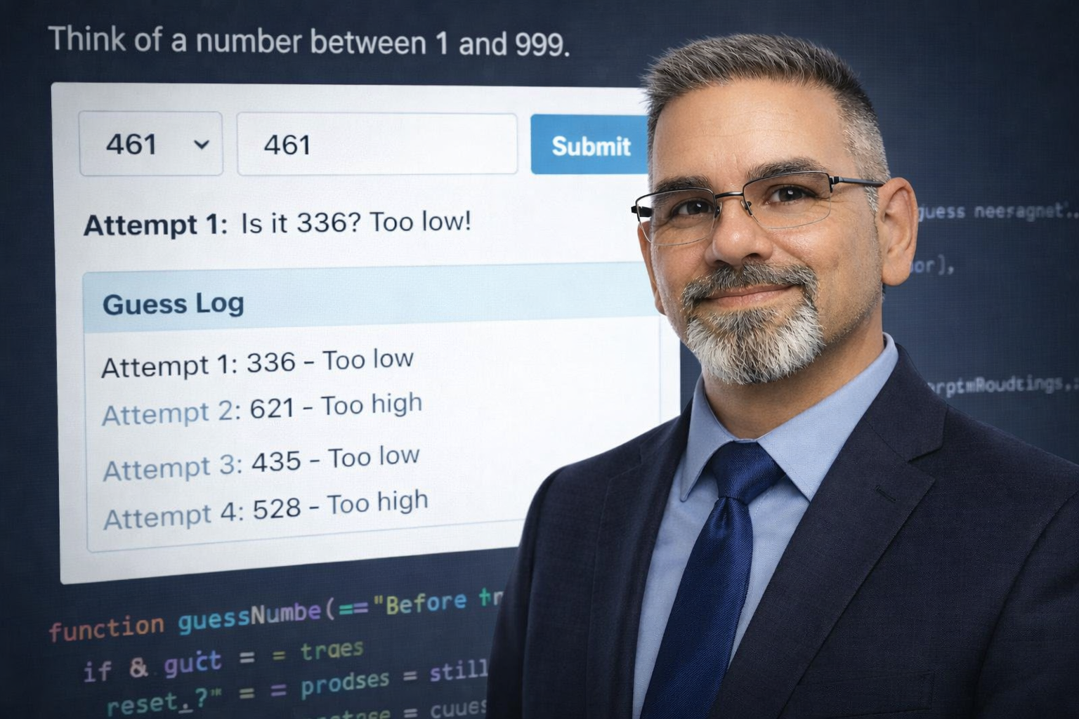

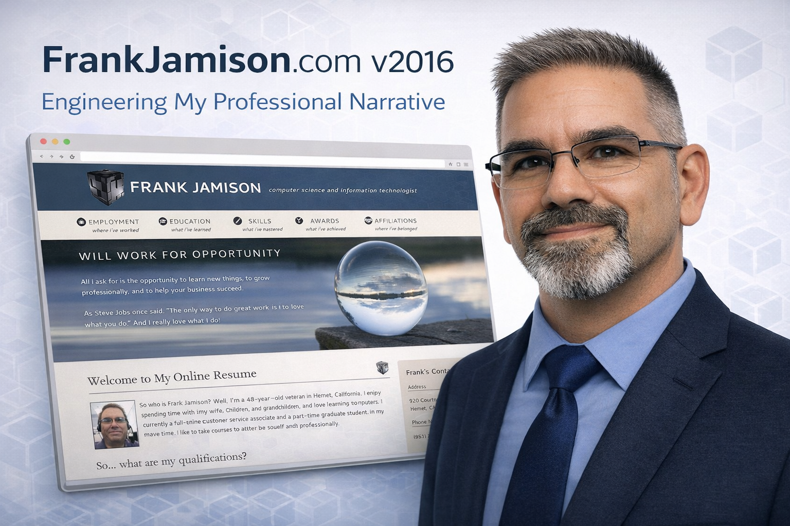


Leave a Reply